This documentation is available as Markdown for AI agents and LLMs. See the full Markdown index or append .md to any documentation URL.
DisclosureGroup A SwiftUI DisclosureGroup component for displaying expandable content.
Recommended version:
~56.0.26
Expo UI DisclosureGroup matches the official SwiftUI DisclosureGroup API and displays a disclosure indicator that reveals or hides content.
Installation
- npx expo install @expo/ui
- yarn expo install @expo/ui
- pnpm expo install @expo/ui
- bun expo install @expo/ui
If you are installing this in an existing React Native app , make sure to install expo in your project.
Usage
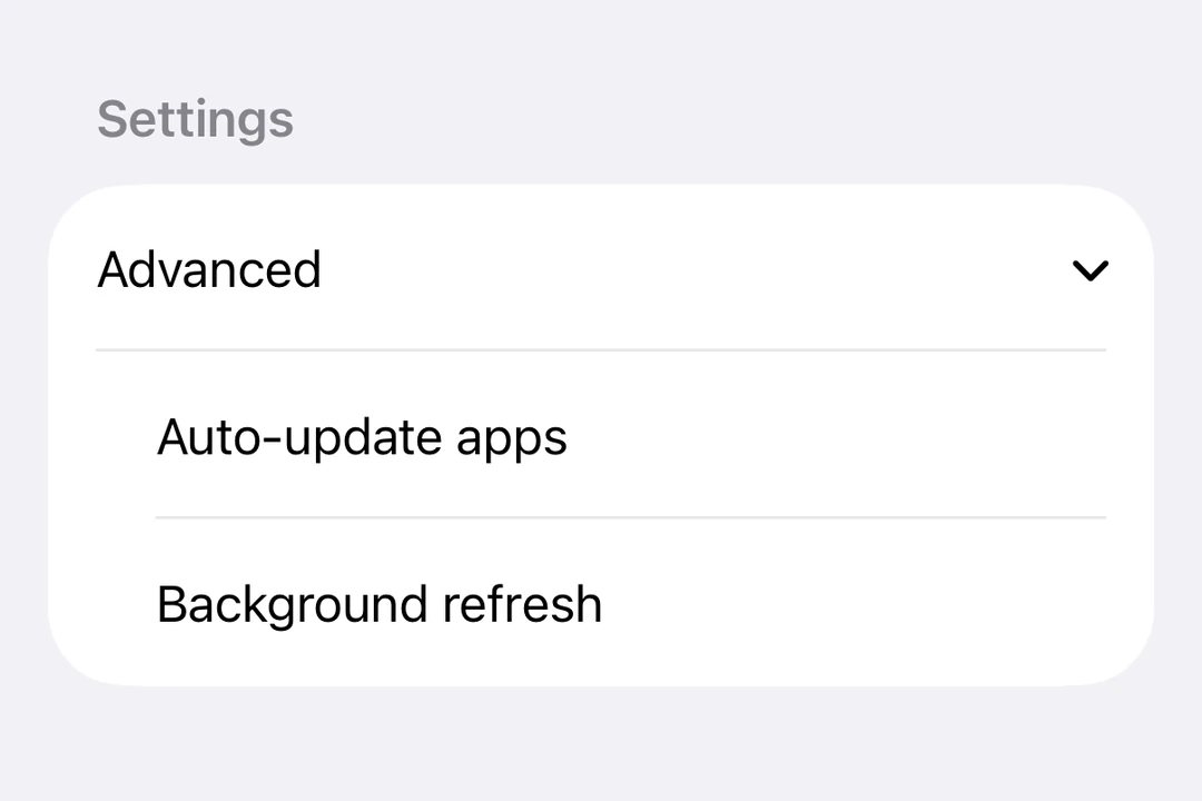
Basic disclosure group
DisclosureGroup is most commonly used inside a Form
BasicDisclosureGroupExample.tsx import { useState } from 'react' ;
import { DisclosureGroup , Form , Host , Section , Text } from '@expo/ui/swift-ui' ;
export default function BasicDisclosureGroupExample ( ) {
const [ isExpanded, setIsExpanded] = useState ( true ) ;
return (
< Host style = { { flex: 1 } } >
< Form >
< Section >
< DisclosureGroup label = " Advanced settings" isExpanded = { isExpanded} onIsExpandedChange = { setIsExpanded} >
< Text > Auto-update apps </ Text >
< Text > App downloads </ Text >
< Text > Offload unused apps </ Text >
</ DisclosureGroup >
</ Section >
</ Form >
</ Host > ) ;
}
Initially expanded
Set isExpanded to true initially to show the content by default.
InitiallyExpandedExample.tsx import { useState } from 'react' ;
import { Host , DisclosureGroup , Text } from '@expo/ui/swift-ui' ;
export default function InitiallyExpandedExample ( ) {
const [ isExpanded, setIsExpanded] = useState ( true ) ;
return (
< Host matchContents >
< DisclosureGroup label = " Details" isExpanded = { isExpanded} onIsExpandedChange = { setIsExpanded} >
< Text > This content is visible by default. </ Text >
</ DisclosureGroup >
</ Host > ) ;
}
Custom label
Use DisclosureGroup.Label when the label needs custom SwiftUI content or modifiers instead of the label string prop.
CustomLabelDisclosureGroupExample.tsx import { useState } from 'react' ;
import { DisclosureGroup , Form , Host , Section , Text } from '@expo/ui/swift-ui' ;
import { font, foregroundStyle } from '@expo/ui/swift-ui/modifiers' ;
export default function CustomLabelDisclosureGroupExample ( ) {
const [ isExpanded, setIsExpanded] = useState ( false ) ;
return (
< Host style = { { flex: 1 } } >
< Form >
< Section >
< DisclosureGroup isExpanded = { isExpanded} onIsExpandedChange = { setIsExpanded} >
< DisclosureGroup.Label >
< Text modifiers = { [ font ( { weight: 'semibold' } ) , foregroundStyle ( '#0a7ea4' ) ] } >
Network options
</ Text >
</ DisclosureGroup.Label >
< Text > Wi-Fi </ Text >
< Text > Bluetooth </ Text >
< Text > Cellular data </ Text >
</ DisclosureGroup >
</ Section >
</ Form >
</ Host > ) ;
}
API
import { DisclosureGroup } from '@expo/ui/swift-ui' ;
No API data file found, sorry!