This documentation is available as Markdown for AI agents and LLMs. See the full Markdown index or append .md to any documentation URL.
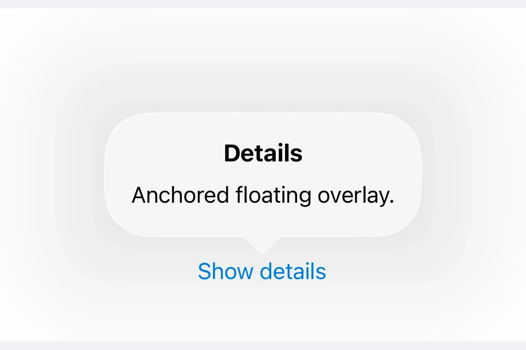
Popover A SwiftUI Popover component for displaying content in a floating overlay.
Recommended version:
~56.0.26
Expo UI Popover matches the official SwiftUI Popover API and provides a way to present content in a floating overlay anchored to a trigger element.
Installation
- npx expo install @expo/ui
- yarn expo install @expo/ui
- pnpm expo install @expo/ui
- bun expo install @expo/ui
If you are installing this in an existing React Native app , make sure to install expo in your project.
Usage
Basic popover
import { useState } from 'react' ;
import { Host , Button , Popover , Text , VStack } from '@expo/ui/swift-ui' ;
import { padding } from '@expo/ui/swift-ui/modifiers' ;
export default function BasicPopoverExample ( ) {
const [ isPresented, setIsPresented] = useState ( false ) ;
return (
< Host matchContents >
< Popover isPresented = { isPresented} onIsPresentedChange = { isPresented => setIsPresented ( isPresented) } >
< Popover.Trigger >
< Button label = " Show Popover" onPress = { ( ) => setIsPresented ( true ) } />
</ Popover.Trigger >
< Popover.Content >
< VStack modifiers = { [ padding ( { all: 16 } ) ] } >
< Text > Hello from Popover! </ Text >
</ VStack >
</ Popover.Content >
</ Popover >
</ Host > ) ;
}
With attachment anchor
The attachmentAnchor prop controls where the popover attaches to the trigger element. Available options are: center, leading, trailing, top, and bottom.
AttachmentAnchorExample.tsx import { useState } from 'react' ;
import { Host , Button , Popover , Text , VStack } from '@expo/ui/swift-ui' ;
import { padding } from '@expo/ui/swift-ui/modifiers' ;
export default function AttachmentAnchorExample ( ) {
const [ isPresented, setIsPresented] = useState ( false ) ;
return (
< Host matchContents >
< Popover isPresented = { isPresented} onIsPresentedChange = { isPresented => setIsPresented ( isPresented) } attachmentAnchor = " trailing" >
< Popover.Trigger >
< Button label = " Show Popover" onPress = { ( ) => setIsPresented ( true ) } />
</ Popover.Trigger >
< Popover.Content >
< VStack modifiers = { [ padding ( { all: 16 } ) ] } >
< Text > Attached to trailing edge </ Text >
</ VStack >
</ Popover.Content >
</ Popover >
</ Host > ) ;
}
With arrow edge
The arrowEdge prop controls which edge of the popover displays the arrow. Available options are: none, leading, trailing, top, and bottom.
import { useState } from 'react' ;
import { Host , Button , Popover , Text , VStack } from '@expo/ui/swift-ui' ;
import { padding } from '@expo/ui/swift-ui/modifiers' ;
export default function ArrowEdgeExample ( ) {
const [ isPresented, setIsPresented] = useState ( false ) ;
return (
< Host matchContents >
< Popover isPresented = { isPresented} onIsPresentedChange = { isPresented => setIsPresented ( isPresented) } arrowEdge = " top" >
< Popover.Trigger >
< Button label = " Show Popover" onPress = { ( ) => setIsPresented ( true ) } />
</ Popover.Trigger >
< Popover.Content >
< VStack modifiers = { [ padding ( { all: 16 } ) ] } >
< Text > Arrow on top edge </ Text >
</ VStack >
</ Popover.Content >
</ Popover >
</ Host > ) ;
}
With React Native content
You can use RNHostView to embed React Native components inside the popover content.
RNContentPopoverExample.tsx import { useState } from 'react' ;
import { Pressable , Text as RNText , View } from 'react-native' ;
import { Host , Button , Popover , RNHostView } from '@expo/ui/swift-ui' ;
export default function RNContentPopoverExample ( ) {
const [ isPresented, setIsPresented] = useState ( false ) ;
const [ counter, setCounter] = useState ( 0 ) ;
return (
< Host matchContents >
< Popover isPresented = { isPresented} onIsPresentedChange = { isPresented => setIsPresented ( isPresented) } >
< Popover.Trigger >
< Button label = " Show RN Popover" onPress = { ( ) => setIsPresented ( true ) } />
</ Popover.Trigger >
< Popover.Content >
< RNHostView matchContents >
< View style = { { padding: 16 } } >
< RNText style = { { fontSize: 16 , fontWeight: 'bold' } } > React Native Content </ RNText >
< RNText style = { { color: '#666' , marginVertical: 8 } } > Counter: { counter} </ RNText >
< Pressable style = { {
backgroundColor: '#007AFF' ,
padding: 12 ,
borderRadius: 8 ,
alignItems: 'center' ,
} } onPress = { ( ) => setCounter ( counter + 1 ) } >
< RNText style = { { color: 'white' } } > Increment </ RNText >
</ Pressable >
</ View >
</ RNHostView >
</ Popover.Content >
</ Popover >
</ Host > ) ;
}
API
import { Popover } from '@expo/ui/swift-ui' ;
No API data file found, sorry!