This documentation is available as Markdown for AI agents and LLMs. See the full Markdown index or append .md to any documentation URL.
TabView
A SwiftUI TabView component for paged or tabbed content.
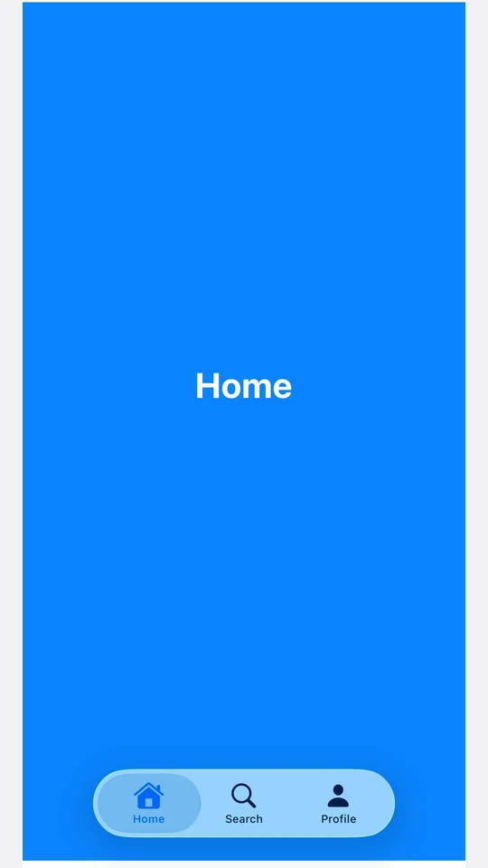
Expo UI TabView matches the official SwiftUI TabView API and switches between styles via the tabViewStyle modifier.
Note: For routed bottom-tab navigation across full-screen routes, use
expo-router/unstable-native-tabsinstead.
Installation
If you are installing this in an existing React Native app, make sure to install expo in your project.
Usage
Each page is a <TabView.Tab> child, identified by a value prop. TabView does not impose its own height — give it a frame, or place it inside a parent that does.
Page style (swipeable pager)
Use tabViewStyle({ type: 'page' }) for a horizontal pager with optional dot indicators. Pass defaultSelection to start the pager on a specific page without controlling it from React.
Controlled selection
Pass selection and onSelectionChange to drive the active tab from React state. Each <TabView.Tab>'s value is matched against selection. Add the animation modifier to animate transitions when selection changes from JS.
Page indicator dots
Use the indexViewStyle modifier together with tabViewStyle({ type: 'page' }) to control the dot indicators. Set indexDisplayMode to 'always', 'never', or 'automatic', and backgroundDisplayMode to render a translucent pill behind the dots.
Bottom tab bar
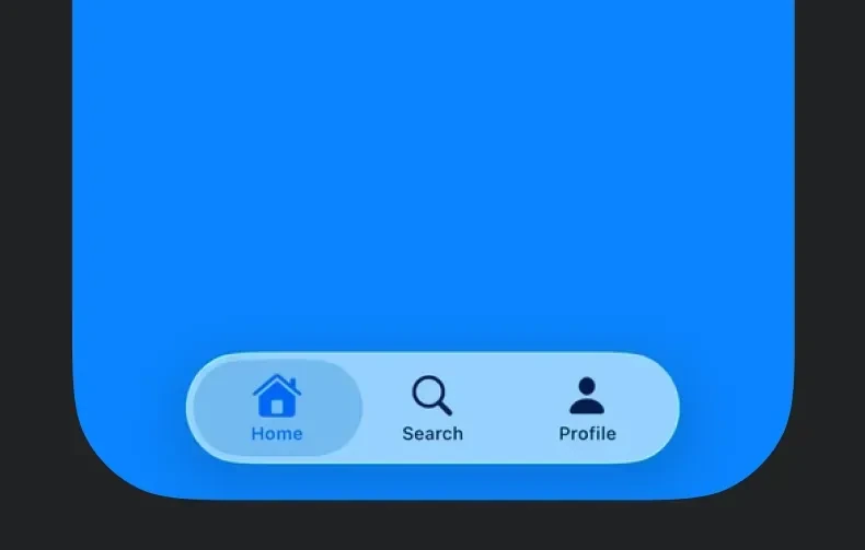
Use tabViewStyle({ type: 'automatic' }) for the SwiftUI default tab bar. Each tab's label and systemImage populate the bar item. Use the badge modifier on a tab to attach a badge to its bar item.
Note: For routed bottom-tab navigation across full-screen routes, use
expo-router/unstable-native-tabsinstead.
API
import { TabView } from '@expo/ui/swift-ui';
No API data file found, sorry!