This documentation is available as Markdown for AI agents and LLMs. See the full Markdown index or append .md to any documentation URL.
DateTimePicker
一个与 @react-native-community/datetimepicker 兼容的日期和时间选择器。
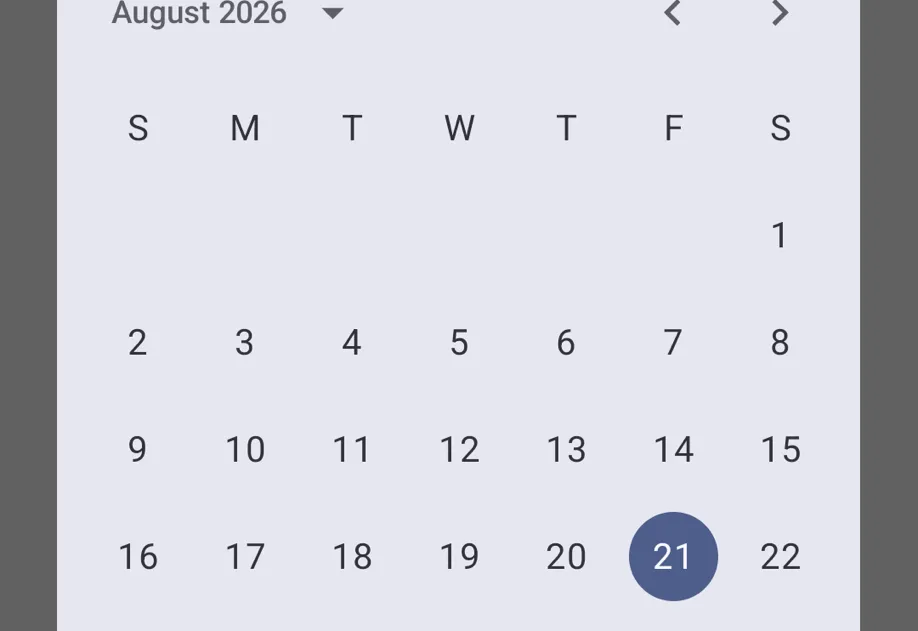
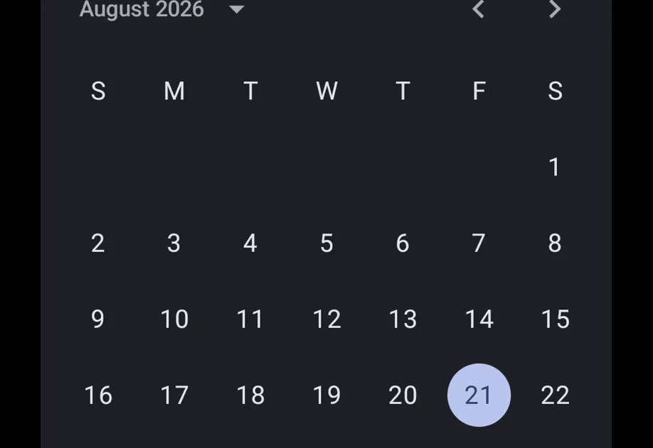
一个 DateTimePicker 组件,其 API 与 @react-native-community/datetimepicker 兼容。它在 Android 上使用 Jetpack Compose,在 iOS 上使用 SwiftUI,默认提供现代的 Material 3 和 SwiftUI 外观(社区模块在 Android 上默认使用较旧的外观)。
🌐 A DateTimePicker component with an API compatible with @react-native-community/datetimepicker. It uses Jetpack Compose on Android and SwiftUI on iOS, providing a modern Material 3 and SwiftUI appearance by default (the community module defaults to the older look on Android).
DateTimePicker 组件是完全声明式的。使用 presentation 属性可以直接在视图层次中渲染选择器 'inline',或在 Android 上作为 'dialog' 渲染。Android 上没有命令式 API (DateTimePickerAndroid.open())。
在 Android 上,内联选择器不会显示标题或主标题,就像 iOS 一样。要显示 Material 3 的“选择日期”标题和已选日期的主标题,可以直接使用 Jetpack Compose DateTimePicker。
🌐 On Android, the inline picker shows no title or headline, as on iOS. To show Material 3's "Select date" title and selected-date headline, use the Jetpack Compose DateTimePicker directly.
在内部,这个组件封装了平台特定的 @expo/ui 原语:
🌐 Under the hood this component wraps the platform-specific @expo/ui primitives:
- Android: Jetpack Compose 日期时间选择器(内联),日期选择器对话框/时间选择器对话框(对话框)
- iOS: SwiftUI 日期选择器
如果你需要更底层的控制(自定义修改器、样式或布局),请直接使用这些基本元素。
🌐 If you need lower-level control (custom modifiers, styles, or layouts), use those primitives directly.
安装
🌐 Installation
If you are installing this in an existing React Native app, make sure to install expo in your project.
从 @react-native-community/datetimepicker 迁移
🌐 Migrating from @react-native-community/datetimepicker
- 将导入从
import DateTimePicker from '@react-native-community/datetimepicker'更新为import DateTimePicker from '@expo/ui/community/datetime-picker'。 - 没有强制性的
DateTimePickerAndroid.open()API。渲染组件并改用presentation="dialog"。 minuteInterval、textColor、firstDayOfWeek、neutralButton、onNeutralButtonPress、fullscreen、title和startOnYearSelection属性不受支持。- 使用
timeZoneName(IANA 名称)代替timeZoneOffsetInMinutes。 countdown模式不被支持。onError属性不需要。
基本用法
🌐 Basic usage
时间选择器
🌐 Time picker
有日期限制
🌐 With date constraints
对话展示
🌐 Dialog presentation
在 Android 上,你可以使用 presentation="dialog" 将选择器显示为模态对话框。组件挂载时对话框会打开。在响应 onValueChange 或 onDismiss 时卸载它。在 iOS 上,此属性会被忽略,选择器始终以内联方式呈现。
🌐 On Android, you can use presentation="dialog" to show the picker as a modal dialog. The dialog opens when the component mounts. Unmount it in response to onValueChange or onDismiss. On iOS, this prop is ignored and the picker always renders inline.
应用接口
🌐 API
import DateTimePicker from '@expo/ui/community/datetime-picker';
No API data file found, sorry!