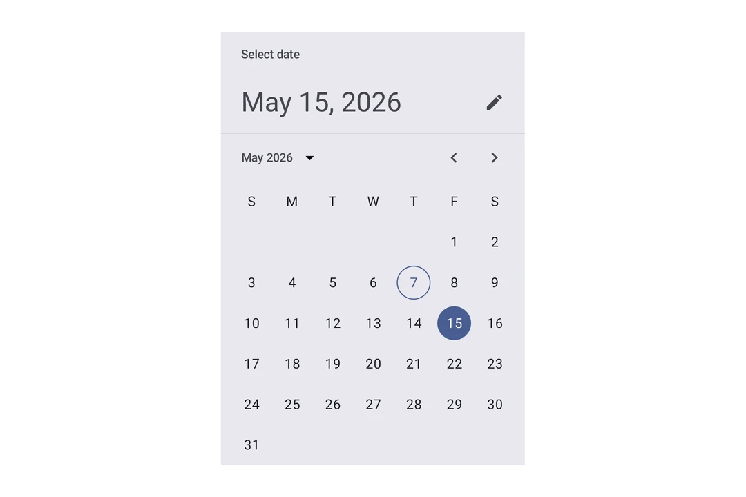
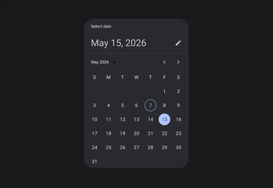
This documentation is available as Markdown for AI agents and LLMs. See the full Markdown index or append .md to any documentation URL.
DateTimePicker 用于选择日期、日期范围和时间的 Jetpack Compose 组件。
Recommended version:
~58.0.15
Expo UI 的日期和时间选择组件与官方 Jetpack Compose 的 日期选择器 、日期范围选择器 和 时间选择器 API 保持一致。
🌐 Expo UI's date and time picker components match the official Jetpack Compose Date Picker , Date Range Picker , and Time Picker APIs.
注意: 日期变体会渲染 Material 的日历网格和输入字段,两者内部都是水平滚动的。父元素 Host 必须在水平方向上提供有限宽度,使用 matchContents={{ vertical: true }} 搭配 style={{ width: '100%' }}(或任何有限宽度)。详情请参见 Host 参考中的匹配内容 。
注意: DateRangePicker 也会垂直滚动,并填充其父容器提供的有限高度。将它的 Host 放在有限布局中,例如使用 flex: 1 的布局。不要在垂直轴上使用 matchContents。
安装
🌐 Installation
- npx expo install @expo/ui
- yarn expo install @expo/ui
- pnpm expo install @expo/ui
- bun expo install @expo/ui
If you are installing this in an existing React Native app , make sure to install expo in your project.
用法
🌐 Usage
日期选择器
🌐 Date picker
import { useState } from 'react' ;
import { Host , DateTimePicker } from '@expo/ui/jetpack-compose' ;
export default function DatePickerExample ( ) {
const [ selectedDate, setSelectedDate] = useState ( new Date ( ) ) ;
return (
< Host matchContents = { { vertical: true } } style = { { width: '100%' } } >
< DateTimePicker onDateSelected = { date => {
setSelectedDate ( date) ;
} } displayedComponents = " date" initialDate = { selectedDate. toISOString ( ) } variant = " picker" />
</ Host > ) ;
}
时间选择器
🌐 Time picker
import { useState } from 'react' ;
import { Host , DateTimePicker } from '@expo/ui/jetpack-compose' ;
export default function TimePickerExample ( ) {
const [ selectedDate, setSelectedDate] = useState ( new Date ( ) ) ;
return (
< Host matchContents = { { vertical: true } } style = { { width: '100%' } } >
< DateTimePicker onDateSelected = { date => {
setSelectedDate ( date) ;
} } displayedComponents = " hourAndMinute" initialDate = { selectedDate. toISOString ( ) } variant = " picker" />
</ Host > ) ;
}
输入变体
🌐 Input variant
使用 variant="input" 将选择器显示为文本输入字段,而不是默认的选择器界面。
🌐 Use variant="input" to display the picker as a text input field instead of the default picker UI.
import { useState } from 'react' ;
import { Host , DateTimePicker } from '@expo/ui/jetpack-compose' ;
export default function InputVariantExample ( ) {
const [ selectedDate, setSelectedDate] = useState ( new Date ( ) ) ;
return (
< Host matchContents = { { vertical: true } } style = { { width: '100%' } } >
< DateTimePicker onDateSelected = { date => {
setSelectedDate ( date) ;
} } displayedComponents = " date" initialDate = { selectedDate. toISOString ( ) } variant = " input" />
</ Host > ) ;
}
没有标题和头条
🌐 Without title and headline
将 showTitle={false} 和 showHeadline={false} 设置为隐藏“选择日期”标题和已选日期的标题。当选择器位于已经有自己标题的屏幕或弹出层时,使用这些属性。在 DatePickerDialog、DateRangePicker 和 DateRangePickerDialog 上也有相同的属性。下面的示例还设置了 showVariantToggle={false} 来隐藏切换不同版本的按钮,这样就只显示日历。
🌐 Set showTitle={false} and showHeadline={false} to hide the "Select date" title and the selected-date headline. Use these props when the picker is in a screen or sheet that already has its own heading. The same props are available on DatePickerDialog, DateRangePicker, and DateRangePickerDialog. The following example also sets showVariantToggle={false} to hide the button that toggles between variants, so only the calendar shows.
import { useState } from 'react' ;
import { Host , DateTimePicker } from '@expo/ui/jetpack-compose' ;
export default function CalendarOnlyExample ( ) {
const [ selectedDate, setSelectedDate] = useState ( new Date ( ) ) ;
return (
< Host matchContents = { { vertical: true } } style = { { width: '100%' } } >
< DateTimePicker onDateSelected = { date => {
setSelectedDate ( date) ;
} } displayedComponents = " date" initialDate = { selectedDate. toISOString ( ) } showVariantToggle = { false } showTitle = { false } showHeadline = { false } />
</ Host > ) ;
}
日期范围选择器
🌐 Date range picker
DateRangePickerAndroidExample.tsx import { useState } from 'react' ;
import {
DateRangePicker ,
type DateRangeSelection ,
Host ,
} from '@expo/ui/jetpack-compose' ;
export default function DateRangePickerAndroidExample ( ) {
const [ range, setRange] = useState < DateRangeSelection> ( {
start: new Date ( ) ,
end: new Date ( Date . now ( ) + 5 * 24 * 60 * 60 * 1000 ) ,
} ) ;
return (
< Host style = { { flex: 1 } } >
< DateRangePicker initialStartDate = { range. start ?. toISOString ( ) } initialEndDate = { range. end ?. toISOString ( ) } onDateRangeSelected = { setRange} />
</ Host > ) ;
}
回调的 end 值是 null,直到用户完成范围选择。
🌐 The callback's end value is null until the user finishes selecting the range.
日期范围选择对话框
🌐 Date range picker dialog
DateRangePickerDialogExample.tsx import { useState } from 'react' ;
import { Button } from 'react-native' ;
import {
DateRangePickerDialog ,
type DateRangeSelection ,
Host ,
} from '@expo/ui/jetpack-compose' ;
export default function DateRangePickerDialogExample ( ) {
const [ visible, setVisible] = useState ( false ) ;
const [ range, setRange] = useState < DateRangeSelection> ( {
start: null ,
end: null ,
} ) ;
return (
< >
< Button title = " 选择日期" onPress = { ( ) => setVisible ( true ) } />
{ visible && (
< Host >
< DateRangePickerDialog initialStartDate = { range. start ?. toISOString ( ) } initialEndDate = { range. end ?. toISOString ( ) } onDateRangeSelected = { selectedRange => {
setRange ( selectedRange) ;
setVisible ( false ) ;
} } onDismissRequest = { ( ) => setVisible ( false ) } />
</ Host > ) }
</ > ) ;
}
应用接口
🌐 API
import {
DateRangePicker ,
DateRangePickerDialog ,
DateTimePicker ,
} from '@expo/ui/jetpack-compose' ;
No API data file found, sorry!