This documentation is available as Markdown for AI agents and LLMs. See the full Markdown index or append .md to any documentation URL.

LazyColumn

用于显示可滚动列表的 Jetpack Compose LazyColumn 组件。

Android
Included in Expo Go
Recommended version:
~58.0.15

Expo UI 的 LazyColumn 与官方 Jetpack Compose LazyColumn API 一致,并显示一个垂直滚动的列表。

🌐 Expo UI LazyColumn matches the official Jetpack Compose LazyColumn API and displays a vertically scrolling list.
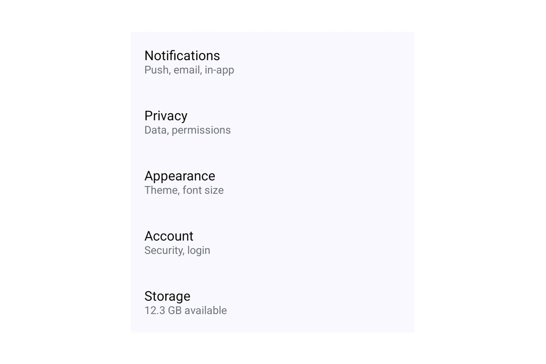
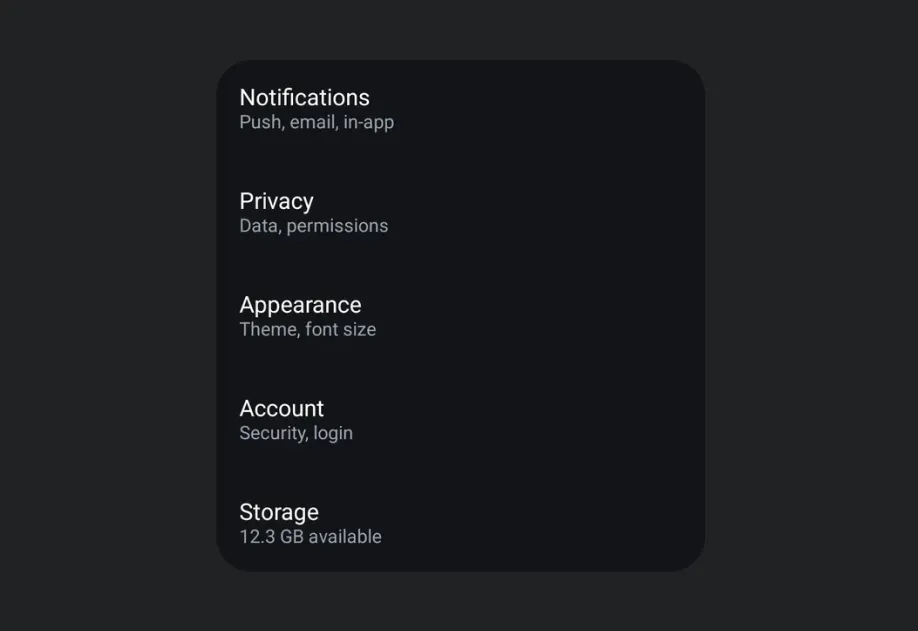
LazyColumn rendering a settings list of five Material 3 list itemsLazyColumn rendering a settings list of five Material 3 list items

安装

🌐 Installation

Terminal
- npx expo install @expo/ui
- yarn expo install @expo/ui
- pnpm expo install @expo/ui
- bun expo install @expo/ui

If you are installing this in an existing React Native app, make sure to install expo in your project.

用法

🌐 Usage

基础懒列

🌐 Basic lazy column

[LazyColumn](#lazycolumn) 的每个子元素都是一行。使用 verticalArrangement 属性来调整行间距,使用 contentPadding 属性为列表内容添加内边距。

🌐 Each child of LazyColumn is one row. Use the verticalArrangement prop to space the rows and the contentPadding prop to add padding around the list content.

BasicLazyColumn.tsx
import { Host, LazyColumn, ListItem, Text, } from '@expo/ui/jetpack-compose'; export default function BasicLazyColumn() { return ( <Host style={{ height: 400 }}> <LazyColumn verticalArrangement={{ spacedBy: 8 }}> <ListItem> <ListItem.HeadlineContent> <Text>Wi-Fi</Text> </ListItem.HeadlineContent> <ListItem.SupportingContent> <Text>Connected to Home</Text> </ListItem.SupportingContent> </ListItem> <ListItem> <ListItem.HeadlineContent> <Text>Bluetooth</Text> </ListItem.HeadlineContent> <ListItem.SupportingContent> <Text>On</Text> </ListItem.SupportingContent> </ListItem> <ListItem> <ListItem.HeadlineContent> <Text>Notifications</Text> </ListItem.HeadlineContent> <ListItem.SupportingContent> <Text>Allowed for all apps</Text> </ListItem.SupportingContent> </ListItem> </LazyColumn> </Host> ); }

大型列表

🌐 Large lists

使用 LazyColumn.Items 来渲染数组中的行。把项目作为 data 传入,每个项目用 keyExtractor 提供唯一的键,并提供一个 children 函数来返回某个项目的行。LazyColumn.Items 只渲染可见区域附近的行,并在滚动时重复使用它们。

🌐 Use LazyColumn.Items to render rows from an array. Pass the items as data, a unique key for each item with keyExtractor, and a children function that returns the row for an item. LazyColumn.Items renders only the rows near the visible area and reuses them while you scroll.

LargeLazyColumn.tsx
import { Host, LazyColumn, ListItem, Text, } from '@expo/ui/jetpack-compose'; type Contact = { id: string; name: string }; const contacts: Contact[] = Array.from( { length: 10000 }, (_, i) => ({ id: String(i), name: `Contact ${i + 1}`, }) ); function renderContact({ item }: { item: Contact }) { return ( <ListItem> <ListItem.HeadlineContent> <Text>{item.name}</Text> </ListItem.HeadlineContent> </ListItem> ); } export default function LargeLazyColumn() { return ( <Host style={{ height: 400 }}> <LazyColumn> <LazyColumn.Items data={contacts} keyExtractor={contact => contact.id}> {renderContact} </LazyColumn.Items> </LazyColumn> </Host> ); }

渲染行时遵守这些规则:

🌐 Follow these rules when you render rows:

  • 在组件外定义 children 函数,或者把它包在 useCallback 里。否则,每次组件渲染时,可见区域附近的行都会重新渲染。
  • 一个重复使用的行会保留它之前显示的项目的本地状态(useState)。当项目变化时重置状态,或者把状态保存在行外。
  • 尚未准备好的行会显示一个空占位符。将 estimatedItemSize 设置为接近你行高度的值,单位为独立像素(dp)。
  • 使用 overscanCount 在可见行的上方和下方准备更多行。
  • 要更新行,请传入一个新的 data 数组。不要在原地修改数组。
  • 把 recycling={false} 设置成提前渲染每一行。

应用接口

🌐 API

import { LazyColumn } from '@expo/ui/jetpack-compose';

No API data file found, sorry!