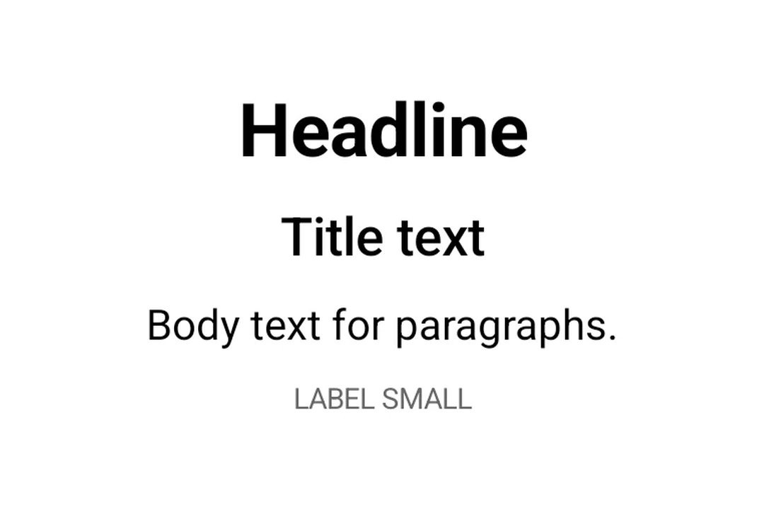
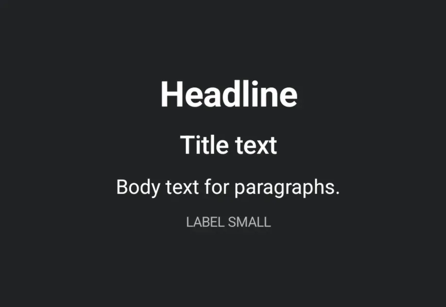
Expo UI 文本与官方 Jetpack Compose 文本样式 API 匹配,并使用 Material 3 排版样式、自定义字体和文本格式选项显示文本。
🌐 Expo UI Text matches the official Jetpack Compose Text styling API and displays text with Material 3 typography styles, custom fonts, and text formatting options.
🌐 Use the style prop with typography to apply Material 3 typography presets.
TypographyExample.tsx
import{Host,Text,Column,
useMaterialColors,}from'@expo/ui/jetpack-compose';import{ paddingAll }from'@expo/ui/jetpack-compose/modifiers';exportdefaultfunctionTypographyExample(){const colors =useMaterialColors();return(<HostmatchContents><Columnmodifiers={[paddingAll(16)]}><Textcolor={colors.onBackground}style={{ typography:'displayLarge'}}>
Display Large
</Text><Textcolor={colors.onBackground}style={{ typography:'headlineMedium'}}>
Headline Medium
</Text><Textcolor={colors.onBackground}style={{ typography:'bodySmall'}}>
Body Small
</Text><Textcolor={colors.onBackground}style={{ typography:'labelLarge'}}>
Label Large
</Text></Column></Host>);}
具有最大行数和溢出的文本
🌐 Text with maxLines and overflow
使用 maxLines 和 overflow 控制文本截断。
🌐 Control text truncation with maxLines and overflow.
TextOverflowExample.tsx
import{Host,Text,
useMaterialColors,}from'@expo/ui/jetpack-compose';import{ width }from'@expo/ui/jetpack-compose/modifiers';exportdefaultfunctionTextOverflowExample(){const colors =useMaterialColors();return(<HostmatchContents><Textcolor={colors.onBackground}maxLines={2}overflow="ellipsis"modifiers={[width(200)]}>
This is a long paragraph of text that will be truncated
after two lines with an ellipsis at the end to indicate
there is more content.
</Text></Host>);}
样式化文本
🌐 Styled text
应用自定义文本样式,包括字体粗细、样式、大小和装饰。
🌐 Apply custom text styles including font weight, style, size, and decoration.
StyledTextExample.tsx
import{Host,Text,Column,
useMaterialColors,}from'@expo/ui/jetpack-compose';import{ paddingAll }from'@expo/ui/jetpack-compose/modifiers';exportdefaultfunctionStyledTextExample(){const colors =useMaterialColors();return(<HostmatchContents><Columnmodifiers={[paddingAll(16)]}><Textcolor={colors.onBackground}style={{ fontWeight:'bold', fontSize:20}}>
Bold text
</Text><Textcolor={colors.onBackground}style={{ fontStyle:'italic'}}>
Italic text
</Text><Textcolor={colors.onBackground}style={{ textDecoration:'underline'}}>
Underlined text
</Text><Textcolor={colors.onBackground}style={{ letterSpacing:4}}>
Spaced out text
</Text><Textcolor="#E91E63"style={{ fontSize:18, textAlign:'center'}}>
Colored and centered
</Text></Column></Host>);}
🌐 Nest <Text> components to apply inline styles to parts of a sentence. Child spans inherit styles from their parent. For example, a bold parent with an italic child renders the child as bold and italic.
🌐 Use fonts loaded via expo-font by passing the font family name to style.fontFamily.
CustomFontExample.tsx
import{Host,Text,Column,
useMaterialColors,}from'@expo/ui/jetpack-compose';import{ paddingAll }from'@expo/ui/jetpack-compose/modifiers';exportdefaultfunctionCustomFontExample(){const colors =useMaterialColors();return(<HostmatchContents><Columnmodifiers={[paddingAll(16)]}><Textcolor={colors.onBackground}style={{ fontFamily:'serif', fontSize:16}}>
System serif font
</Text><Textcolor={colors.onBackground}style={{ fontFamily:'monospace', fontSize:16}}>
System monospace font
</Text><Textcolor={colors.onBackground}style={{ fontFamily:'Inter-Bold', fontSize:16}}>
Custom Inter Bold font
</Text></Column></Host>);}