This documentation is available as Markdown for AI agents and LLMs. See the full Markdown index or append .md to any documentation URL.
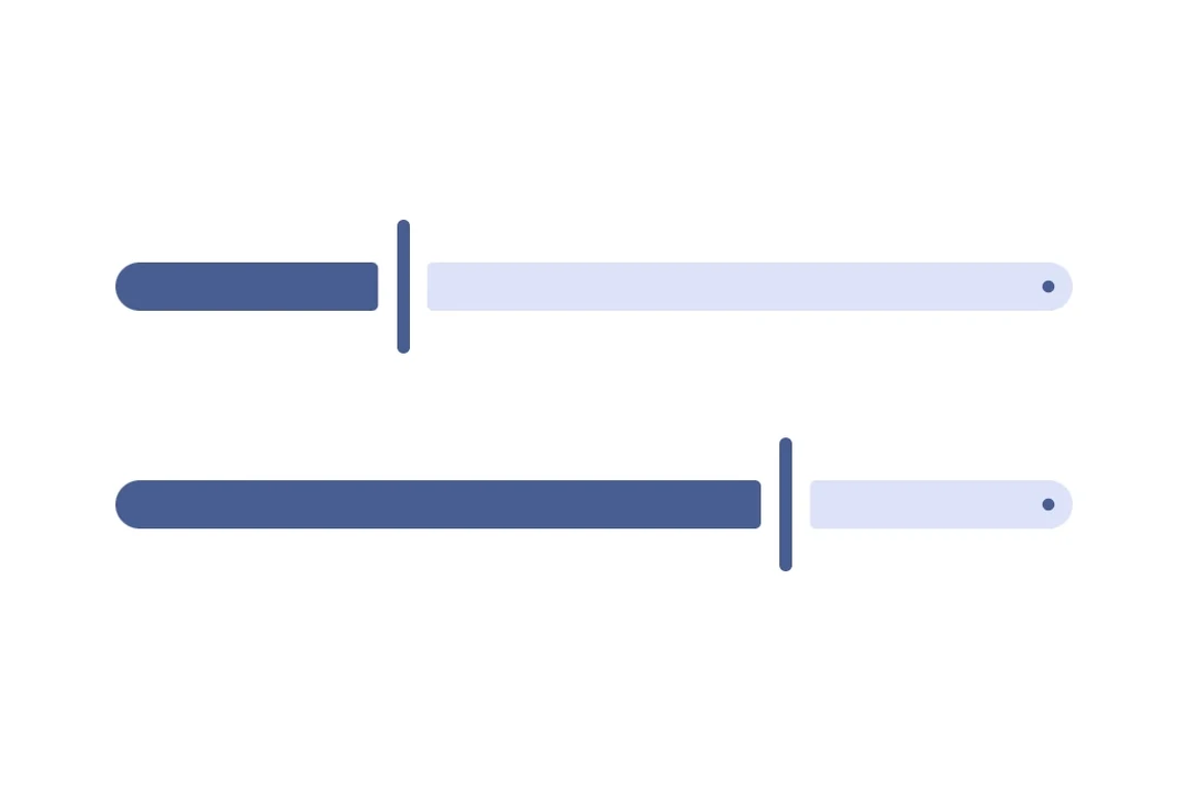
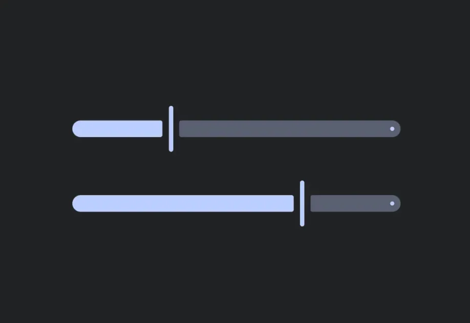
滑块 一个用于从范围中选择值的 Jetpack Compose 滑块组件。
Recommended version:
~58.0.15
信息 有关跨平台使用,请参阅通用 Slider
Expo UI 滑块与官方 Jetpack Compose Slider API 相匹配,并允许从有界范围中选择数值。
🌐 Expo UI Slider matches the official Jetpack Compose Slider API and allows selecting values from a bounded range.
安装
🌐 Installation
- npx expo install @expo/ui
- yarn expo install @expo/ui
- pnpm expo install @expo/ui
- bun expo install @expo/ui
If you are installing this in an existing React Native app , make sure to install expo in your project.
用法
🌐 Usage
基础滑块
🌐 Basic slider
import { useState } from 'react' ;
import { Host , Slider } from '@expo/ui/jetpack-compose' ;
export default function BasicSliderExample ( ) {
const [ value, setValue] = useState ( 0.5 ) ;
return (
< Host matchContents = { { vertical: true } } style = { { width: '100%' } } >
< Slider value = { value} onValueChange = { setValue} />
</ Host > ) ;
}
自定义范围滑块
🌐 Slider with custom range
使用 min 和 max 属性来定义滑块的数值范围。
🌐 Use the min and max props to define the slider's value range.
CustomRangeSliderExample.tsx import { useState } from 'react' ;
import { Host , Slider } from '@expo/ui/jetpack-compose' ;
export default function CustomRangeSliderExample ( ) {
const [ value, setValue] = useState ( 50 ) ;
return (
< Host matchContents = { { vertical: true } } style = { { width: '100%' } } >
< Slider value = { value} min = { 0 } max = { 100 } onValueChange = { setValue} />
</ Host > ) ;
}
带步骤的滑块
🌐 Slider with steps
使用 steps 属性来定义离散增量。将 steps 设置为 0 以获得连续值。
🌐 Use the steps prop to define discrete increments. Set steps to 0 for continuous values.
import { useState } from 'react' ;
import { Host , Slider } from '@expo/ui/jetpack-compose' ;
export default function SteppedSliderExample ( ) {
const [ value, setValue] = useState ( 0 ) ;
return (
< Host matchContents = { { vertical: true } } style = { { width: '100%' } } >
< Slider value = { value} min = { 0 } max = { 100 } steps = { 10 } onValueChange = { setValue} />
</ Host > ) ;
}
自定义颜色
🌐 Custom colors
使用 colors 属性来覆盖滑块拇指、轨道和刻度线的默认 Material3 颜色。
🌐 Use the colors prop to override the default Material3 colors for the slider's thumb, track, and tick marks.
CustomColorsSliderExample.tsx import { useState } from 'react' ;
import { Host , Slider } from '@expo/ui/jetpack-compose' ;
export default function CustomColorsSliderExample ( ) {
const [ value, setValue] = useState ( 0.5 ) ;
return (
< Host matchContents = { { vertical: true } } style = { { width: '100%' } } >
< Slider value = { value} colors = { {
thumbColor: '#6200EE' ,
activeTrackColor: '#6200EE' ,
inactiveTrackColor: '#E0E0E0' ,
} } onValueChange = { setValue} />
</ Host > ) ;
}
自定义滑块和轨道
🌐 Custom thumb and track
同时使用 Slider.Thumb 和 Slider.Track 插槽来实现完全自定义的滑块外观。
🌐 Use both Slider.Thumb and Slider.Track slots for a fully custom slider appearance.
FullyCustomSliderExample.tsx import { useState } from 'react' ;
import {
Host ,
Slider ,
Shape ,
Row ,
Box ,
} from '@expo/ui/jetpack-compose' ;
import {
fillMaxWidth,
height,
weight,
size,
clip,
background,
Shapes ,
} from '@expo/ui/jetpack-compose/modifiers' ;
export default function FullyCustomSliderExample ( ) {
const [ value, setValue] = useState ( 0.5 ) ;
return (
< Host matchContents = { { vertical: true } } style = { { width: '100%' } } >
< Slider value = { value} onValueChange = { setValue} >
< Slider.Thumb >
< Box modifiers = { [
size ( 24 , 24 ) ,
clip ( Shapes . Circle ) ,
background ( '#6200EE' ) ,
] } />
</ Slider.Thumb >
< Slider.Track >
< Row modifiers = { [ fillMaxWidth ( ) , height ( 8 ) ] } >
< Shape.RoundedCorner color = " #6200EE" cornerRadii = { { topStart: 4 , bottomStart: 4 } } modifiers = { [ weight ( Math . max ( value, 0.01 ) ) , height ( 8 ) ] } />
< Shape.RoundedCorner color = " #BDBDBD" cornerRadii = { { topEnd: 4 , bottomEnd: 4 } } modifiers = { [
weight ( Math . max ( 1 - value, 0.01 ) ) ,
height ( 8 ) ,
] } />
</ Row >
</ Slider.Track >
</ Slider >
</ Host > ) ;
}
垂直滑块
🌐 Vertical slider
使用 VerticalSlider 来沿垂直轨迹选择单个值。设置 reverseDirection 可以让数值从下往上增加,而不是从上往下。
🌐 Use VerticalSlider to select a single value along a vertical track. Set reverseDirection to make values increase from bottom to top instead of top to bottom.
VerticalSliderExample.tsx import { useState } from 'react' ;
import { Host , VerticalSlider } from '@expo/ui/jetpack-compose' ;
import { height } from '@expo/ui/jetpack-compose/modifiers' ;
export default function VerticalSliderExample ( ) {
const [ value, setValue] = useState ( 0.5 ) ;
return (
< Host matchContents >
< VerticalSlider value = { value} reverseDirection
onValueChange = { setValue} modifiers = { [ height ( 240 ) ] } />
</ Host > ) ;
}
应用接口
🌐 API
import { Slider , VerticalSlider } from '@expo/ui/jetpack-compose' ;
No API data file found, sorry!