This documentation is available as Markdown for AI agents and LLMs. See the full Markdown index or append .md to any documentation URL.

复选框

一个用于选择控件的 Jetpack Compose 复选框组件。

Android
Included in Expo Go
Recommended version:
~58.0.15

Expo UI 复选框与官方 Jetpack Compose Checkbox API 相匹配。

🌐 Expo UI Checkbox matches the official Jetpack Compose Checkbox API.
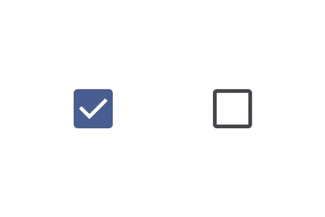
Checked and unchecked Material 3 checkboxesChecked and unchecked Material 3 checkboxes

安装

🌐 Installation

Terminal
- npx expo install @expo/ui
- yarn expo install @expo/ui
- pnpm expo install @expo/ui
- bun expo install @expo/ui

If you are installing this in an existing React Native app, make sure to install expo in your project.

用法

🌐 Usage

基本复选框

🌐 Basic checkbox

CheckboxExample.tsx
import { useState } from 'react'; import { Host, Checkbox } from '@expo/ui/jetpack-compose'; export default function CheckboxExample() { const [checked, setChecked] = useState(false); return ( <Host matchContents> <Checkbox value={checked} onCheckedChange={setChecked} /> </Host> ); }

自定义颜色

🌐 Custom colors

CustomColorsExample.tsx
import { useState } from 'react'; import { Host, Checkbox } from '@expo/ui/jetpack-compose'; export default function CustomColorsExample() { const [checked, setChecked] = useState(false); return ( <Host matchContents> <Checkbox value={checked} onCheckedChange={setChecked} colors={{ checkedColor: '#6200EE', checkmarkColor: '#FFFFFF', }} /> </Host> ); }

全选(三态复选框)

🌐 Select all (TriStateCheckbox)

使用 TriStateCheckbox 来表示其子项状态的父级复选框。它支持三种状态:'on'、'off' 和 'indeterminate'。

🌐 Use TriStateCheckbox for a parent checkbox that reflects the state of its children. It supports three states: 'on', 'off', and 'indeterminate'.

将 toggleable 修饰符应用到每个 Row 上,以使整行(复选框 + 标签)可点击,并具有正确的可访问性语义。在行上使用 toggleable 时,应从复选框本身省略 onCheckedChange/onClick,以避免重复处理。

🌐 Apply the toggleable modifier to each Row to make the entire row (checkbox + label) tappable with correct accessibility semantics. When using toggleable on the row, omit onCheckedChange/onClick from the checkbox itself to avoid double-handling.

SelectAllExample.tsx
import { useState } from 'react'; import { Host, Checkbox, TriStateCheckbox, Row, Column, Text, } from '@expo/ui/jetpack-compose'; import { toggleable } from '@expo/ui/jetpack-compose/modifiers'; export default function SelectAllExample() { const [child1, setChild1] = useState(false); const [child2, setChild2] = useState(false); const [child3, setChild3] = useState(false); const parentState = child1 && child2 && child3 ? 'on' : !child1 && !child2 && !child3 ? 'off' : 'indeterminate'; return ( <Host matchContents> <Column> <Row verticalAlignment="center" modifiers={[ toggleable( parentState === 'on', () => { const newState = parentState !== 'on'; setChild1(newState); setChild2(newState); setChild3(newState); }, { role: 'checkbox' } ), ]}> <TriStateCheckbox state={parentState} /> <Text>Select all</Text> </Row> <Row verticalAlignment="center" modifiers={[ toggleable(child1, () => setChild1(!child1), { role: 'checkbox', }), ]}> <Checkbox value={child1} /> <Text>Option 1</Text> </Row> <Row verticalAlignment="center" modifiers={[ toggleable(child2, () => setChild2(!child2), { role: 'checkbox', }), ]}> <Checkbox value={child2} /> <Text>Option 2</Text> </Row> <Row verticalAlignment="center" modifiers={[ toggleable(child3, () => setChild3(!child3), { role: 'checkbox', }), ]}> <Checkbox value={child3} /> <Text>Option 3</Text> </Row> </Column> </Host> ); }

应用接口

🌐 API

import { Checkbox, TriStateCheckbox, } from '@expo/ui/jetpack-compose';

No API data file found, sorry!