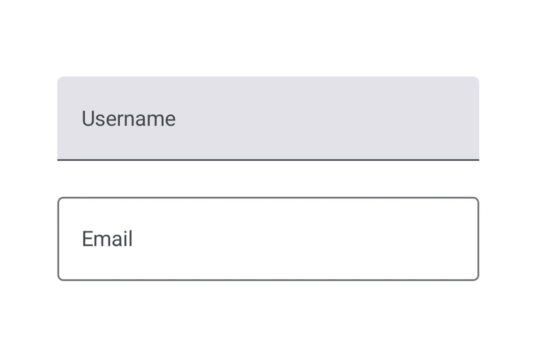
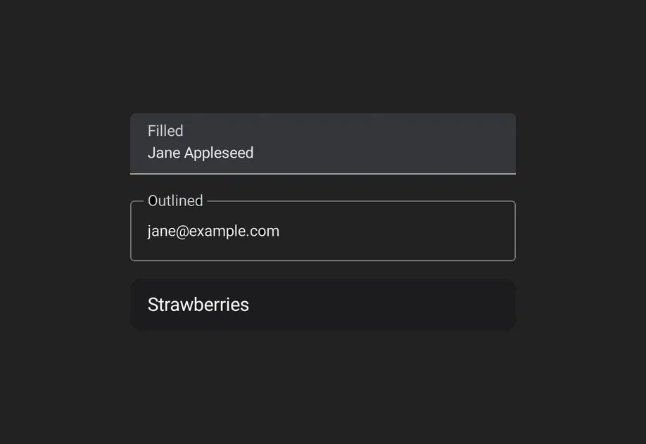
🌐 Expo UI provides three text field components that match the official Jetpack Compose TextField API: TextField (filled), OutlinedTextField (outlined border), and BasicTextField (unstyled). The Material variants TextField and OutlinedTextField share the same props and support composable slot children for label, placeholder, icons, prefix, suffix, and supporting text. BasicTextField has no Material chrome, so you supply your own decoration.
🌐 Bind a useNativeState observable to value. The field tracks the user's input on its own, and you read the current value from text.value. The filled style shown here is the default Material3 text input.
UncontrolledTextFieldExample.tsx
import{Host,TextField,Text,
useNativeState,}from'@expo/ui/jetpack-compose';exportdefaultfunctionUncontrolledTextFieldExample(){const text =useNativeState('');return(<HostmatchContents><TextFieldvalue={text}><TextField.Label><Text>Username</Text></TextField.Label></TextField></Host>);}
受控文本字段
🌐 Controlled text field
将 useNativeState 可观察对象作为 value 传递,并使用 onValueChange 工作单元在写回之前转换或验证输入。下面的示例会在输入时将文本转换为大写。
🌐 Pass a useNativeState observable as value and an onValueChange worklet to transform or validate input before writing it back. The example below uppercases the text as it is typed.
import{Host,TextField,Text,
useNativeState,}from'@expo/ui/jetpack-compose';import{ useCallback }from'react';exportdefaultfunctionControlledTextFieldExample(){const text =useNativeState('');const handleValueChange =useCallback((value:string)=>{'worklet';
text.value= value.toUpperCase();},[text]);return(<HostmatchContents><TextFieldvalue={text}onValueChange={handleValueChange}><TextField.Label><Text>Name</Text></TextField.Label></TextField></Host>);}
轮廓文本字段
🌐 Outlined text field
对于有边框轮廓而非填充背景的文本字段,请使用 OutlinedTextField。
🌐 Use OutlinedTextField for a text field with a border outline instead of a filled background.
OutlinedTextFieldExample.tsx
import{Host,OutlinedTextField,Text,
useNativeState,}from'@expo/ui/jetpack-compose';exportdefaultfunctionOutlinedTextFieldExample(){const text =useNativeState('');return(<HostmatchContents><OutlinedTextFieldvalue={text}><OutlinedTextField.Label><Text>Email</Text></OutlinedTextField.Label><OutlinedTextField.Placeholder><Text>you@example.com</Text></OutlinedTextField.Placeholder></OutlinedTextField></Host>);}
🌐 Both TextField and OutlinedTextField support 7 composable slots that match the Compose API: Label, Placeholder, LeadingIcon, TrailingIcon, Prefix, Suffix, and SupportingText.
TextFieldSlotsExample.tsx
import{Host,TextField,Text,
useNativeState,}from'@expo/ui/jetpack-compose';exportdefaultfunctionTextFieldSlotsExample(){const text =useNativeState('');return(<HostmatchContents><TextFieldvalue={text}><TextField.Label><Text>Price</Text></TextField.Label><TextField.Placeholder><Text>0.00</Text></TextField.Placeholder><TextField.LeadingIcon><Text>💰</Text></TextField.LeadingIcon><TextField.Prefix><Text>$</Text></TextField.Prefix><TextField.Suffix><Text>USD</Text></TextField.Suffix><TextField.SupportingText><Text>Enter the amount</Text></TextField.SupportingText></TextField></Host>);}
键盘选项
🌐 Keyboard options
使用 keyboardOptions 属性来配置键盘类型、大写、自动纠正和输入法操作。
🌐 Use the keyboardOptions prop to configure the keyboard type, capitalization, auto-correct, and IME action.
KeyboardOptionsExample.tsx
import{Host,TextField,Text,
useNativeState,}from'@expo/ui/jetpack-compose';exportdefaultfunctionKeyboardOptionsExample(){const text =useNativeState('');return(<HostmatchContents><TextFieldvalue={text}singleLinekeyboardOptions={{
keyboardType:'email',
capitalization:'none',
autoCorrectEnabled:false,
imeAction:'done',}}><TextField.Label><Text>Email</Text></TextField.Label></TextField></Host>);}
键盘操作
🌐 Keyboard actions
使用 keyboardActions 属性来处理 IME 操作按钮的按下事件。触发的回调取决于在 keyboardOptions 中设置的 imeAction。每个回调都会接收当前的文本值。
🌐 Use the keyboardActions prop to handle IME action button presses. The triggered callback depends on the imeAction set in keyboardOptions. Each callback receives the current text value.
KeyboardActionsExample.tsx
import{Host,TextField,Text,
useNativeState,}from'@expo/ui/jetpack-compose';exportdefaultfunctionKeyboardActionsExample(){const text =useNativeState('');return(<HostmatchContents><TextFieldvalue={text}singleLinekeyboardOptions={{ imeAction:'search'}}keyboardActions={{onSearch: value =>console.log('Searched:', value),}}><TextField.Label><Text>Search</Text></TextField.Label></TextField></Host>);}
命令参考
🌐 Imperative ref
使用引用可以以命令式方式设置文本、清除字段、更改选择或移动焦点。
🌐 Use a ref to imperatively set text, clear the field, change the selection, or move focus.
🌐 When onValueChange is marked with the 'worklet' directive, it runs synchronously on the UI thread, so writes to useNativeState observables inside the callback take effect before the next frame. There is no flicker between the typed text and the masked text. The example below masks a phone number as the user types and writes both value and selection from the worklet to keep the cursor at the end of the formatted value.