This documentation is available as Markdown for AI agents and LLMs. See the full Markdown index or append .md to any documentation URL.

TextInput

一个由原生 SwiftUI 和 Jetpack Compose 组件支持的文本输入,具有与 React Native 兼容的 API。

Android
iOS
Web
Included in Expo Go
Recommended version:
~58.0.15

一个文本输入,在 Android 上从 @expo/ui/jetpack-compose 路由到 TextField,在 iOS 上从 @expo/ui/swift-ui 路由到 TextField,以及在 Web 上通过 React Native 的 TextInput 路由。

🌐 A text input that routes to TextField from @expo/ui/jetpack-compose on Android, TextField from @expo/ui/swift-ui on iOS, and React Native's TextInput on web.

该 API 镜像了 React Native 的 TextInput,有两个变化:value 和 selection 是可观察的状态对象(使用 useNativeState 创建),并且 onChangeText 可以是一个 worklet,用于在 UI 线程上同步更新状态。

🌐 The API mirrors React Native's TextInput, with two changes: value and selection are observable state objects (created with useNativeState), and onChangeText can be a worklet for synchronously updating the state on the UI thread.
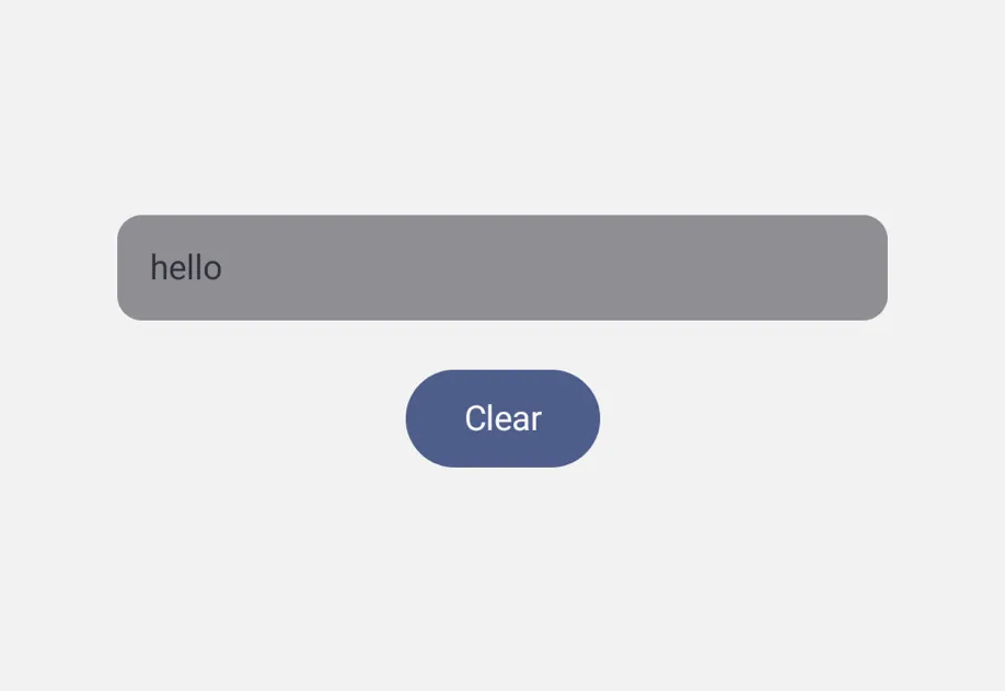
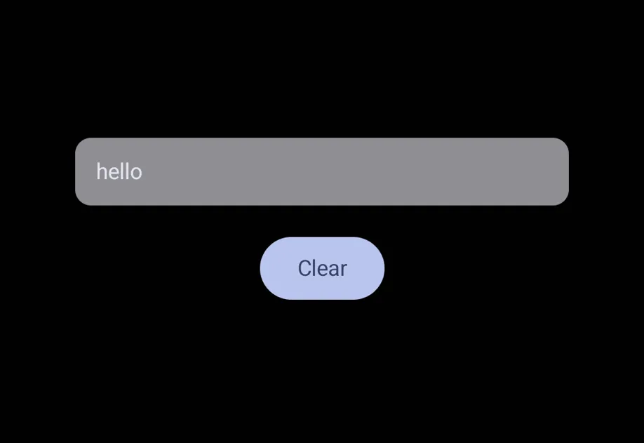
A text field containing hello above a Clear buttonA text field containing hello above a Clear button

安装

🌐 Installation

Terminal
- npx expo install @expo/ui
- yarn expo install @expo/ui
- pnpm expo install @expo/ui
- bun expo install @expo/ui

If you are installing this in an existing React Native app, make sure to install expo in your project.

用法

🌐 Usage

失控的

🌐 Uncontrolled

省略 value,字段会在内部管理自己的文本。使用 onChangeText 来观察编辑,并使用 ref 执行诸如 focus、blur 和 clear 的命令操作。

🌐 Omit value and the field manages its own text internally. Use onChangeText to observe edits, and use the ref for imperative actions like focus, blur, and clear.

UncontrolledTextInputExample.tsx
import { Button, Column, Host, TextInput, type TextInputRef } from '@expo/ui'; import { useRef } from 'react'; export default function UncontrolledTextInputExample() { const inputRef = useRef<TextInputRef>(null); return ( <Host matchContents={{ vertical: true }} style={{ width: '100%' }}> <Column spacing={8}> <TextInput ref={inputRef} defaultValue="hello" placeholder="Type here" onChangeText={value => console.log(value)} /> <Button label="Clear" onPress={() => inputRef.current?.clear()} /> </Column> </Host> ); }

受控

🌐 Controlled

传递 value 以从 useNativeState 可观察对象驱动该字段。下面的示例在你输入时将 Hello 替换为 World。

🌐 Pass value to drive the field from a useNativeState observable. The example below replaces Hello with World as you type.

ControlledTextInputExample.tsx
import { Host, TextInput, useNativeState } from '@expo/ui'; import { useCallback } from 'react'; export default function ControlledTextInputExample() { const text = useNativeState('Hello'); const handleChangeText = useCallback( (value: string) => { 'worklet'; text.value = value === 'Hello' ? 'World' : value; }, [text] ); return ( <Host matchContents={{ vertical: true }} style={{ width: '100%' }}> <TextInput value={text} placeholder="Type here" onChangeText={handleChangeText} /> </Host> ); }

工作单元掩码

🌐 Worklet masking

将 'worklet' 指令添加到 onChangeText 以在 UI 线程上同步更新状态。对 value 的写入可以直接生效,而无需经过可能导致光标闪烁的 JS 线程往返。

🌐 Add the 'worklet' directive to onChangeText for synchronously updating the state on the UI thread. Writes to value land without the JS-thread round-trip that can cause cursor flicker.

PhoneMaskExample.tsx
import { Host, TextInput, useNativeState } from '@expo/ui'; import { useCallback } from 'react'; function formatPhone(input: string) { 'worklet'; const digits = input.replace(/\D/g, '').slice(0, 10); if (digits.length <= 3) return digits; if (digits.length <= 6) return `(${digits.slice(0, 3)}) ${digits.slice(3)}`; return `(${digits.slice(0, 3)}) ${digits.slice(3, 6)}-${digits.slice(6)}`; } export default function PhoneMaskExample() { const phone = useNativeState('(555) 123-4567'); const selection = useNativeState({ start: 0, end: 0 }); const handleChangeText = useCallback( (value: string) => { 'worklet'; const formatted = formatPhone(value); if (formatted !== value) { phone.value = formatted; // Snaps to end for demo. Real masks need smarter cursor handling. selection.value = { start: formatted.length, end: formatted.length }; } }, [phone, selection] ); return ( <Host matchContents={{ vertical: true }} style={{ width: '100%' }}> <TextInput value={phone} selection={selection} keyboardType="phone-pad" placeholder="(555) 123-4567" onChangeText={handleChangeText} /> </Host> ); }

不受支持的 React Native 属性

🌐 Unsupported React Native props

一些 React Native 的 TextInput 属性不受支持,因为 Compose 的 TextField 或 SwiftUI 的 TextField 没有提供等效属性,或者因为该属性被其他机制取代。有关支持的属性,请参见下方的 API 部分。如果缺失的属性妨碍了你的使用场景,请 提交问题,以便优先处理。

🌐 Some React Native TextInput props are not supported, because Compose's TextField or SwiftUI's TextField does not expose an equivalent, or because the prop is replaced by a different mechanism. See the API section below for the supported props. If a missing prop blocks your use case, open an issue so it can be prioritized.

应用接口

🌐 API

import { TextInput, useNativeState } from '@expo/ui';

No API data file found, sorry!