This documentation is available as Markdown for AI agents and LLMs. See the full Markdown index or append .md to any documentation URL.
Recommended version:
~58.0.15
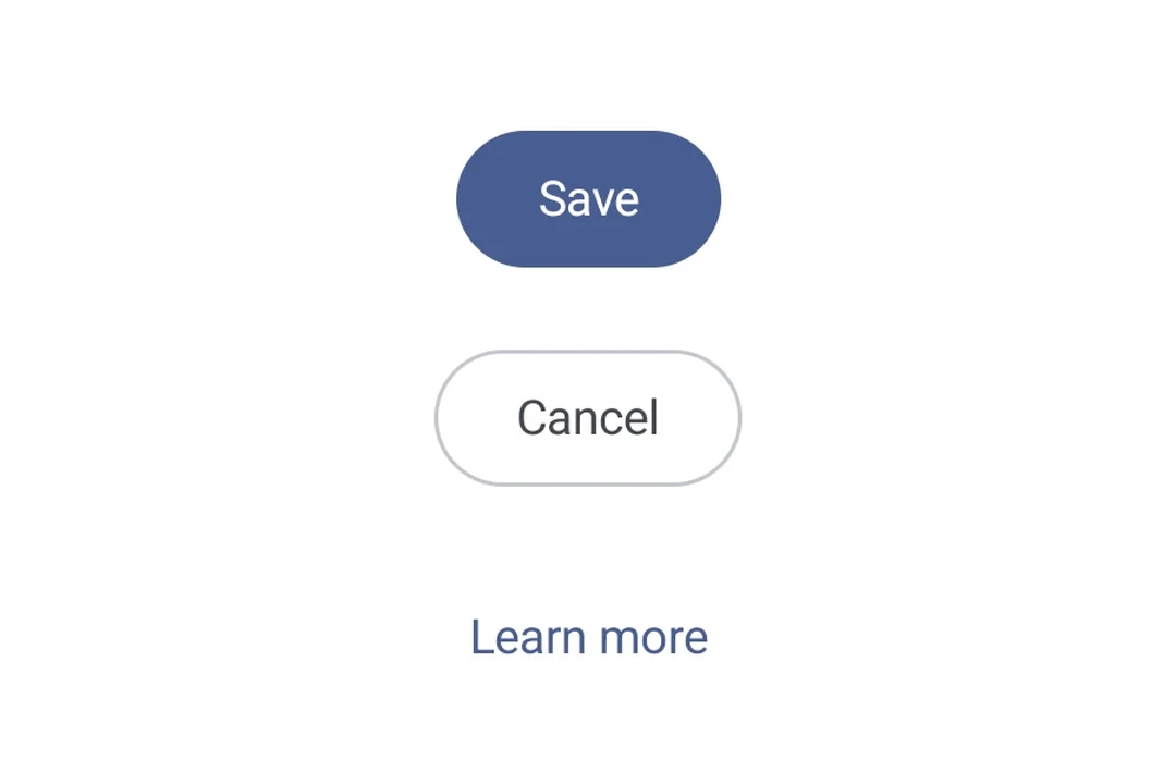
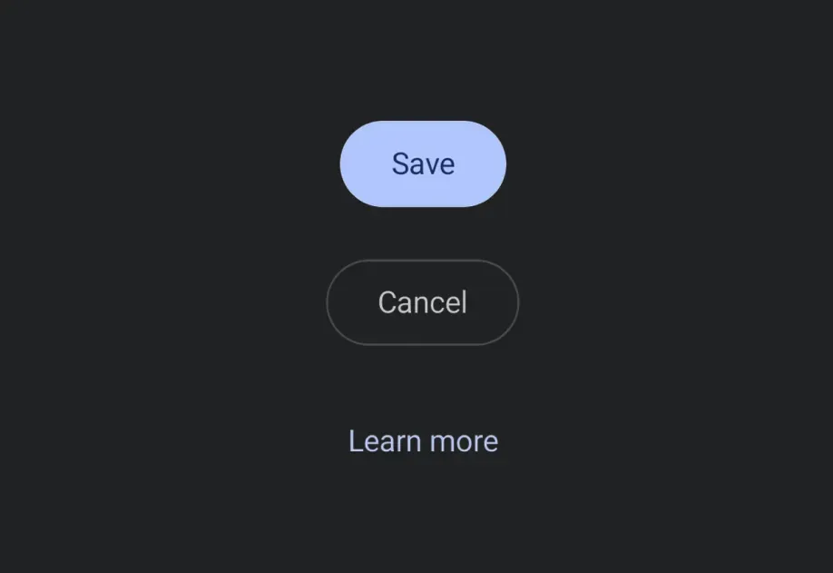
一个可按压的按钮,在 Android、iOS 和网页上呈现一致。支持 filled、outlined 和 text 视觉变体。
🌐 A pressable button that renders consistently across Android, iOS, and web. Supports filled, outlined, and text visual variants.
安装
🌐 Installation
- npx expo install @expo/ui
- yarn expo install @expo/ui
- pnpm expo install @expo/ui
- bun expo install @expo/ui
If you are installing this in an existing React Native app, make sure to install expo in your project.
用法
🌐 Usage
基础按钮
🌐 Basic button
import { Host, Button } from '@expo/ui';

export default function BasicButtonExample() {
  return (
    <Host matchContents>
      <Button label="Press me" onPress={() => alert('Pressed!')} />
    </Host>
  );
}
变体
🌐 Variants
使用 variant 属性选择一个视觉变体。
🌐 Pick a visual variant with the variant prop.
ButtonVariantsExample.tsx import { Host, Column, Button } from '@expo/ui';
export default function ButtonVariantsExample() {
return (
<Host matchContents>
<Column spacing={8}>
<Button variant="filled" label="Filled" onPress={() => {}} />
<Button variant="outlined" label="Outlined" onPress={() => {}} />
<Button variant="text" label="Text" onPress={() => {}} />
</Column>
</Host>
);
}
自定义内容
🌐 Custom content
传递 children 以实现完全自定义的按钮内容。当提供 children 时,label 属性将被忽略。
🌐 Pass children for fully custom button contents. The label prop is ignored when children is provided.
import { Host, Button, Row, Icon, Text } from '@expo/ui';

export default function CustomButtonExample() {
  return (
    <Host matchContents>
      <Button onPress={() => {}}>
        <Row spacing={6} alignment="center">
          <Icon
            name={Icon.select({
              ios: 'star.fill',
              android: require('@expo/material-symbols/star.xml'),
            })}
            size={16}
            color="#FFFFFF"
          />
          <Text textStyle={{ color: '#FFFFFF' }}>Favorite</Text>
        </Row>
      </Button>
    </Host>
  );
}
已禁用
🌐 Disabled
DisabledButtonExample.tsx import { Host, Button } from '@expo/ui';
export default function DisabledButtonExample() {
return (
<Host matchContents>
<Button label="Disabled" onPress={() => {}} disabled />
</Host>
);
}
应用接口
🌐 API
import { Button } from '@expo/ui';
No API data file found, sorry!