This documentation is available as Markdown for AI agents and LLMs. See the full Markdown index or append .md to any documentation URL.

FieldGroup

一个可滚动的、分组的设置风格行的容器。

Android
iOS
Web
Included in Expo Go
Recommended version:
~58.0.15

一个可滚动的容器,用于分组的设置风格行,模仿 iOS 设置屏幕的外观。在内部组合使用 FieldGroup.Section(用于显式分组)、FieldGroup.SectionHeader 和 FieldGroup.SectionFooter 插槽。

🌐 A scrollable container for grouped settings-style rows, mirroring the look of an iOS Settings screen. Compose FieldGroup.Section (for explicit groups), FieldGroup.SectionHeader, and FieldGroup.SectionFooter slots inside.

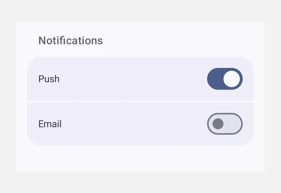
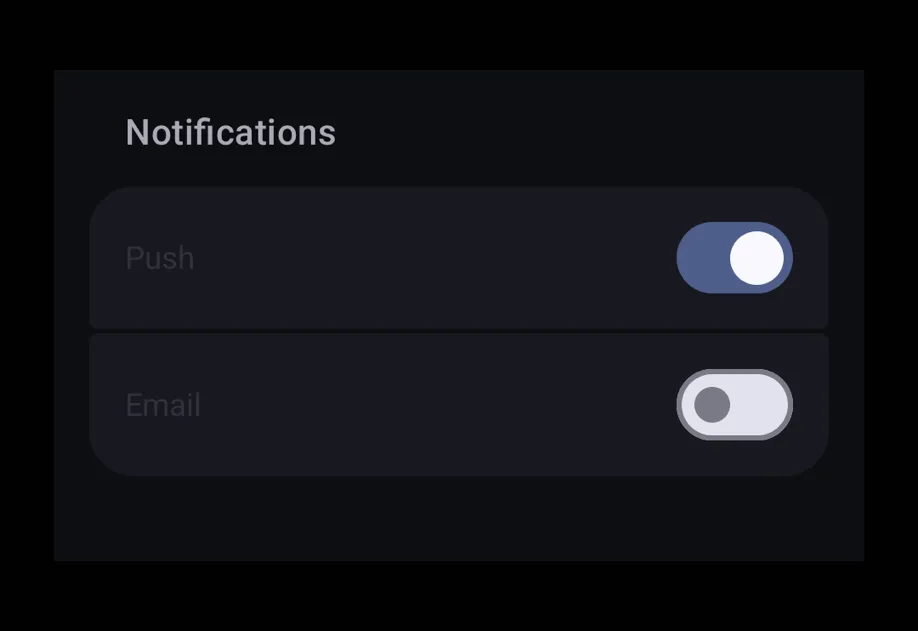
A Notifications section with Push and Email switch rowsA Notifications section with Push and Email switch rows

安装

🌐 Installation

Terminal
- npx expo install @expo/ui
- yarn expo install @expo/ui
- pnpm expo install @expo/ui
- bun expo install @expo/ui

If you are installing this in an existing React Native app, make sure to install expo in your project.

用法

🌐 Usage

分段表格

🌐 Sectioned form

FieldGroupExample.tsx
import { useState } from 'react'; import { useColorScheme } from 'react-native'; import { Host, FieldGroup, Switch, Text } from '@expo/ui'; export default function FieldGroupExample() { const [notifications, setNotifications] = useState(true); const [analytics, setAnalytics] = useState(false); const colorScheme = useColorScheme(); const ink = { color: colorScheme === 'dark' ? '#FFFFFF' : '#000000' }; return ( <Host style={{ flex: 1 }}> <FieldGroup> <FieldGroup.Section title="Notifications"> <Switch label="Push" value={notifications} onValueChange={setNotifications} /> <Switch label="Email" value={analytics} onValueChange={setAnalytics} /> </FieldGroup.Section> <FieldGroup.Section title="About"> <Text textStyle={ink}>Version 1.0.0</Text> </FieldGroup.Section> </FieldGroup> </Host> ); }

自定义部分页眉和页脚

🌐 Custom section header and footer

使用 FieldGroup.SectionHeader 和 FieldGroup.SectionFooter 来呈现完全样式化的页眉/页脚插槽,以替代默认的 title 文本。

🌐 Use FieldGroup.SectionHeader and FieldGroup.SectionFooter to render fully styled header/footer slots in place of the default title text.

FieldGroupSlotsExample.tsx
import { useState } from 'react'; import { useColorScheme } from 'react-native'; import { Host, FieldGroup, Switch, Text } from '@expo/ui'; export default function FieldGroupSlotsExample() { const [enabled, setEnabled] = useState(false); const colorScheme = useColorScheme(); const ink = { color: colorScheme === 'dark' ? '#FFFFFF' : '#000000' }; return ( <Host style={{ flex: 1 }}> <FieldGroup> <FieldGroup.Section> <FieldGroup.SectionHeader> <Text textStyle={{ ...ink, fontSize: 16, fontWeight: '700' }}>Privacy</Text> </FieldGroup.SectionHeader> <Switch label="Share usage" value={enabled} onValueChange={setEnabled} /> <FieldGroup.SectionFooter> <Text textStyle={{ fontSize: 12, color: '#8E8E93' }}> Helps us improve the app. You can disable this at any time. </Text> </FieldGroup.SectionFooter> </FieldGroup.Section> </FieldGroup> </Host> ); }

应用接口

🌐 API

import { FieldGroup } from '@expo/ui';

No API data file found, sorry!