This documentation is available as Markdown for AI agents and LLMs. See the full Markdown index or append .md to any documentation URL.

滑块

用于从连续或分步范围中选择值的控件。

Android
iOS
Web
Included in Expo Go
Recommended version:
~58.0.15

一个用于在范围内选择数值的受控滑块。将 value 与 onValueChange 配对以从 React 管理状态。

🌐 A controlled slider for selecting a numeric value within a range. Pair value with onValueChange to manage state from React.
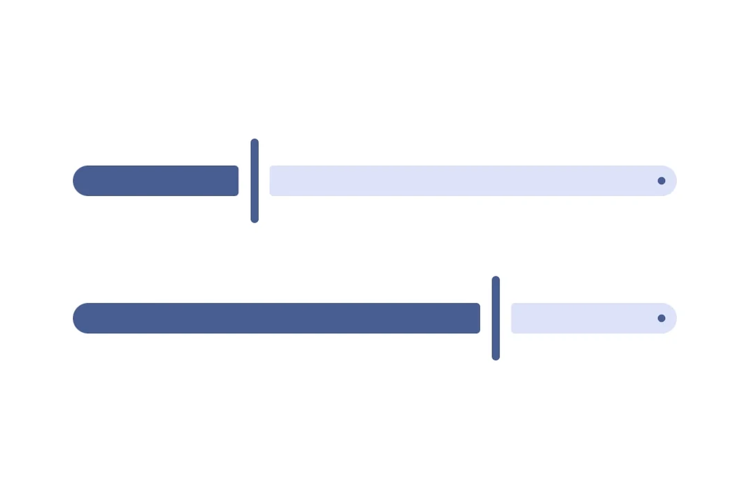
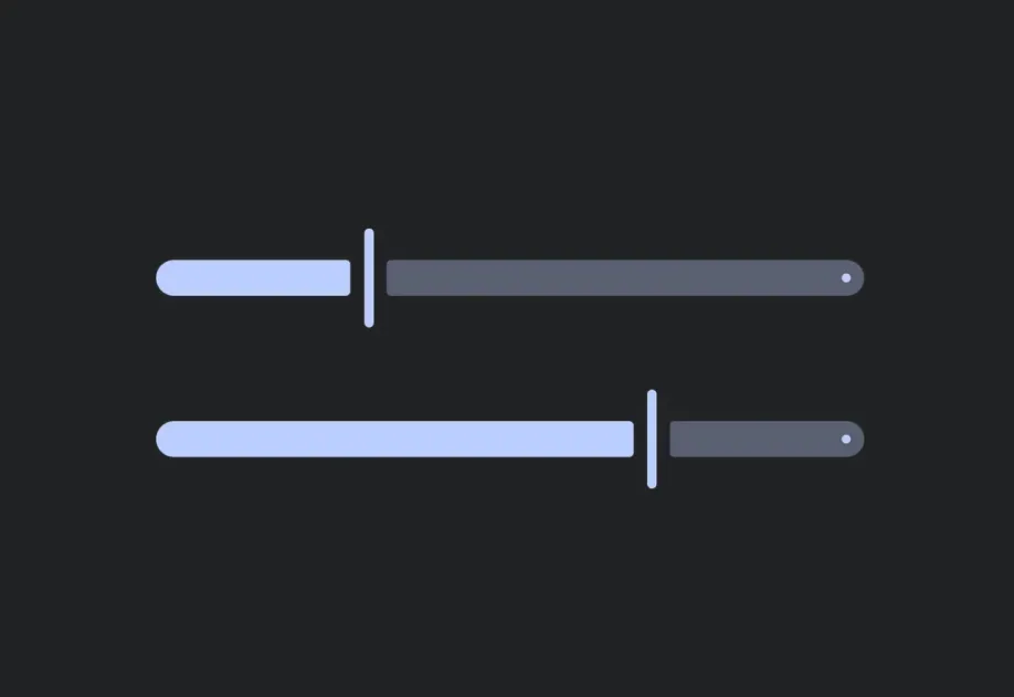
Two Material 3 sliders at different positionsTwo Material 3 sliders at different positions

安装

🌐 Installation

Terminal
- npx expo install @expo/ui
- yarn expo install @expo/ui
- pnpm expo install @expo/ui
- bun expo install @expo/ui

If you are installing this in an existing React Native app, make sure to install expo in your project.

用法

🌐 Usage

连续滑块

🌐 Continuous slider

默认范围是 [0, 1]。

🌐 The default range is [0, 1].

ContinuousSliderExample.tsx
import { useState } from 'react'; import { Host, Slider } from '@expo/ui'; export default function ContinuousSliderExample() { const [value, setValue] = useState(0.5); return ( <Host matchContents={{ vertical: true }} style={{ width: '100%' }}> <Slider value={value} onValueChange={setValue} /> </Host> ); }

具有自定义范围的分步滑块

🌐 Stepped slider with custom range

使用 min、max 和 step 来限制滑块产生的数值。

🌐 Use min, max, and step to constrain the values produced by the slider.

SteppedSliderExample.tsx
import { useState } from 'react'; import { useColorScheme } from 'react-native'; import { Host, Column, Slider, Text } from '@expo/ui'; export default function SteppedSliderExample() { const [volume, setVolume] = useState(50); const colorScheme = useColorScheme(); return ( <Host matchContents={{ vertical: true }} style={{ width: '100%' }}> <Column spacing={8}> <Text textStyle={{ color: colorScheme === 'dark' ? '#FFFFFF' : '#000000' }}> {`Volume: ${volume}`} </Text> <Slider value={volume} onValueChange={setVolume} min={0} max={100} step={10} /> </Column> </Host> ); }

应用接口

🌐 API

import { Slider } from '@expo/ui';

No API data file found, sorry!