This documentation is available as Markdown for AI agents and LLMs. See the full Markdown index or append .md to any documentation URL.

AlertDialog

用于显示原生警告对话框的 Jetpack Compose AlertDialog 组件。

Android
Included in Expo Go
Recommended version:
~58.0.15

Expo UI AlertDialog 与官方 Jetpack Compose AlertDialog API 相匹配。内容通过插槽子组件(AlertDialog.Title、AlertDialog.Text、AlertDialog.ConfirmButton、AlertDialog.DismissButton、AlertDialog.Icon)提供,这些子组件直接映射到 Compose 的插槽参数。

🌐 Expo UI AlertDialog matches the official Jetpack Compose AlertDialog API. Content is provided via slot sub-components (AlertDialog.Title, AlertDialog.Text, AlertDialog.ConfirmButton, AlertDialog.DismissButton, AlertDialog.Icon) that map directly to Compose's slot parameters.
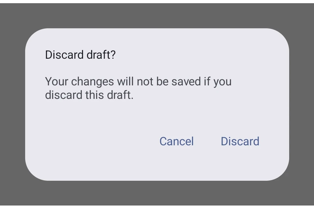
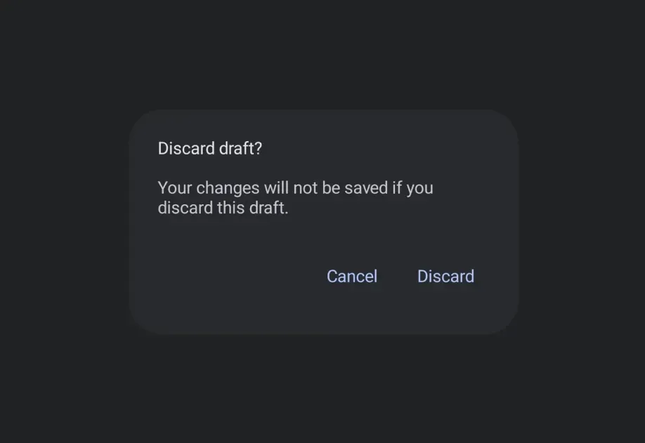
Material 3 alert dialog with title, supporting text, and Cancel/Discard buttonsMaterial 3 alert dialog with title, supporting text, and Cancel/Discard buttons

安装

🌐 Installation

Terminal
- npx expo install @expo/ui
- yarn expo install @expo/ui
- pnpm expo install @expo/ui
- bun expo install @expo/ui

If you are installing this in an existing React Native app, make sure to install expo in your project.

用法

🌐 Usage

基本警告对话框

🌐 Basic alert dialog

BasicAlertDialogExample.tsx
import { useState } from 'react'; import { Host, AlertDialog, Button, TextButton, Text, } from '@expo/ui/jetpack-compose'; export default function BasicAlertDialogExample() { const [visible, setVisible] = useState(false); return ( <Host matchContents> <Button onClick={() => setVisible(true)}> <Text>Show alert</Text> </Button> {visible && ( <AlertDialog onDismissRequest={() => setVisible(false)}> <AlertDialog.Title> <Text>Confirm action</Text> </AlertDialog.Title> <AlertDialog.Text> <Text>Are you sure you want to proceed?</Text> </AlertDialog.Text> <AlertDialog.ConfirmButton> <TextButton onClick={() => setVisible(false)}> <Text>Confirm</Text> </TextButton> </AlertDialog.ConfirmButton> <AlertDialog.DismissButton> <TextButton onClick={() => setVisible(false)}> <Text>Cancel</Text> </TextButton> </AlertDialog.DismissButton> </AlertDialog> )} </Host> ); }

自定义颜色

🌐 Custom colors

CustomColorsExample.tsx
import { useState } from 'react'; import { Host, AlertDialog, Button, TextButton, Text, } from '@expo/ui/jetpack-compose'; export default function CustomColorsExample() { const [visible, setVisible] = useState(false); return ( <Host matchContents> <Button onClick={() => setVisible(true)}> <Text>Show alert</Text> </Button> {visible && ( <AlertDialog onDismissRequest={() => setVisible(false)} colors={{ containerColor: '#1E1E2E', titleContentColor: '#CDD6F4', textContentColor: '#BAC2DE', }}> <AlertDialog.Title> <Text>Custom Dialog</Text> </AlertDialog.Title> <AlertDialog.Text> <Text>This dialog uses custom colors.</Text> </AlertDialog.Text> <AlertDialog.ConfirmButton> <TextButton onClick={() => setVisible(false)}> <Text>OK</Text> </TextButton> </AlertDialog.ConfirmButton> <AlertDialog.DismissButton> <TextButton onClick={() => setVisible(false)}> <Text>Cancel</Text> </TextButton> </AlertDialog.DismissButton> </AlertDialog> )} </Host> ); }

带图标

🌐 With icon

IconDialogExample.tsx
import { useState } from 'react'; import { Host, AlertDialog, Button, TextButton, Text, Icon, } from '@expo/ui/jetpack-compose'; export default function IconDialogExample() { const [visible, setVisible] = useState(false); return ( <Host matchContents> <Button onClick={() => setVisible(true)}> <Text>Show alert</Text> </Button> {visible && ( <AlertDialog onDismissRequest={() => setVisible(false)}> <AlertDialog.Icon> {/* Replace with your own icon asset */} <Icon source={require('./info-icon.xml')} /> </AlertDialog.Icon> <AlertDialog.Title> <Text>Dialog with Icon</Text> </AlertDialog.Title> <AlertDialog.Text> <Text>This dialog has an icon above the title.</Text> </AlertDialog.Text> <AlertDialog.ConfirmButton> <TextButton onClick={() => setVisible(false)}> <Text>OK</Text> </TextButton> </AlertDialog.ConfirmButton> </AlertDialog> )} </Host> ); }

应用接口

🌐 API

import { AlertDialog } from '@expo/ui/jetpack-compose';

No API data file found, sorry!