This documentation is available as Markdown for AI agents and LLMs. See the full Markdown index or append .md to any documentation URL.
DropdownMenu 用于显示下拉菜单的 Jetpack Compose DropdownMenu 组件。
Recommended version:
~58.0.15
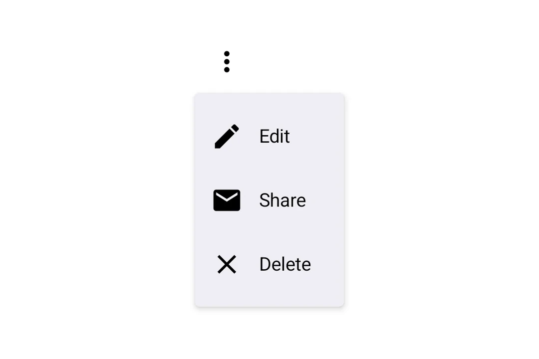
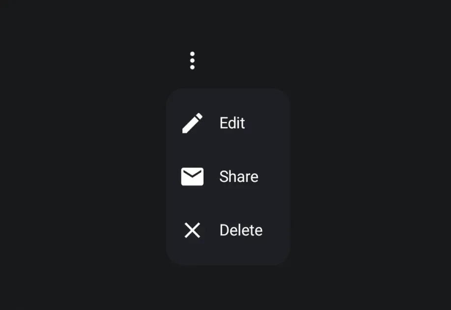
Expo UI 下拉菜单与官方 Jetpack Compose Menu API 匹配,并在触发元素被按下时显示下拉菜单。
🌐 Expo UI DropdownMenu matches the official Jetpack Compose Menu API and displays a dropdown menu when a trigger element is pressed.
安装
🌐 Installation
- npx expo install @expo/ui
- yarn expo install @expo/ui
- pnpm expo install @expo/ui
- bun expo install @expo/ui
If you are installing this in an existing React Native app , make sure to install expo in your project.
用法
🌐 Usage
基本下拉菜单
🌐 Basic dropdown menu
BasicDropdownMenuExample.tsx import {
Host ,
DropdownMenu ,
DropdownMenuItem ,
OutlinedButton ,
Text ,
Icon ,
} from '@expo/ui/jetpack-compose' ;
import { useState } from 'react' ;
const homeIcon = require ( './assets/home.xml' ) ;
export default function BasicDropdownMenuExample ( ) {
const [ isExpanded, setIsExpanded] = useState ( false ) ;
return (
< Host matchContents >
< DropdownMenu expanded = { isExpanded} onDismissRequest = { ( ) => setIsExpanded ( false ) } >
< DropdownMenu.Trigger >
< OutlinedButton onClick = { ( ) => setIsExpanded ( true ) } >
< Text > Show menu </ Text >
</ OutlinedButton >
</ DropdownMenu.Trigger >
< DropdownMenu.Items >
< DropdownMenuItem onClick = { ( ) => {
setIsExpanded ( false ) ;
console . log ( 'Home pressed' ) ;
} } >
< DropdownMenuItem.Text >
< Text > Home </ Text >
</ DropdownMenuItem.Text >
< DropdownMenuItem.LeadingIcon >
< Icon source = { homeIcon} size = { 24 } />
</ DropdownMenuItem.LeadingIcon >
</ DropdownMenuItem >
</ DropdownMenu.Items >
</ DropdownMenu >
</ Host > ) ;
}
React Native 组件作为触发器
🌐 React Native components as trigger
你可以通过将 React Native 视图(例如 Pressable)封装在 RNHostView
🌐 You can use a React Native view (such as Pressable) as the dropdown's trigger by wrapping it in RNHostView
RNTriggerDropdownMenuExample.tsx import {
Host ,
DropdownMenu ,
DropdownMenuItem ,
Text as ComposeText ,
RNHostView ,
} from '@expo/ui/jetpack-compose' ;
import { useState } from 'react' ;
import { Pressable , Text } from 'react-native' ;
export default function RNTriggerDropdownMenuExample ( ) {
const [ isExpanded, setIsExpanded] = useState ( false ) ;
return (
< Host matchContents >
< DropdownMenu expanded = { isExpanded} onDismissRequest = { ( ) => setIsExpanded ( false ) } >
< DropdownMenu.Trigger >
< RNHostView matchContents >
< Pressable onPress = { ( ) => setIsExpanded ( true ) } style = { {
alignSelf: 'flex-start' ,
paddingHorizontal: 16 ,
paddingVertical: 10 ,
borderRadius: 8 ,
backgroundColor: '#9B59B6' ,
} } >
< Text style = { { color: 'white' , fontWeight: '600' } } >
RN Pressable Trigger
</ Text >
</ Pressable >
</ RNHostView >
</ DropdownMenu.Trigger >
< DropdownMenu.Items >
< DropdownMenuItem onClick = { ( ) => setIsExpanded ( false ) } >
< DropdownMenuItem.Text >
< ComposeText > Item 1 </ ComposeText >
</ DropdownMenuItem.Text >
</ DropdownMenuItem >
< DropdownMenuItem onClick = { ( ) => setIsExpanded ( false ) } >
< DropdownMenuItem.Text >
< ComposeText > Item 2 </ ComposeText >
</ DropdownMenuItem.Text >
</ DropdownMenuItem >
</ DropdownMenu.Items >
</ DropdownMenu >
</ Host > ) ;
}
长按触发
🌐 Long-press trigger
Jetpack Compose 没有专门的长按菜单原语——你可以通过在触发视图上使用 combinedClickableDropdownMenu 来组合一个。菜单会自动锚定到触发器。
🌐 Jetpack Compose has no dedicated long-press menu primitive — you compose one from a combinedClickableDropdownMenu. The menu anchors to the trigger automatically.
LongPressDropdownMenuExample.tsx import {
Host ,
DropdownMenu ,
DropdownMenuItem ,
Text ,
} from '@expo/ui/jetpack-compose' ;
import {
background,
combinedClickable,
} from '@expo/ui/jetpack-compose/modifiers' ;
import { useState } from 'react' ;
export default function LongPressDropdownMenuExample ( ) {
const [ isExpanded, setIsExpanded] = useState ( false ) ;
return (
< Host matchContents >
< DropdownMenu expanded = { isExpanded} onDismissRequest = { ( ) => setIsExpanded ( false ) } >
< DropdownMenu.Trigger >
< Text modifiers = { [
background ( '#e0e0e0' ) ,
combinedClickable ( {
onClick : ( ) => console . log ( 'Short tap' ) ,
onLongClick : ( ) => setIsExpanded ( true ) ,
} ) ,
] } >
Long-press me
</ Text >
</ DropdownMenu.Trigger >
< DropdownMenu.Items >
< DropdownMenuItem onClick = { ( ) => setIsExpanded ( false ) } >
< DropdownMenuItem.Text >
< Text > Copy </ Text >
</ DropdownMenuItem.Text >
</ DropdownMenuItem >
< DropdownMenuItem elementColors = { { textColor: '#B3261E' } } onClick = { ( ) => setIsExpanded ( false ) } >
< DropdownMenuItem.Text >
< Text > Delete </ Text >
</ DropdownMenuItem.Text >
</ DropdownMenuItem >
</ DropdownMenu.Items >
</ DropdownMenu >
</ Host > ) ;
}
圆角
🌐 Rounded corners
使用 cornerRadius 来用自定义的圆角半径(单位 dp)覆盖默认的 Material3 菜单形状。
🌐 Use cornerRadius to override the default Material3 menu shape with a custom corner radius (in dp).
RoundedDropdownMenuExample.tsx import {
Host ,
DropdownMenu ,
DropdownMenuItem ,
OutlinedButton ,
Text ,
} from '@expo/ui/jetpack-compose' ;
import { useState } from 'react' ;
export default function RoundedDropdownMenuExample ( ) {
const [ isExpanded, setIsExpanded] = useState ( false ) ;
return (
< Host matchContents >
< DropdownMenu expanded = { isExpanded} onDismissRequest = { ( ) => setIsExpanded ( false ) } cornerRadius = { 16 } >
< DropdownMenu.Trigger >
< OutlinedButton onClick = { ( ) => setIsExpanded ( true ) } >
< Text > Show menu </ Text >
</ OutlinedButton >
</ DropdownMenu.Trigger >
< DropdownMenu.Items >
< DropdownMenuItem onClick = { ( ) => setIsExpanded ( false ) } >
< DropdownMenuItem.Text >
< Text > Item 1 </ Text >
</ DropdownMenuItem.Text >
</ DropdownMenuItem >
</ DropdownMenu.Items >
</ DropdownMenu >
</ Host > ) ;
}
阴影高度
🌐 Shadow elevation
使用 shadowElevation 来设置弹出框的阴影高度(dp)。设置为 0 可以去掉阴影,或者省略它以使用 Material 3 的默认值。DropdownMenu 上的修饰符作用于触发器容器,所以阴影修饰符不会改变弹出框的阴影。
🌐 Use shadowElevation to set the popup shadow elevation in dp. Set it to 0 to remove the shadow, or omit it to use Material 3's default. Modifiers on DropdownMenu apply to the trigger container, so shadow modifiers do not change the popup shadow.
ShadowDropdownMenuExample.tsx import {
Host ,
DropdownMenu ,
DropdownMenuItem ,
OutlinedButton ,
Text ,
} from '@expo/ui/jetpack-compose' ;
import { useState } from 'react' ;
export default function ShadowDropdownMenuExample ( ) {
const [ isExpanded, setIsExpanded] = useState ( false ) ;
return (
< Host matchContents >
< DropdownMenu expanded = { isExpanded} onDismissRequest = { ( ) => setIsExpanded ( false ) } shadowElevation = { 1 } >
< DropdownMenu.Trigger >
< OutlinedButton onClick = { ( ) => setIsExpanded ( true ) } >
< Text > Show menu </ Text >
</ OutlinedButton >
</ DropdownMenu.Trigger >
< DropdownMenu.Items >
< DropdownMenuItem onClick = { ( ) => setIsExpanded ( false ) } >
< DropdownMenuItem.Text >
< Text > Item 1 </ Text >
</ DropdownMenuItem.Text >
</ DropdownMenuItem >
</ DropdownMenu.Items >
</ DropdownMenu >
</ Host > ) ;
}
应用接口
🌐 API
import { DropdownMenu } from '@expo/ui/jetpack-compose' ;
No API data file found, sorry!