This documentation is available as Markdown for AI agents and LLMs. See the full Markdown index or append .md to any documentation URL.
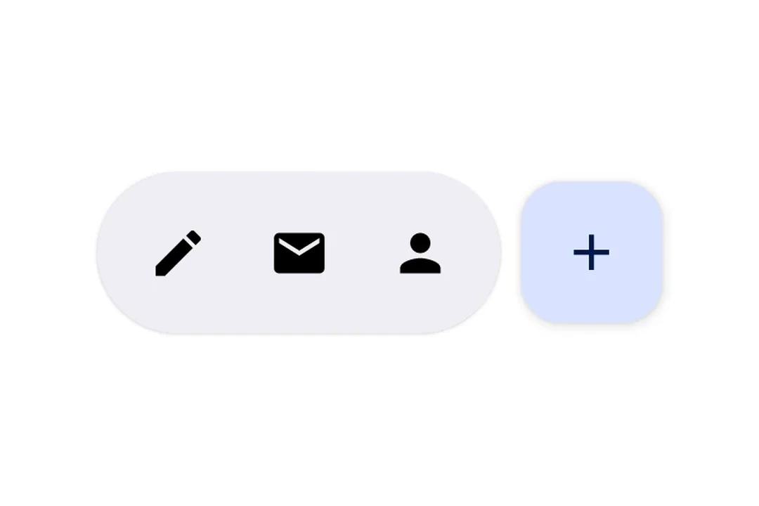
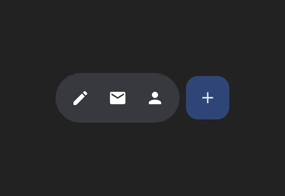
HorizontalFloatingToolbar 一个用于显示浮动操作栏的 Jetpack Compose HorizontalFloatingToolbar 组件。
Recommended version:
~58.0.15
Expo UI HorizontalFloatingToolbar 封装了官方 Jetpack Compose HorizontalFloatingToolbar
🌐 Expo UI HorizontalFloatingToolbar wraps the official Jetpack Compose HorizontalFloatingToolbar
注意: 如果你只需要一个浮动按钮,请使用 FloatingActionButton
安装
🌐 Installation
- npx expo install @expo/ui
- yarn expo install @expo/ui
- pnpm expo install @expo/ui
- bun expo install @expo/ui
If you are installing this in an existing React Native app , make sure to install expo in your project.
用法
🌐 Usage
可滚动内容上的浮动工具栏
🌐 Floating toolbar over scrollable content
将工具栏放置在带有 floatingToolbarExitAlwaysScrollBehavior 的 Box 中以实现滚动驱动的隐藏/显示行为。使用 align('bottomCenter') 将工具栏定位在屏幕底部。整个布局保持在 Compose 层内 — 无需 React Native 的绝对定位。
🌐 Place the toolbar inside a Box with floatingToolbarExitAlwaysScrollBehavior to get scroll-driven hide/show behavior. Use align('bottomCenter') to position the toolbar at the bottom of the screen. The entire layout stays within the Compose layer — no React Native absolute positioning needed.
FloatingToolbarExample.tsx import {
Box ,
HorizontalFloatingToolbar ,
Host ,
Icon ,
IconButton ,
LazyColumn ,
ListItem ,
Text ,
} from '@expo/ui/jetpack-compose' ;
import {
align,
fillMaxSize,
offset,
} from '@expo/ui/jetpack-compose/modifiers' ;
const ITEMS = Array . from (
{ length: 20 } ,
( _, index) => ` Item ${ index + 1 } ` ) ;
export default function FloatingToolbarExample ( ) {
return (
< Host style = { { flex: 1 } } >
< Box modifiers = { [ fillMaxSize ( ) ] } floatingToolbarExitAlwaysScrollBehavior = " bottom" >
< LazyColumn modifiers = { [ fillMaxSize ( ) ] } >
{ ITEMS . map ( item => (
< ListItem key = { item} >
< ListItem.HeadlineContent >
< Text > { item} </ Text >
</ ListItem.HeadlineContent >
</ ListItem > ) ) }
</ LazyColumn >
< HorizontalFloatingToolbar variant = " vibrant" modifiers = { [ align ( 'bottomCenter' ) , offset ( 0 , - 16 ) ] } >
< IconButton onClick = { ( ) => console . log ( 'Edit pressed' ) } >
< Icon source = { require ( './assets/edit.xml' ) } />
</ IconButton >
< HorizontalFloatingToolbar.FloatingActionButton onPress = { ( ) => console . log ( 'Add pressed' ) } >
< Icon source = { require ( './assets/add.xml' ) } />
</ HorizontalFloatingToolbar.FloatingActionButton >
</ HorizontalFloatingToolbar >
</ Box >
</ Host > ) ;
}
带浮动操作按钮的工具栏
🌐 Toolbar with FloatingActionButton
将 IconButton 用作工具栏项目的直接子元素,将 HorizontalFloatingToolbar.FloatingActionButton 用于主要操作。
🌐 Use IconButton as direct children for toolbar items, and HorizontalFloatingToolbar.FloatingActionButton for the primary action.
ToolbarWithFABExample.tsx import {
Host ,
HorizontalFloatingToolbar ,
IconButton ,
Icon ,
} from '@expo/ui/jetpack-compose' ;
export default function ToolbarWithFABExample ( ) {
return (
< Host matchContents >
< HorizontalFloatingToolbar >
< IconButton onClick = { ( ) => console . log ( 'Edit pressed' ) } >
< Icon source = { require ( './assets/edit.xml' ) } contentDescription = " Edit" />
</ IconButton >
< IconButton onClick = { ( ) => console . log ( 'Share pressed' ) } >
< Icon source = { require ( './assets/share.xml' ) } contentDescription = " Share" />
</ IconButton >
< HorizontalFloatingToolbar.FloatingActionButton onPress = { ( ) => console . log ( 'Add pressed' ) } >
< Icon source = { require ( './assets/add.xml' ) } contentDescription = " Add" />
</ HorizontalFloatingToolbar.FloatingActionButton >
</ HorizontalFloatingToolbar >
</ Host > ) ;
}
应用接口
🌐 API
import { HorizontalFloatingToolbar } from '@expo/ui/jetpack-compose' ;
No API data file found, sorry!