Expo Router 中的导航布局
了解如何使用目录和布局文件构建页面之间的不同关系。
什么是布局文件,如何在屏幕之间导航,以及如何使用重定向阻止访问。
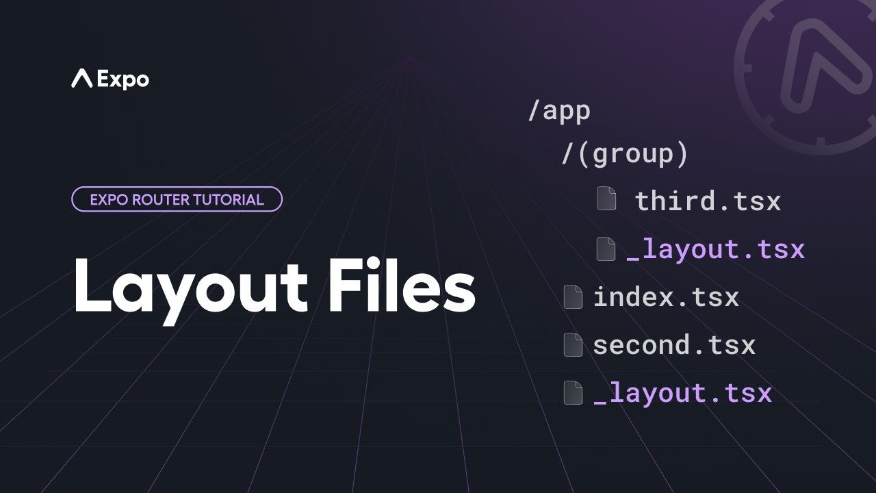
在 src/app 目录下的每个目录(包括 src/app 本身)都可以在该目录下通过 _layout.tsx 文件定义布局。该文件定义了该目录内所有页面的排列方式。你可以在这里为该目录中的页面定义堆栈导航器、标签导航器、抽屉导航器,或者其他你想使用的布局。布局文件导出一个默认组件,该组件会在你导航到该目录中的任意页面之前渲染。
🌐 Each directory within the src/app directory (including src/app itself) can define a layout in the form of a _layout.tsx file inside that directory. This file defines how all the pages within that directory are arranged. This is where you would define a stack navigator, tab navigator, drawer navigator, or any other layout that you want to use for the pages in that directory. The layout file exports a default component that is rendered before whatever page you are navigating to within that directory.
让我们看一些常见的布局场景。
🌐 Let's look at a few common layout scenarios.
根布局
🌐 Root layout
几乎每个应用的 src/app 目录下都会直接包含一个 _layout.tsx 文件。这是根布局,代表你的导航入口。除了描述应用的顶层导航器之外,这个文件也是你放置初始化代码的地方,这些代码以前可能放在 App.jsx 文件中,例如加载字体、与启动屏幕交互或添加上下文提供者。
🌐 Virtually every app will have a _layout.tsx file directly inside the src/app directory. This is the root layout and represents the entry point for your navigation. In addition to describing the top-level navigator for your app, this file is where you would put initialization code that may have previously gone inside an App.jsx file, such as loading fonts, interacting with the splash screen, or adding context providers.
以下是根布局示例:
🌐 Here's an example root layout:
import { useFonts } from 'expo-font';
import { Stack } from 'expo-router';
import * as SplashScreen from 'expo-splash-screen';
import { useEffect } from 'react';

SplashScreen.preventAutoHideAsync();

export default function RootLayout() {
  const [loaded] = useFonts({
    SpaceMono: require('@/assets/fonts/SpaceMono-Regular.ttf'),
  });

  useEffect(() => {
    if (loaded) {
      SplashScreen.hide();
    }
  }, [loaded]);

  if (!loaded) {
    return null;
  }

  return <Stack />;
}
以上示例最初显示启动画面,然后在字体加载完成后渲染堆栈导航器,这将使你的应用继续执行初始路由。
🌐 The above example shows the splash screen initially and then renders a stack navigator once the fonts are loaded, which will cause your app to proceed to the initial route.
堆栈
🌐 Stacks
你可以在你的根布局中实现一个堆栈导航器,如上所示,或在目录中的任何其他布局文件中实现。假设你有一个目录结构,其中包含一个堆栈:
🌐 You can implement a stack navigator in your root layout, as shown above, or in any other layout file inside a directory. Let's suppose you have a file structure with a stack inside of a directory:
srcappproducts_layout.tsxindex.tsx[productId].tsxaccessoriesindex.tsx如果你希望 src/app/products 目录中的所有内容以堆叠关系排列,请在 _layout.tsx 文件中返回一个 Stack 组件:
🌐 If you want everything inside the src/app/products directory to be arranged in a stack relationship, inside the _layout.tsx file, return a Stack component:
import { Stack } from 'expo-router';

export default function StackLayout() {
  return <Stack />;
}
当你导航到 /products 时,它会首先进入默认路由,即 products/index.tsx。如果你导航到 /products/123,那么该页面将被压入堆栈。默认情况下,堆栈会在头部渲染一个返回按钮,点击该按钮会将当前页面从堆栈中弹出,让用户返回到上一页。即使一个页面不可见,只要它仍然被压入堆栈,它仍然会被渲染。
🌐 When you navigate to /products, it will first go to the default route, which is products/index.tsx. If you navigate to /products/123, then that page will be pushed onto the stack. By default, the stack will render a back button in the header that will pop the current page off the stack, returning the user to the previous page. Even when a page isn't visible, if it is still pushed onto the stack, it is still being rendered.
Stack 组件实现了 React Navigation 的原生堆栈,并且可以使用相同的屏幕选项。然而,你不必在导航器内具体定义页面。目录中的文件将自动被视为堆栈中的有效路由。不过,如果你想定义屏幕选项,可以在 Stack 组件内添加 Stack.Screen 组件。name 属性应与路由名称匹配,但你不需要提供 component 属性;Expo Router 会自动进行映射:
🌐 The Stack component implements React Navigation's native stack and can use the same screen options. However, you do not have to define the pages specifically inside the navigator. The files inside the directory will be automatically treated as eligible routes in the stack. However, if you want to define screen options, you can add a Stack.Screen component inside the Stack component. The name prop should match the route name, but you do not need to supply a component prop; Expo Router will map this automatically:
import { Stack } from 'expo-router';

export default function StackLayout() {
  return (
    <Stack>
      <Stack.Screen name="[productId]" options={{ headerShown: false }} />
    </Stack>
  );
}
虽然可以嵌套导航器,但请确保只在真正需要时才这样做。在上述示例中,如果你想将 products/accessories/index.tsx 推入堆栈中,并不需要在 accessories 目录下额外创建一个带有 Stack 导航器的 _layout.tsx。那样会在第一个堆栈中定义另一个堆栈。添加仅影响 URL 的目录是可以的,否则请使用与父目录相同的导航器。
🌐 While it is possible to nest navigators, be sure to only do so when it is truly needed. In the above example, if you want to push products/accessories/index.tsx onto the stack, it's not necessary to have an additional _layout.tsx in the accessories directory with a Stack navigator. That would define another stack inside the first one. It is fine to add directories that only affect the URL, otherwise, use the same navigator as the parent directory.
选项卡
🌐 Tabs
Expo Router 提供了多种方式来实现标签导航,具体取决于你的需求。
🌐 Expo Router provides multiple ways to implement tab navigation depending on your needs.
JavaScript 标签页
🌐 JavaScript tabs
你可以在布局文件中使用 Tabs 组件实现基于 JavaScript 的标签导航器。该目录下的所有直接路由都将被视为标签。考虑以下文件结构:
🌐 You can implement a JavaScript-based tab navigator in a layout file using the Tabs component. All the routes directly inside that directory will be treated as tabs. Consider the following file structure:
srcapp(tabs)_layout.tsxindex.tsxfeed.tsxprofile.tsx在 _layout.tsx 文件中,返回一个 Tabs 组件:
🌐 In the _layout.tsx file, return a Tabs component:
import { Tabs } from 'expo-router';
import MaterialIcons from '@expo/vector-icons/MaterialIcons';

export default function TabLayout() {
  return (
    <Tabs>
      <Tabs.Screen
        name="index"
        options={{
          title: 'Home',
          tabBarIcon: ({ color }) => <MaterialIcons size={28} name="house.fill" color={color} />,
        }}
      />
      <Tabs.Screen name="feed" options={{ title: 'Feed' }} />
      <Tabs.Screen name="profile" options={{ title: 'Profile' }} />
    </Tabs>
  );
}
这将导致 index.tsx、feed.tsx 和 profile.tsx 文件一起出现在同一个底部标签导航中。这个 Tabs 组件使用了 React Navigation 的原生底部标签 并支持相同的选项。
🌐 This will cause the index.tsx, feed.tsx, and profile.tsx files to appear together in the same bottom tabs navigator. This Tabs component uses React Navigation's native bottom tabs and supports the same options.
在 Tabs 的情况下,你可能需要在导航器中定义标签页,因为这会影响标签页的显示顺序、标题以及标签页内的图标。索引路由将是默认选中的标签页。
🌐 In the case of Tabs, you will likely want to define the tabs in the navigator, as this influences the order in which tabs appear, the title, and the icon inside the tab. The index route will be the default selected tab.
原生标签页
🌐 Native tabs
在 Android 和 iOS 上,你可以使用 原生标签 来渲染平台内置的标签栏。原生标签提供预期的平台行为,例如点击滚动到顶部、原生动画和原生外观与体验。
🌐 On Android and iOS, you can use native tabs to render the platform's built-in tab bar. Native tabs provide expected platform behaviors like scroll-to-top on tap, native animations, and a native look and feel.
像 JavaScript 标签页一样,本地标签页可以在路由组目录中的布局文件中使用:
🌐 Like JavaScript tabs, native tabs can be used in a layout file inside a route group directory:
srcapp(tabs)_layout.tsxindex.tsxfeed.tsxprofile.tsximport { NativeTabs } from 'expo-router/unstable-native-tabs'; export default function TabLayout() { return ( <NativeTabs> <NativeTabs.Trigger name="index"> <NativeTabs.Trigger.Label>Home</NativeTabs.Trigger.Label> <NativeTabs.Trigger.Icon src={require('@/assets/images/tabIcons/home.png')} /> </NativeTabs.Trigger> <NativeTabs.Trigger name="feed"> <NativeTabs.Trigger.Label>Feed</NativeTabs.Trigger.Label> <NativeTabs.Trigger.Icon src={require('@/assets/images/tabIcons/feed.png')} /> </NativeTabs.Trigger> <NativeTabs.Trigger name="profile"> <NativeTabs.Trigger.Label>Profile</NativeTabs.Trigger.Label> <NativeTabs.Trigger.Icon src={require('@/assets/images/tabIcons/profile.png')} /> </NativeTabs.Trigger> </NativeTabs> ); }
特定平台标签
🌐 Platform-specific tabs
由于原生标签页仅在 Android 和 iOS 上可用,一个常见的模式是使用平台特定的文件扩展名为原生和网页提供不同的标签页实现。根布局渲染一个标签页组件,而 Expo 的模块解析会根据平台自动选择正确的文件。
🌐 Since native tabs are only available on Android and iOS, a common pattern is to use platform-specific file extensions to provide different tab implementations for native and web. The root layout renders a tab component, and Expo's module resolution automatically picks the correct file based on the platform.
srcapp_layout.tsxindex.tsxexplore.tsxcomponentsapp-tabs.native.tsxNative tabs (Android and iOS)app-tabs.tsxCustom tabs (web)根布局导入并渲染 AppTabs 组件。app-tabs.native.tsx 在 Android 和 iOS 上使用,app-tabs.tsx 在网页上使用:
🌐 The root layout imports and renders the AppTabs component. app-tabs.native.tsx is used on Android and iOS, and app-tabs.tsx on web:
import AppTabs from '@/components/app-tabs';

export default function RootLayout() {
  return <AppTabs />;
}
在 Android 和 iOS 上,app-tabs.native.tsx 使用 原生标签:
🌐 On Android and iOS, app-tabs.native.tsx uses native tabs:
import { NativeTabs } from 'expo-router/native-tabs';

export default function AppTabs() {
  return (
    <NativeTabs>
      <NativeTabs.Trigger name="index">
        <NativeTabs.Trigger.Label>Home</NativeTabs.Trigger.Label>
        <NativeTabs.Trigger.Icon src={require('@/assets/images/tabIcons/home.png')} />
      </NativeTabs.Trigger>
      <NativeTabs.Trigger name="explore">
        <NativeTabs.Trigger.Label>Explore</NativeTabs.Trigger.Label>
        <NativeTabs.Trigger.Icon src={require('@/assets/images/tabIcons/explore.png')} />
      </NativeTabs.Trigger>
    </NativeTabs>
  );
}
在网页上,app-tabs.tsx 使用来自 expo-router/ui 的 自定义标签页,这些是无样式且灵活的组件:
🌐 On web, app-tabs.tsx uses custom tabs from expo-router/ui, which are unstyled and flexible components:
import { Tabs, TabList, TabTrigger, TabSlot } from 'expo-router/ui';

export default function AppTabs() {
  return (
    <Tabs>
      <TabSlot />
      <TabList>
        <TabTrigger name="index" href="/">
          Home
        </TabTrigger>
        <TabTrigger name="explore" href="/explore">
          Explore
        </TabTrigger>
      </TabList>
    </Tabs>
  );
}
插槽
🌐 Slot
在某些情况下,你可能希望使用没有导航器的布局。这对于在当前路由周围添加页头或页脚,或者在目录内的任意路由上显示模态框非常有用。在这种情况下,你可以使用 Slot 组件,它作为当前子路由的占位符。
🌐 In some cases, you may want a layout without a navigator. This is helpful for adding a header or footer around the current route, or for displaying a modal over any route inside a directory. In this case, you can use the Slot component, which serves as a placeholder for the current child route.
考虑以下文件结构:
🌐 Consider the following file structure:
srcappsocial_layout.tsxindex.tsxfeed.tsxprofile.tsx例如,你可能希望将 social 目录中的任何路由封装在页头和页脚中,但希望在页面之间导航时只是替换当前页面,而不是将新页面推入堆栈,然后可以通过“返回”导航操作将其弹出。在 _layout.tsx 文件中,返回一个被页头和页脚包围的 Slot 组件:
🌐 For example, you may want to wrap any route inside the social directory with a header and footer, but you want navigating between the pages to simply replace the current page rather than pushing new pages onto a stack, which can then later be popped off with a "back" navigation action. In the _layout.tsx file, return a Slot component surrounded by your header and footer:
import { Slot } from 'expo-router';

export default function Layout() {
  return (
    <>
      <Header />
      <Slot />
      <Footer />
    </>
  );
}
其他布局
🌐 Other layouts
这些只是一些常见布局的例子,让你了解它是如何工作的。关于布局,你可以做的还有很多:
🌐 These are just a few examples of common layouts to give you an idea of how it works. There's much more you can do with layout:
- 实现一个抽屉导航器
- 在 Android 和 iOS 上使用 本地标签页 以获得平台原生的标签栏
- 将默认标签替换为完全自定义标签
- 使用模态窗口显示带透明度的页面,以便父导航器仍然可以在下面看到
- 适配任何与 React Navigation 兼容的导航器,包括顶部标签页、底部弹出层等