This documentation is available as Markdown for AI agents and LLMs. See the full Markdown index or append .md to any documentation URL.
Jetpack 组合 用于使用 @expo/ui 构建原生 Android 界面的 Jetpack Compose 组件。
Recommended version:
~57.0.22
@expo/ui/jetpack-compose中的Jetpack Compose组件允许你使用Jetpack Compose从React Native构建完全原生的Android界面。
🌐 The Jetpack Compose components in @expo/ui/jetpack-compose allow you to build fully native Android interfaces using Jetpack Compose from React Native.
安装
🌐 Installation
- npx expo install @expo/ui
- yarn expo install @expo/ui
- pnpm expo install @expo/ui
- bun expo install @expo/ui
If you are installing this in an existing React Native app , make sure to install expo in your project.
用法
🌐 Usage
使用 @expo/ui/jetpack-compose 的组件需要将其封装在 HostHost 是 Jetpack Compose 视图的容器。
🌐 Using a component from @expo/ui/jetpack-compose requires wrapping it in a HostHost is a container for Jetpack Compose views.
import { Host , Button } from '@expo/ui/jetpack-compose' ;
export function SaveButton ( ) {
return (
< Host matchContents >
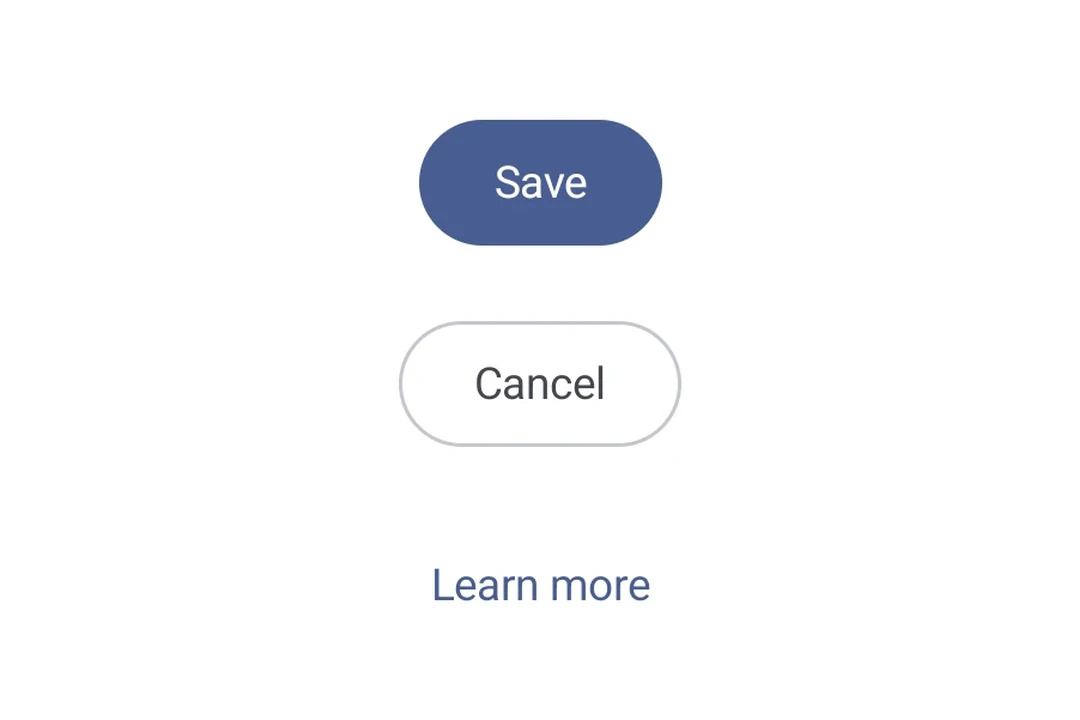
< Button onClick = { ( ) => alert ( 'Saved!' ) } > Save changes </ Button >
</ Host > ) ;
}
使用 Jetpack Compose 扩展 创建自定义的 Jetpack Compose 组件和修改器,并与 Expo UI 集成。
可用组件
🌐 Available components
示例
🌐 Examples
修饰符
🌐 Modifiers
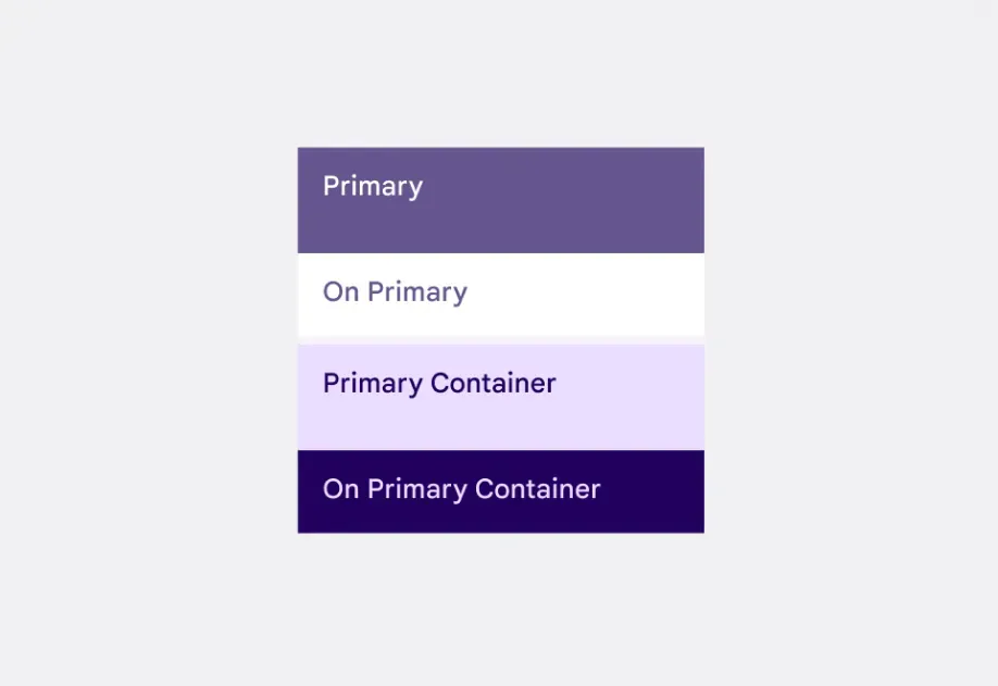
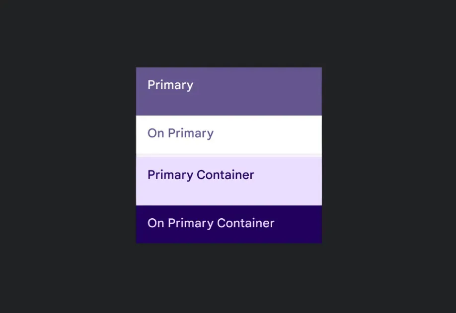
修饰符通过 modifiers 属性按数组顺序应用。把 background 放在 paddingAll 前面,这样内边距就在背景内部,而不是外部。
🌐 Modifiers are applied with the modifiers prop, in array order. Put background before paddingAll so the padding sits inside the background rather than outside it.
ComposeModifiersExample.tsx import { Column , Host , Text } from '@expo/ui/jetpack-compose' ;
import {
background,
border,
fillMaxWidth,
paddingAll,
shadow,
} from '@expo/ui/jetpack-compose/modifiers' ;
export default function ComposeModifiersExample ( ) {
return (
< Host style = { { flex: 1 } } >
< Column verticalArrangement = { { spacedBy: 16 } } modifiers = { [ paddingAll ( 16 ) ] } >
< Text color = " #FFFFFF" modifiers = { [
fillMaxWidth ( ) ,
shadow ( 4 ) ,
background ( '#6750A4' ) ,
paddingAll ( 16 ) ,
] } >
Background, shadow and padding
</ Text >
< Text color = " #1D192B" modifiers = { [
fillMaxWidth ( ) ,
background ( '#E8DEF8' ) ,
border ( 2 , '#6750A4' ) ,
paddingAll ( 16 ) ,
] } >
Background, border and padding
</ Text >
</ Column >
</ Host > ) ;
}
设置界面
🌐 Settings screen
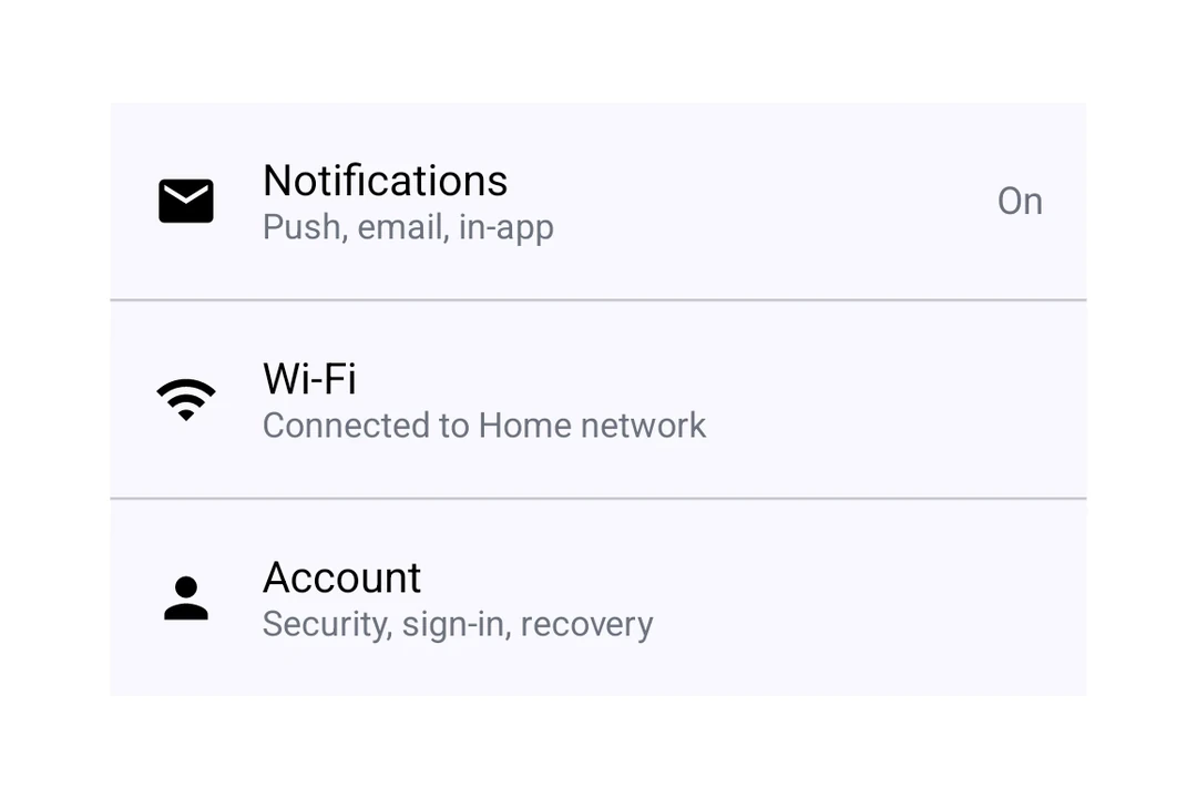
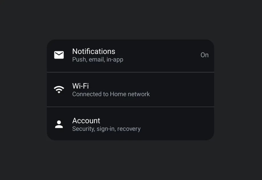
将 ListItem 插槽与 Switch 和 Icon 结合起来,构建一个 Material 3 设置屏幕。
🌐 Combine ListItem slots with a Switch and an Icon to build a Material 3 settings screen.
ComposeSettingsScreenExample.tsx import {
Column ,
Host ,
Icon ,
ListItem ,
Switch ,
Text ,
useMaterialColors,
} from '@expo/ui/jetpack-compose' ;
import ChevronRight from '@expo/material-symbols/chevron_right.xml' ;
import Flight from '@expo/material-symbols/flight.xml' ;
import Wifi from '@expo/material-symbols/wifi.xml' ;
import { useState } from 'react' ;
export default function ComposeSettingsScreenExample ( ) {
const [ airplaneMode, setAirplaneMode] = useState ( true ) ;
const colors = useMaterialColors ( ) ;
return (
< Host style = { { flex: 1 } } >
< Column >
< ListItem >
< ListItem.LeadingContent >
< Icon source = { Flight } tint = { colors. onSurfaceVariant } contentDescription = " Airplane mode" />
</ ListItem.LeadingContent >
< ListItem.HeadlineContent >
< Text > Airplane mode </ Text >
</ ListItem.HeadlineContent >
< ListItem.TrailingContent >
< Switch value = { airplaneMode} onCheckedChange = { setAirplaneMode} />
</ ListItem.TrailingContent >
</ ListItem >
< ListItem >
< ListItem.LeadingContent >
< Icon source = { Wifi } tint = { colors. onSurfaceVariant } contentDescription = " Wi-Fi" />
</ ListItem.LeadingContent >
< ListItem.HeadlineContent >
< Text > Wi-Fi </ Text >
</ ListItem.HeadlineContent >
< ListItem.SupportingContent >
< Text > Expo Guest </ Text >
</ ListItem.SupportingContent >
< ListItem.TrailingContent >
< Icon source = { ChevronRight } tint = { colors. onSurfaceVariant } contentDescription = " Open" />
</ ListItem.TrailingContent >
</ ListItem >
</ Column >
</ Host > ) ;
}
亮度行
🌐 Brightness row
亮度或音量控制的常见模式是用图标夹住 Slider。给 Slider 一个 weight 修饰符,这样它就可以占用图标留下的剩余空间。
🌐 A common pattern for brightness or volume controls is to flank a Slider with icons. Give the Slider a weight modifier so it takes the space left over by the icons.
ComposeBrightnessRowExample.tsx import {
Host ,
Icon ,
Row ,
Slider ,
useMaterialColors,
} from '@expo/ui/jetpack-compose' ;
import {
paddingAll,
weight,
} from '@expo/ui/jetpack-compose/modifiers' ;
import BacklightHigh from '@expo/material-symbols/backlight_high.xml' ;
import BacklightLow from '@expo/material-symbols/backlight_low.xml' ;
import { useState } from 'react' ;
export default function ComposeBrightnessRowExample ( ) {
const [ brightness, setBrightness] = useState ( 0.5 ) ;
const colors = useMaterialColors ( ) ;
return (
< Host style = { { flex: 1 } } >
< Row verticalAlignment = " center" horizontalArrangement = { { spacedBy: 12 } } modifiers = { [ paddingAll ( 16 ) ] } >
< Icon source = { BacklightLow } tint = { colors. onSurfaceVariant } contentDescription = " Dimmer" />
< Slider value = { brightness} onValueChange = { setBrightness} modifiers = { [ weight ( 1 ) ] } />
< Icon source = { BacklightHigh } tint = { colors. onSurfaceVariant } contentDescription = " Brighter" />
</ Row >
</ Host > ) ;
}
次要文本
🌐 Secondary text
第二行使用 ListItem.SupportingContent,而跟随明暗主题的文字颜色使用 useMaterialColors。
🌐 Use ListItem.SupportingContent for the second line, and useMaterialColors for a text color that follows the light and dark themes.
ComposeSecondaryTextExample.tsx import {
Column ,
Host ,
ListItem ,
Text ,
useMaterialColors,
} from '@expo/ui/jetpack-compose' ;
export default function ComposeSecondaryTextExample ( ) {
const colors = useMaterialColors ( ) ;
return (
< Host style = { { flex: 1 } } >
< Column >
< ListItem >
< ListItem.HeadlineContent >
< Text > Chrome </ Text >
</ ListItem.HeadlineContent >
< ListItem.SupportingContent >
< Text color = { colors. onSurfaceVariant } >
Last used: Today
</ Text >
</ ListItem.SupportingContent >
< ListItem.TrailingContent >
< Text color = { colors. onSurfaceVariant } > 1.57 GB </ Text >
</ ListItem.TrailingContent >
</ ListItem >
</ Column >
</ Host > ) ;
}