This documentation is available as Markdown for AI agents and LLMs. See the full Markdown index or append .md to any documentation URL.
This is documentation for the next SDK version. For up-to-date documentation, see the latest version (SDK 57).
ExposedDropdownMenuBox
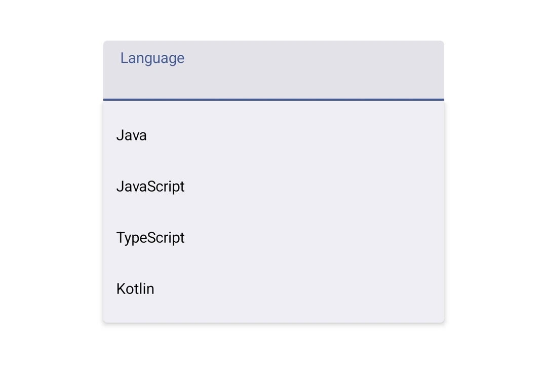
A Jetpack Compose ExposedDropdownMenuBox component for displaying a dropdown menu with a customizable anchor.
For a cross-platform picker, seePicker— built on top ofExposedDropdownMenuBoxon Android.
Expo UI ExposedDropdownMenuBox matches the official Jetpack Compose ExposedDropdownMenuBox. Use the menuAnchor() modifier on the anchor content (typically a read-only TextField) and ExposedDropdownMenu to wrap DropdownMenuItem children.
Installation
- npx expo install @expo/uiIf you are installing this in an existing React Native app, make sure to install expo in your project.
Usage
Basic
The anchor is a read-only
TextFieldbound to auseNativeStateobservable. Update that observable in each item'sonClickto reflect the selected value.
import {
  DropdownMenuItem,
  ExposedDropdownMenuBox,
  ExposedDropdownMenu,
  Host,
  Text,
  TextField,
  useNativeState,
} from '@expo/ui/jetpack-compose';
import { menuAnchor } from '@expo/ui/jetpack-compose/modifiers';
import { useState } from 'react';

const LANGUAGES = [
  { label: 'Java', value: 'java' },
  { label: 'JavaScript', value: 'js' },
  { label: 'TypeScript', value: 'ts' },
];

export default function BasicExposedDropdownMenuBoxExample() {
  const selectedLabel = useNativeState('Java');
  const [expanded, setExpanded] = useState(false);

  return (
    <Host matchContents>
      <ExposedDropdownMenuBox expanded={expanded} onExpandedChange={setExpanded}>
        <TextField value={selectedLabel} readOnly modifiers={[menuAnchor()]} />
        <ExposedDropdownMenu expanded={expanded} onDismissRequest={() => setExpanded(false)}>
          {LANGUAGES.map(lang => (
            <DropdownMenuItem
              key={lang.value}
              onClick={() => {
                selectedLabel.value = lang.label;
                setExpanded(false);
              }}>
              <DropdownMenuItem.Text>
                <Text>{lang.label}</Text>
              </DropdownMenuItem.Text>
            </DropdownMenuItem>
          ))}
        </ExposedDropdownMenu>
      </ExposedDropdownMenuBox>
    </Host>
  );
}
API
import { ExposedDropdownMenuBox } from '@expo/ui/jetpack-compose';
Components
Type: React.Element<ExposedDropdownMenuProps>
A Material 3 ExposedDropdownMenu that displays menu items in a dropdown.
Must be used inside an ExposedDropdownMenuBox.
Props for the ExposedDropdownMenu component.
Type: React.Element<ExposedDropdownMenuBoxProps>
A Material 3 ExposedDropdownMenuBox.
Use the menuAnchor() modifier on the anchor content (e.g. a TextField or Text).
Use ExposedDropdownMenu to wrap DropdownMenuItem children.
Example
<ExposedDropdownMenuBox expanded={expanded} onExpandedChange={setExpanded}>
  <TextField modifiers={[menuAnchor()]} defaultValue={value} readOnly />
  <ExposedDropdownMenu expanded={expanded} onDismissRequest={() => setExpanded(false)}>
    <DropdownMenuItem onClick={() => { setSelected('a'); setExpanded(false); }}>
      <DropdownMenuItem.Text><Text>Option A</Text></DropdownMenuItem.Text>
    </DropdownMenuItem>
  </ExposedDropdownMenu>
</ExposedDropdownMenuBox>
ReactNodeChildren — should contain an anchor element with the menuAnchor() modifier
and an ExposedDropdownMenu with DropdownMenuItem children.