This documentation is available as Markdown for AI agents and LLMs. See the full Markdown index or append .md to any documentation URL.
This is documentation for the next SDK version. For up-to-date documentation, see the latest version (SDK 57).
Picker
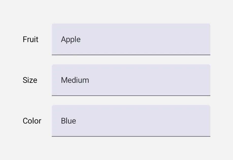
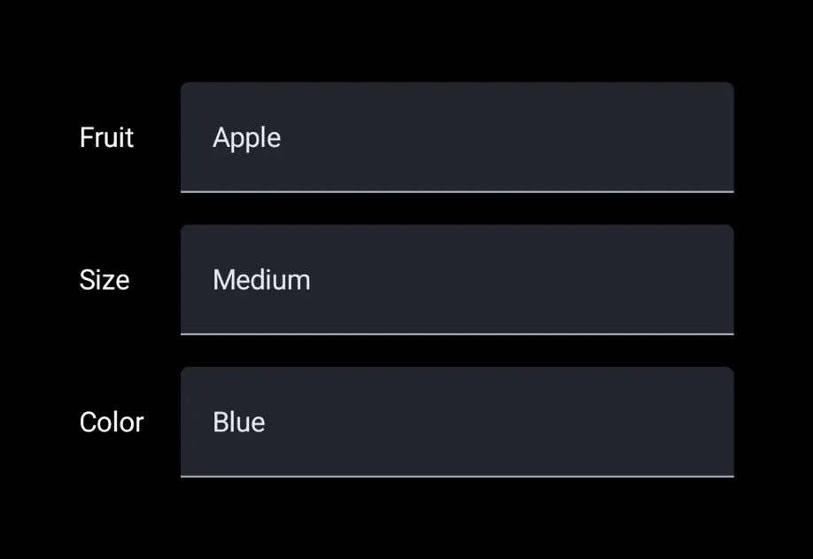
A single-selection input with menu and wheel appearances.
Picker is a single-selection input. You can use <Picker.Item label value /> children to declare options so that the parent Picker reads them and renders a platform-appropriate dropdown or rotor.
The universal Picker is independent of @expo/ui/community/picker, which remains a compat shim for @react-native-picker/picker. Prefer this universal Picker for new code unless you specifically need the RN-Picker API surface.
Installation
If you are installing this in an existing React Native app, make sure to install expo in your project.
Usage
Menu appearance (default)
Wheel appearance
appearance="wheel" renders an inline scrollable rotor on iOS. On Android and web, this falls back to the platform's default dropdown (Material 3 doesn't ship a wheel-style picker).
API
import { Picker } from '@expo/ui';
No API data file found, sorry!