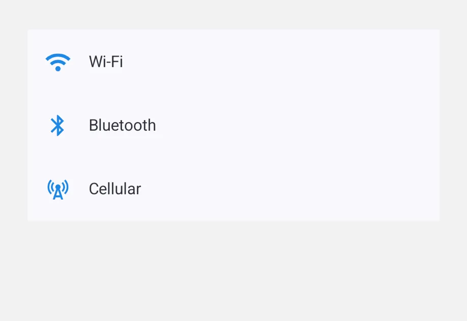
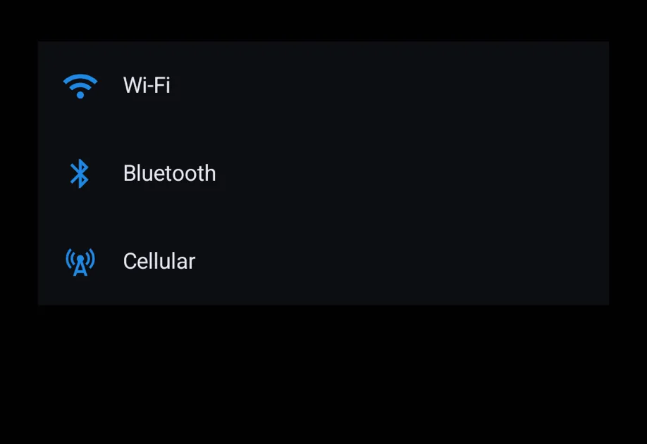
🌐 For full control over slot content, use the compound API: <ListItem.Leading>, <ListItem.Trailing>, and <ListItem.Supporting>. Anything not wrapped in a slot becomes the headline.
Optional pull-to-refresh handler.
When provided, the list shows the platform-native refresh affordance.
The returned promise drives the indicator's visibility.
testID
Android
iOS
Web
Optional • Type: string
Identifier used to locate the component in end-to-end tests.
A tappable row in a list.
Composes with List.
Pass row content via the leading / trailing / supportingText shorthand props or the compound <ListItem.Leading> / <ListItem.Trailing> / <ListItem.Supporting> slot children.
Props for the ListItem component.
A tappable row in a list.
Shorthand for the leading slot.
Overridden by <ListItem.Leading> if both are provided.
modifiers
Android
iOS
Web
Optional • Type: ModifierConfig[]
Platform-specific modifier escape hatch. Pass an array of modifier configs
from @expo/ui/swift-ui/modifiers or @expo/ui/jetpack-compose/modifiers.
On iOS these are applied to the underlying SwiftUI Button and can override
its default buttonStyle(.plain).
onPress
Android
iOS
Web
Optional • Type: () => void
Tap handler.
Activates over the entire row rectangle, including the empty gap between leading/headline/trailing.
Shorthand for the supporting (sub-)text slot.
Strings are rendered with platform-appropriate secondary styling; pass a ReactNode for richer content.
Overridden by <ListItem.Supporting> if both are provided.
testID
Android
iOS
Web
Optional • Type: string
Identifier used to locate the component in end-to-end tests.