This is documentation for the next SDK version. For up-to-date documentation, see the latest version (SDK 55).
TextField
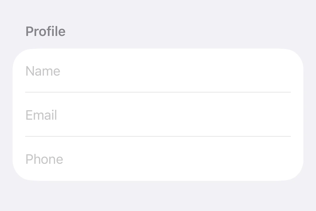
A SwiftUI TextField component for text input.
For the complete documentation index, see llms.txt. Use this file to discover all available pages.
Expo UI TextField matches the official SwiftUI TextField API and supports single-line and multiline input, keyboard configuration, submit handling, and an imperative ref for programmatic control.
Installation
- npx expo install @expo/uiIf you are installing this in an existing React Native app, make sure to install expo in your project.
Usage
Basic text field
import { useState } from 'react';
import { Host, TextField } from '@expo/ui/swift-ui';

export default function BasicTextFieldExample() {
  const [value, setValue] = useState('');

  return (
    <Host matchContents>
      <TextField placeholder="Username" onTextChange={setValue} />
    </Host>
  );
}
Multiline text field
Set axis="vertical" to allow the text field to expand vertically. Use the lineLimit modifier to control the visible line count. When using Host matchContents, add fixedSize({ horizontal: false, vertical: true }) so the text field accepts the parent's width while using its ideal height.
import { useState } from 'react';
import { Host, TextField } from '@expo/ui/swift-ui';
import { lineLimit, fixedSize } from '@expo/ui/swift-ui/modifiers';

export default function MultilineTextFieldExample() {
  const [value, setValue] = useState('');

  return (
    <Host matchContents>
      <TextField
        axis="vertical"
        placeholder="Tell us about yourself..."
        onTextChange={setValue}
        modifiers={[lineLimit(5), fixedSize({ horizontal: false, vertical: true })]}
      />
    </Host>
  );
}
Keyboard type
Use the keyboardType modifier to display a specific keyboard layout.
import { useState } from 'react';
import { Host, TextField } from '@expo/ui/swift-ui';
import { keyboardType, autocorrectionDisabled } from '@expo/ui/swift-ui/modifiers';

export default function KeyboardTypeExample() {
  const [value, setValue] = useState('');

  return (
    <Host matchContents>
      <TextField
        placeholder="Email"
        onTextChange={setValue}
        modifiers={[keyboardType('email-address'), autocorrectionDisabled()]}
      />
    </Host>
  );
}
Submit handling
Use the submitLabel modifier to customize the return key and onSubmit to handle the submit action.
import { useState } from 'react';
import { Host, TextField } from '@expo/ui/swift-ui';
import { submitLabel, onSubmit } from '@expo/ui/swift-ui/modifiers';

export default function SubmitHandlingExample() {
  const [value, setValue] = useState('');

  return (
    <Host matchContents>
      <TextField
        placeholder="Search..."
        onTextChange={setValue}
        modifiers={[submitLabel('search'), onSubmit(() => console.log('Submitted:', value))]}
      />
    </Host>
  );
}
Imperative ref
Use a ref to imperatively set text, focus, blur, or select text.
Note:
setSelectionrequires iOS 18.0+ / tvOS 18.0+. The other ref methods work on all supported versions.
import { useRef } from 'react';
import {
  Host,
  TextField,
  TextFieldRef,
  Button,
  HStack,
  VStack,
  useNativeState,
} from '@expo/ui/swift-ui';
import { buttonStyle } from '@expo/ui/swift-ui/modifiers';

export default function ImperativeRefExample() {
  const ref = useRef<TextFieldRef>(null);
  const text = useNativeState('Select me!');

  return (
    <Host matchContents>
      <VStack>
        <TextField ref={ref} text={text} placeholder="Imperative field" />
        <HStack spacing={12}>
          <Button
            modifiers={[buttonStyle('bordered')]}
            onPress={() => ref.current?.focus()}
            label="Focus"
          />
          <Button
            modifiers={[buttonStyle('bordered')]}
            onPress={() => ref.current?.blur()}
            label="Blur"
          />
          <Button
            modifiers={[buttonStyle('bordered')]}
            onPress={() => ref.current?.setText('SwiftUI rocks!')}
            label="Set Text"
          />
          <Button
            modifiers={[buttonStyle('bordered')]}
            onPress={() => ref.current?.clear()}
            label="Clear"
          />
          <Button
            modifiers={[buttonStyle('bordered')]}
            onPress={() => ref.current?.setSelection(0, 7)}
            label="Select"
          />
        </HStack>
      </VStack>
    </Host>
  );
}
Worklet text masking
When onTextChange is marked with the 'worklet' directive, it runs synchronously on the UI thread, so writes to useNativeState observables inside the callback take effect before the next frame. There is no flicker between the typed text and the masked text. The example below masks a phone number as the user types and writes both text and selection from the worklet to keep the cursor at the end of the formatted value.
Note: Worklets require installing
react-native-reanimatedandreact-native-worklets. Theselectionprop requires iOS 18.0+ / tvOS 18.0+. On older versions the worklet can still update the text but cursor positioning is unavailable.
import { Host, TextField, useNativeState } from '@expo/ui/swift-ui';
import { keyboardType } from '@expo/ui/swift-ui/modifiers';
import { useEffectEvent } from 'react';

export default function WorkletPhoneMaskExample() {
  const phone = useNativeState('');
  const selection = useNativeState({ start: 0, end: 0 });

  const handleTextChange = useEffectEvent((v: string) => {
    'worklet';
    const digits = v.replace(/\D/g, '').slice(0, 10);
    let formatted = digits;
    if (digits.length > 6) {
      formatted = `(${digits.slice(0, 3)}) ${digits.slice(3, 6)}-${digits.slice(6)}`;
    } else if (digits.length > 3) {
      formatted = `(${digits.slice(0, 3)}) ${digits.slice(3)}`;
    }
    if (formatted !== v) {
      phone.value = formatted;
      // Snaps to end for demo. Real masks need smarter cursor handling.
      selection.value = { start: formatted.length, end: formatted.length };
    }
  });

  return (
    <Host matchContents>
      <TextField
        text={phone}
        selection={selection}
        placeholder="(555) 123-4567"
        modifiers={[keyboardType('phone-pad')]}
        onTextChange={handleTextChange}
      />
    </Host>
  );
}
API
import { TextField } from '@expo/ui/swift-ui';
Component
Type: React.Element<TextFieldProps>
Renders a SwiftUI TextField.
boolean • Default: falseIf true, the text field will be focused automatically when mounted.
string • Default: 'horizontal'The axis along which the text field grows when content exceeds a single line.
'horizontal'— single line (default).'vertical'— expands vertically for multiline content. UselineLimitmodifier to cap visible lines.
Acceptable values are: 'horizontal' | 'vertical'
stringInitial value displayed when mounted. Uncontrolled — change key to reset.
(focused: boolean) => voidA callback triggered when the field gains or loses focus.
({ start, end }: {
  end: number,
  start: number
}) => void
A callback triggered when user selects text in the TextField.
(value: string) => voidA callback triggered when the text value changes.
Ref<TextFieldRef>Types
Can be used for imperatively setting text and focus on the TextField component.