This documentation is available as Markdown for AI agents and LLMs. See the full Markdown index or append .md to any documentation URL.

ArrangementView

一个 SwiftUI 的 ArrangementView 组件,可以以自适应布局排列主视图和次要视图。

iOS
tvOS
Included in Expo Go
Recommended version:
~58.0.15

Expo UI 的 ArrangementView 与官方 SwiftUI ArrangementView API 相匹配,可排列主视图和次视图。布局会根据可用空间和硬件特性(例如可折叠显示屏)进行调整。

🌐 Expo UI ArrangementView matches the official SwiftUI ArrangementView API and arranges a primary and a secondary view. The layout adapts to the available size and to hardware features, such as a foldable display.
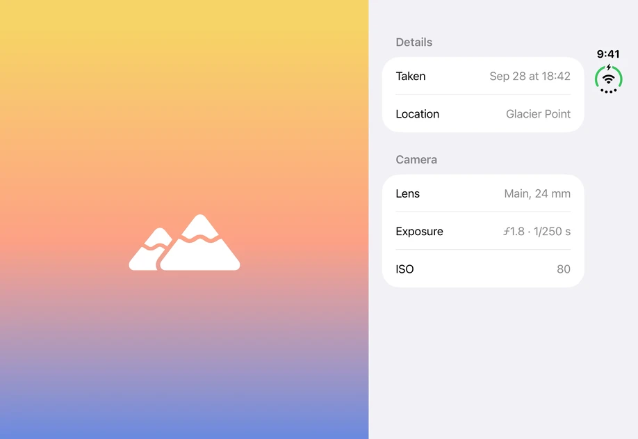
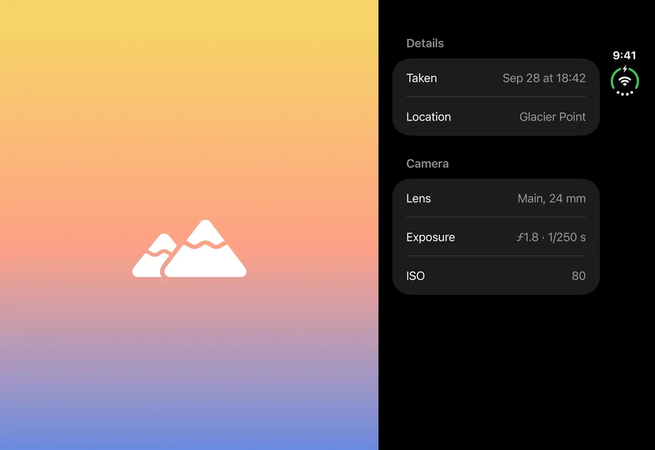
A photo placeholder on the left and a Details form on the rightA photo placeholder on the left and a Details form on the right

安装

🌐 Installation

Terminal
- npx expo install @expo/ui
- yarn expo install @expo/ui
- pnpm expo install @expo/ui
- bun expo install @expo/ui

If you are installing this in an existing React Native app, make sure to install expo in your project.

用法

🌐 Usage

把视图放在 ArrangementView.Primary 和 ArrangementView.Secondary,然后使用 arrangementViewStyle 修饰符选择布局。

🌐 Put the views in ArrangementView.Primary and ArrangementView.Secondary, and choose the layout with the arrangementViewStyle modifier.

分开

🌐 Split

'split' 样式将两个视图并排放置。使用 splitArrangementLayoutSize 修饰符限制视图的大小。另一个视图占据剩余空间。

🌐 The 'split' style places the two views side by side. Limit the size of a view with the splitArrangementLayoutSize modifier. The other view takes the remaining space.

SplitArrangementExample.tsx
import { ArrangementView, Form, Host, Image, LabeledContent, Section, Text, ZStack, } from '@expo/ui/swift-ui'; import { arrangementViewStyle, background, frame, listSectionMargins, splitArrangementLayoutSize, } from '@expo/ui/swift-ui/modifiers'; const fill = frame({ maxWidth: Infinity, maxHeight: Infinity }); const sectionMargin = listSectionMargins({ edges: 'leading', length: 20, }); export default function SplitArrangementExample() { return ( <Host style={{ flex: 1 }}> <ArrangementView modifiers={[arrangementViewStyle('split'), fill]}> <ArrangementView.Primary> <ZStack modifiers={[ fill, background({ type: 'linearGradient', colors: ['#F6D365', '#FDA085', '#5B86E5'], startPoint: { x: 0, y: 0 }, endPoint: { x: 0, y: 1 }, }), ]}> <Image systemName="mountain.2.fill" size={96} color="#FFFFFF" /> </ZStack> </ArrangementView.Primary> <ArrangementView.Secondary> <Form modifiers={[ splitArrangementLayoutSize({ minWidth: 260, idealWidth: 320, maxWidth: 400, }), ]}> <Section title="详细信息" modifiers={[sectionMargin]}> <LabeledContent label="Taken"> <Text>Sep 28 at 18:42</Text> </LabeledContent> <LabeledContent label="Location"> <Text>Glacier Point</Text> </LabeledContent> </Section> <Section title="相机" modifiers={[sectionMargin]}> <LabeledContent label="Lens"> <Text>Main, 24 mm</Text> </LabeledContent> <LabeledContent label="Exposure"> <Text>ƒ1.8 · 1/250 s</Text> </LabeledContent> <LabeledContent label="ISO"> <Text>80</Text> </LabeledContent> </Section> </Form> </ArrangementView.Secondary> </ArrangementView> </Host> ); }

叠加

🌐 Overlay

'overlay' 样式会将主视图叠加在次要视图之上。当布局变为水平或垂直排列时,使用 overlayArrangementEdge 修饰符设置视图占据的边缘。

🌐 The 'overlay' style layers the primary view over the secondary view. Set the edge a view occupies when the arrangement changes to a horizontal or vertical layout with the overlayArrangementEdge modifier.

OverlayArrangementExample.tsx
import { ArrangementView, Button, Host, HStack, Image, Spacer, Text, VStack, ZStack, } from '@expo/ui/swift-ui'; import { arrangementViewStyle, background, font, frame, labelStyle, overlayArrangementEdge, padding, } from '@expo/ui/swift-ui/modifiers'; const fill = frame({ maxWidth: Infinity, maxHeight: Infinity }); export default function OverlayArrangementExample() { return ( <Host style={{ flex: 1 }}> <ArrangementView modifiers={[arrangementViewStyle('overlay'), fill]}> <ArrangementView.Primary> <VStack modifiers={[overlayArrangementEdge('bottom')]}> <Spacer /> <VStack spacing={12} modifiers={[ padding({ all: 20 }), frame({ maxWidth: Infinity }), background({ type: 'material', material: 'thin' }), ]}> <Text modifiers={[font({ textStyle: 'headline' })]}> Episode 4: The Long Way Round </Text> <HStack spacing={32} modifiers={[labelStyle('iconOnly')]}> <Button label="Back 10 seconds" systemImage="gobackward.10" onPress={() => {}} /> <Button label="Play" systemImage="play.fill" onPress={() => {}} /> <Button label="Forward 10 seconds" systemImage="goforward.10" onPress={() => {}} /> </HStack> </VStack> </VStack> </ArrangementView.Primary> <ArrangementView.Secondary> <ZStack modifiers={[fill, background('#3A1C71')]}> <Image systemName="play.rectangle.fill" size={72} color="#FFFFFF" /> </ZStack> </ArrangementView.Secondary> </ArrangementView> </Host> ); }

应用接口

🌐 API

import { ArrangementView } from '@expo/ui/swift-ui';

No API data file found, sorry!