This documentation is available as Markdown for AI agents and LLMs. See the full Markdown index or append .md to any documentation URL.

挑选器

用于从列表中选择选项的 SwiftUI Picker 组件。

iOS
tvOS
Included in Expo Go
Recommended version:
~58.0.15

Expo UI Picker 与官方 SwiftUI Picker API 相匹配,并通过 pickerStyle 修饰符支持所有选择器样式。

🌐 Expo UI Picker matches the official SwiftUI Picker API and supports all picker styles via the pickerStyle modifier.
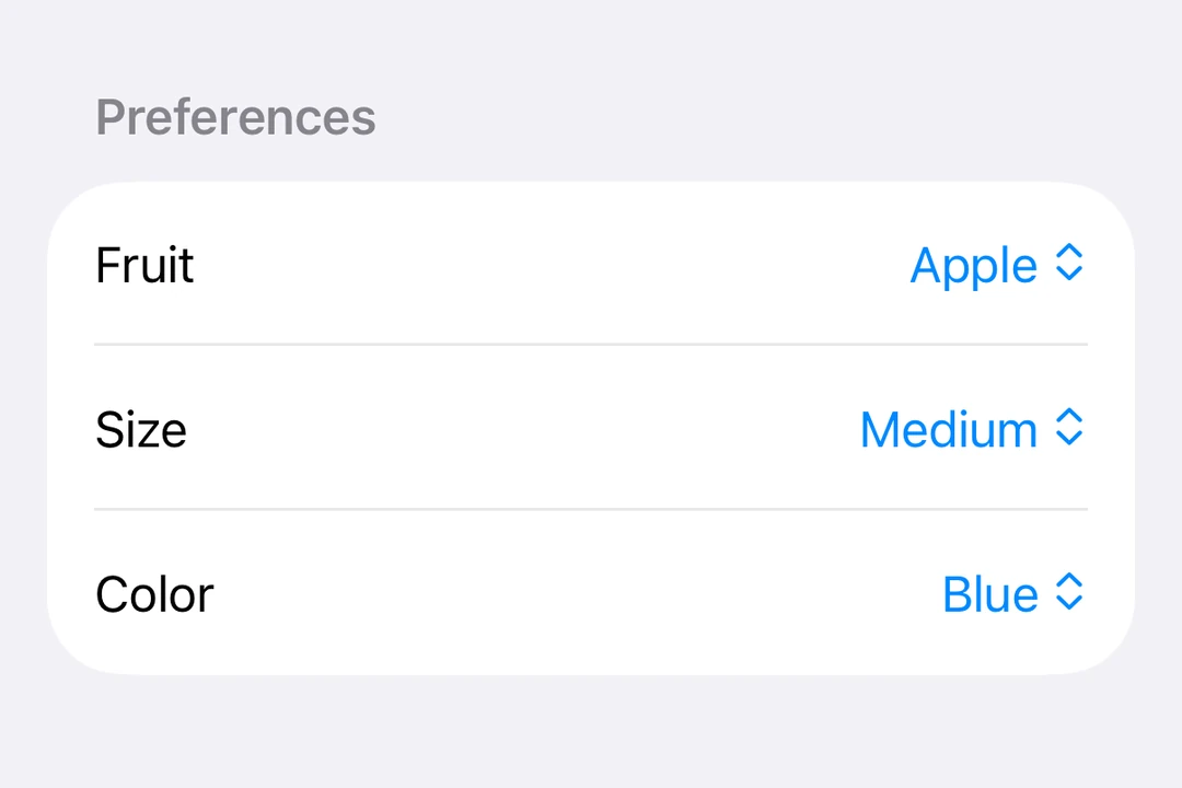
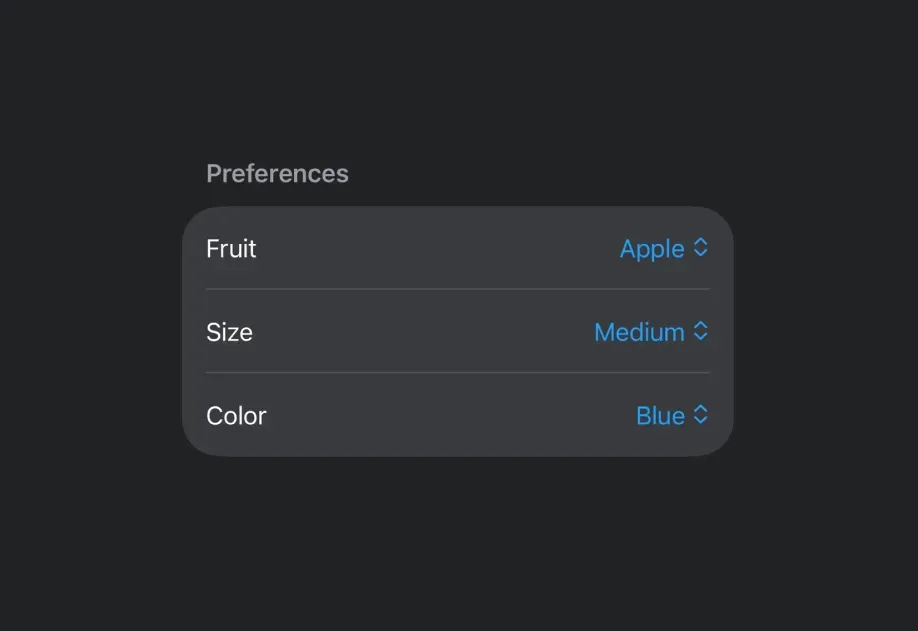
Menu-style Picker showing fruit options with the current selection checkedMenu-style Picker showing fruit options with the current selection checked

安装

🌐 Installation

Terminal
- npx expo install @expo/ui
- yarn expo install @expo/ui
- pnpm expo install @expo/ui
- bun expo install @expo/ui

If you are installing this in an existing React Native app, make sure to install expo in your project.

分段选择器

🌐 Segmented picker

SegmentedPickerExample.tsx
import { useState } from 'react'; import { Host, Picker, Text } from '@expo/ui/swift-ui'; import { pickerStyle, tag } from '@expo/ui/swift-ui/modifiers'; const options = ['Apple', 'Banana', 'Orange']; export default function SegmentedPickerExample() { const [selectedTag, setSelectedTag] = useState(options[0]); // Segmented and wheel pickers stretch to the width they are given, so they // collapse under `matchContents`. return ( <Host style={{ flex: 1 }}> <Picker modifiers={[pickerStyle('segmented')]} label="Select a fruit" selection={selectedTag} onSelectionChange={selection => { setSelectedTag(selection); }}> {options.map(option => ( <Text key={option} modifiers={[tag(option)]}> {option} </Text> ))} </Picker> </Host> ); }

菜单选择器

🌐 Menu picker

MenuPickerExample.tsx
import { useState } from 'react'; import { Host, Picker, Text } from '@expo/ui/swift-ui'; import { pickerStyle, tag } from '@expo/ui/swift-ui/modifiers'; const options = ['Apple', 'Banana', 'Orange']; export default function MenuPickerExample() { const [selectedTag, setSelectedTag] = useState(options[0]); return ( <Host style={{ flex: 1 }}> <Picker modifiers={[pickerStyle('menu')]} label="Select a fruit" selection={selectedTag} onSelectionChange={selection => { setSelectedTag(selection); }}> {options.map(option => ( <Text key={option} modifiers={[tag(option)]}> {option} </Text> ))} </Picker> </Host> ); }

轮式挑选器

🌐 Wheel picker

WheelPickerExample.tsx
import { useState } from 'react'; import { Host, Picker, Text } from '@expo/ui/swift-ui'; import { pickerStyle, tag } from '@expo/ui/swift-ui/modifiers'; const options = ['Apple', 'Banana', 'Orange']; export default function WheelPickerExample() { const [selectedTag, setSelectedTag] = useState(options[0]); return ( <Host style={{ flex: 1 }}> <Picker modifiers={[pickerStyle('wheel')]} label="Select a fruit" selection={selectedTag} onSelectionChange={selection => { setSelectedTag(selection); }}> {options.map(option => ( <Text key={option} modifiers={[tag(option)]}> {option} </Text> ))} </Picker> </Host> ); }

应用接口

🌐 API

import { Picker } from '@expo/ui/swift-ui';

No API data file found, sorry!