This documentation is available as Markdown for AI agents and LLMs. See the full Markdown index or append .md to any documentation URL.
列表 一个用于显示可滚动项目列表的 SwiftUI 列表组件。
Recommended version:
~58.0.15
信息 有关跨平台使用,请参阅通用 List
Expo UI 列表与官方 SwiftUI List API 匹配,并支持通过 listStyle
🌐 Expo UI List matches the official SwiftUI List API and supports styling via the listStyle
安装
🌐 Installation
- npx expo install @expo/ui
- yarn expo install @expo/ui
- pnpm expo install @expo/ui
- bun expo install @expo/ui
If you are installing this in an existing React Native app , make sure to install expo in your project.
用法
🌐 Usage
基础列表
🌐 Basic list
import { Host , List , Text , Section } from '@expo/ui/swift-ui' ;
export default function BasicListExample ( ) {
return (
< Host style = { { flex: 1 } } >
< List >
< Section title = " 水果" >
< Text > Apple </ Text >
< Text > Banana </ Text >
< Text > Orange </ Text >
</ Section >
< Section title = " 蔬菜" >
< Text > Carrot </ Text >
< Text > Broccoli </ Text >
< Text > Spinach </ Text >
</ Section >
</ List >
</ Host > ) ;
}
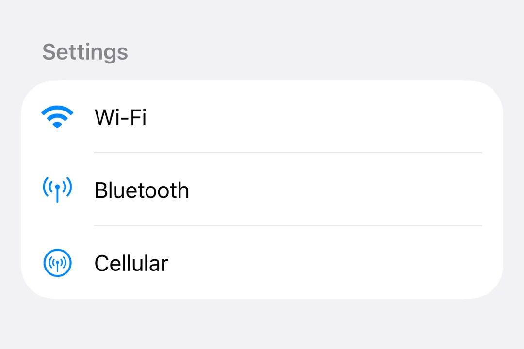
带标签和图标的列表
🌐 List with labels and icons
ListWithLabelsExample.tsx import { Host , List , Label , Section } from '@expo/ui/swift-ui' ;
export default function ListWithLabelsExample ( ) {
return (
< Host style = { { flex: 1 } } >
< List >
< Section title = " 设置" >
< Label title = " 无线网络" systemImage = " wifi" />
< Label title = " 蓝牙" systemImage = " antenna.radiowaves.left.and.right" />
< Label title = " 蜂窝网络" systemImage = " antenna.radiowaves.left.and.right.circle" />
</ Section >
</ List >
</ Host > ) ;
}
大型列表
🌐 Large lists
使用 List.ForEachdata 传入,每个项目用 keyExtractor 提供唯一的键,并提供一个 children 函数来返回每个项目的行。List.ForEach 只渲染可见区域附近的行,并在滚动时重复使用它们。
🌐 Use List.ForEachdata, a unique key for each item with keyExtractor, and a children function that returns the row for an item. List.ForEach renders only the rows near the visible area and reuses them while you scroll.
import { Host , List , Text } from '@expo/ui/swift-ui' ;
type Contact = { id: string ; name: string } ;
const contacts: Contact [ ] = Array . from (
{ length: 10000 } ,
( _, i) => ( {
id: String ( i) ,
name: ` Contact ${ i + 1 } ` ,
} )
) ;
function renderContact ( { item } : { item: Contact } ) {
return < Text > { item. name } </ Text > ;
}
export default function LargeListExample ( ) {
return (
< Host style = { { flex: 1 } } >
< List >
< List.ForEach data = { contacts} keyExtractor = { contact => contact. id } >
{ renderContact}
</ List.ForEach >
</ List >
</ Host > ) ;
}
渲染行时遵守这些规则:
🌐 Follow these rules when you render rows:
在组件外定义 children 函数,或者把它包在 useCallback 里。否则,每次组件渲染时,可见区域附近的行都会重新渲染。
一个重复使用的行会保留它之前显示的项目的本地状态(useState)。当项目变化时重置状态,或者把状态保存在行外。
尚未准备好的行会显示一个空占位符。将 estimatedItemSize 设置为接近你行内容高度的值(以点为单位),不包括 List 的内边距。
使用 overscanCount 在可见行的上方和下方准备更多行。
要更新行,请传入一个新的 data 数组。不要在原地修改数组。
把 recycling={false} 设置成提前渲染每一行。
列表样式
🌐 List styles
使用 listStyle
🌐 Use the listStyle
注意: inset、insetGrouped 和 sidebar 样式在 tvOS 上不可用。
import { useState } from 'react' ;
import {
Host ,
List ,
Text ,
Section ,
Picker ,
} from '@expo/ui/swift-ui' ;
import {
listStyle,
pickerStyle,
tag,
} from '@expo/ui/swift-ui/modifiers' ;
const styles = [
'automatic' ,
'plain' ,
'inset' ,
'insetGrouped' ,
'grouped' ,
'sidebar' ,
] as const ;
export default function ListStylesExample ( ) {
const [ styleIndex, setStyleIndex] = useState ( 0 ) ;
return (
< Host style = { { flex: 1 } } >
< List modifiers = { [ listStyle ( styles[ styleIndex] ) ] } >
< Section title = " 样式选择器" >
< Picker label = " List Style" selection = { styleIndex} onSelectionChange = { setStyleIndex} modifiers = { [ pickerStyle ( 'menu' ) ] } >
{ styles. map ( ( style, index) => (
< Text key = { style} modifiers = { [ tag ( index) ] } >
{ style}
</ Text > ) ) }
</ Picker >
</ Section >
< Section title = " 样品项目" >
< Text > Item 1 </ Text >
< Text > Item 2 </ Text >
< Text > Item 3 </ Text >
</ Section >
</ List >
</ Host > ) ;
}
选择和编辑模式
🌐 Selection and edit mode
使用 List.ForEachonDelete 和 onMove 属性,启用列表项的选择、删除和重新排序功能。
🌐 Enable selection, deletion, and reordering of list items using the List.ForEachonDelete and onMove props.
使用 environment
使用 keyExtractor 属性来识别项目
使用 selection
使用 moveDisableddeleteDisabled
import { useState } from 'react' ;
import {
Host ,
List ,
Label ,
Section ,
Button ,
Toggle ,
} from '@expo/ui/swift-ui' ;
import { environment } from '@expo/ui/swift-ui/modifiers' ;
type Task = { id: string ; title: string } ;
const INITIAL_TASKS : Task [ ] = [
{ id: '1' , title: 'Task 1' } ,
{ id: '2' , title: 'Task 2' } ,
{ id: '3' , title: 'Task 3' } ,
{ id: '4' , title: 'Task 4' } ,
] ;
function renderTask ( { item } : { item: Task } ) {
return < Label title = { item. title } /> ;
}
export default function EditableListExample ( ) {
const [ tasks, setTasks] = useState < Task[ ] > ( INITIAL_TASKS ) ;
const [ selectedIds, setSelectedIds] = useState < string [ ] > ( [ ] ) ;
const [ editMode, setEditMode] = useState ( false ) ;
const handleDelete = ( indices: number [ ] ) => {
setTasks ( prev => prev. filter ( ( _, i) => ! indices. includes ( i) ) ) ;
} ;
const handleMove = (
sourceIndices: number [ ] ,
destination: number
) => {
setTasks ( prev => {
const newTasks = [ ... prev] ;
const [ removed] = newTasks. splice ( sourceIndices[ 0 ] , 1 ) ;
const adjustedDest =
sourceIndices[ 0 ] < destination
? destination - 1
: destination;
newTasks. splice ( adjustedDest, 0 , removed) ;
return newTasks;
} ) ;
} ;
return (
< Host style = { { flex: 1 } } >
< List selection = { selectedIds} onSelectionChange = { ids => setSelectedIds ( ids. map ( String ) ) } modifiers = { [
environment ( 'editMode' , editMode ? 'active' : 'inactive' ) ,
] } >
< Section title = " 设置" >
< Toggle label = " Edit mode" isOn = { editMode} onIsOnChange = { setEditMode} />
</ Section >
< Section title = " 任务" >
< List.ForEach data = { tasks} keyExtractor = { task => task. id } onDelete = { handleDelete} onMove = { handleMove} >
{ renderTask}
</ List.ForEach >
</ Section >
</ List >
</ Host > ) ;
}
下拉刷新
🌐 Pull to refresh
使用 refreshable
🌐 Use the refreshable
RefreshableListExample.tsx import { useState } from 'react' ;
import { Host , List , Text , Section } from '@expo/ui/swift-ui' ;
import { refreshable } from '@expo/ui/swift-ui/modifiers' ;
export default function RefreshableListExample ( ) {
const [ lastRefresh, setLastRefresh] = useState < Date | null > ( null ) ;
const handleRefresh = async ( ) => {
await new Promise ( resolve => setTimeout ( resolve, 1500 ) ) ;
setLastRefresh ( new Date ( ) ) ;
} ;
return (
< Host style = { { flex: 1 } } >
< List modifiers = { [ refreshable ( handleRefresh) ] } >
< Section title = " 数据" >
< Text > Pull down to refresh </ Text >
{ lastRefresh && (
< Text >
Last refresh: { lastRefresh. toLocaleTimeString ( ) }
</ Text > ) }
</ Section >
</ List >
</ Host > ) ;
}
行样式
🌐 Row styling
使用 listRowBackgroundlistRowSeparatorlistRowSeparatorTintlistRowInsetsalignmentGuidelistRowSeparatorLeading 指南来设置行分隔符的起始位置。
🌐 Use listRowBackgroundlistRowSeparatorlistRowSeparatorTintlistRowInsetsalignmentGuidelistRowSeparatorLeading guide to set where a row separator starts.
import { Host , List , Text , Section } from '@expo/ui/swift-ui' ;
import {
alignmentGuide,
listRowBackground,
listRowSeparator,
listRowSeparatorTint,
listRowInsets,
} from '@expo/ui/swift-ui/modifiers' ;
export default function RowStylingExample ( ) {
return (
< Host style = { { flex: 1 } } >
< List >
< Section title = " 样式化行" >
< Text modifiers = { [ listRowBackground ( 'blue' ) ] } >
Blue background
</ Text >
< Text modifiers = { [ listRowSeparator ( 'hidden' ) ] } >
Hidden separator
</ Text >
< Text modifiers = { [ listRowSeparatorTint ( 'red' ) ] } >
Red separator
</ Text >
< Text modifiers = { [ listRowInsets ( { leading: 40 } ) ] } >
Extra leading inset
</ Text >
< Text modifiers = { [
listRowInsets ( { leading: 0 , trailing: 0 } ) ,
] } >
No horizontal insets
</ Text >
< Text modifiers = { [
alignmentGuide ( 'listRowSeparatorLeading' , 32 ) ,
] } >
Separator starts 32 points in
</ Text >
</ Section >
</ List >
</ Host > ) ;
}
键盘隐藏行为
🌐 Keyboard dismiss behavior
使用 scrollDismissesKeyboard
🌐 Use the scrollDismissesKeyboard
KeyboardDismissExample.tsx import { Host , List , Section , TextField } from '@expo/ui/swift-ui' ;
import { scrollDismissesKeyboard } from '@expo/ui/swift-ui/modifiers' ;
export default function KeyboardDismissExample ( ) {
return (
< Host style = { { flex: 1 } } >
< List modifiers = { [ scrollDismissesKeyboard ( 'interactively' ) ] } >
< Section title = " 表格" >
< TextField placeholder = " Name" />
< TextField placeholder = " Email" />
< TextField placeholder = " Phone" />
</ Section >
</ List >
</ Host > ) ;
}
标题突出
🌐 Header prominence
使用 headerProminence
🌐 Use the headerProminence
HeaderProminenceExample.tsx import { Host , List , Text , Section } from '@expo/ui/swift-ui' ;
import { headerProminence } from '@expo/ui/swift-ui/modifiers' ;
export default function HeaderProminenceExample ( ) {
return (
< Host style = { { flex: 1 } } >
< List modifiers = { [ headerProminence ( 'increased' ) ] } >
< Section title = " 重要部分" >
< Text > This section has increased header prominence </ Text >
</ Section >
< Section title = " 另一部分" >
< Text > Headers are more prominent </ Text >
</ Section >
</ List >
</ Host > ) ;
}
应用接口
🌐 API
import { List } from '@expo/ui/swift-ui' ;
No API data file found, sorry!