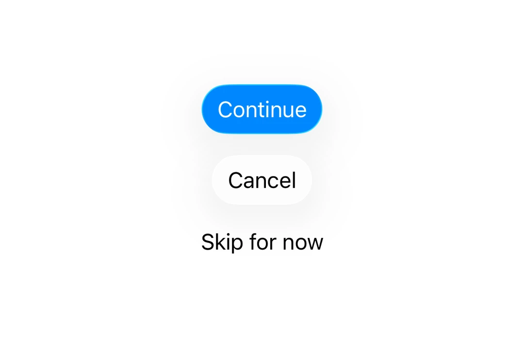
This documentation is available as Markdown for AI agents and LLMs. See the full Markdown index or append .md to any documentation URL.
按钮 用于显示原生按钮的 SwiftUI 按钮组件。
Recommended version:
~58.0.15
信息 有关跨平台使用,请参阅通用 Button
Expo UI 按钮与官方 SwiftUI Button API 一致,并支持通过 buttonStylecontrolSize
🌐 Expo UI Button matches the official SwiftUI Button API and supports styling via the buttonStylecontrolSize
安装
🌐 Installation
- npx expo install @expo/ui
- yarn expo install @expo/ui
- pnpm expo install @expo/ui
- bun expo install @expo/ui
If you are installing this in an existing React Native app , make sure to install expo in your project.
用法
🌐 Usage
基础按钮
🌐 Basic button
import { Host , Button } from '@expo/ui/swift-ui' ;
export default function BasicButtonExample ( ) {
return (
< Host style = { { flex: 1 } } >
< Button label = " Press me" onPress = { ( ) => alert ( 'Pressed!' ) } />
</ Host > ) ;
}
带系统图片的按钮
🌐 Button with system image
ButtonWithImageExample.tsx import { Host , Button } from '@expo/ui/swift-ui' ;
export default function ButtonWithImageExample ( ) {
return (
< Host style = { { flex: 1 } } >
< Button label = " Download" systemImage = " arrow.down.circle" onPress = { ( ) => alert ( 'Downloading...' ) } />
</ Host > ) ;
}
仅图标按钮
🌐 Icon-only button
使用 labelStyle 修饰符仅显示图标,同时保留标签以便无障碍访问。
🌐 Use the labelStyle modifier to show only the icon while keeping the label for accessibility.
IconOnlyButtonExample.tsx import { Host , Button } from '@expo/ui/swift-ui' ;
import { labelStyle } from '@expo/ui/swift-ui/modifiers' ;
export default function IconOnlyButtonExample ( ) {
return (
< Host style = { { flex: 1 } } >
< Button label = " Settings" systemImage = " gear" modifiers = { [ labelStyle ( 'iconOnly' ) ] } onPress = { ( ) => alert ( 'Settings' ) } />
</ Host > ) ;
}
按钮样式
🌐 Button styles
使用 buttonStyle 修饰符来更改按钮的外观。可用的样式有:bordered、borderedProminent、borderless、plain、glass 和 glassProminent。
🌐 Use the buttonStyle modifier to change the button's appearance. Available styles are: bordered, borderedProminent, borderless, plain, glass, and glassProminent.
注意: 只有在使用 Xcode 26 构建并运行 iOS 26 及以上版本时,才可使用 glass 和 glassProminent 样式。
import { Host , Button , VStack } from '@expo/ui/swift-ui' ;
import { buttonStyle } from '@expo/ui/swift-ui/modifiers' ;
export default function ButtonStylesExample ( ) {
return (
< Host style = { { flex: 1 } } >
< VStack spacing = { 8 } >
< Button label = " Bordered" modifiers = { [ buttonStyle ( 'bordered' ) ] } />
< Button label = " Bordered Prominent" modifiers = { [ buttonStyle ( 'borderedProminent' ) ] } />
< Button label = " Borderless" modifiers = { [ buttonStyle ( 'borderless' ) ] } />
< Button label = " Plain" modifiers = { [ buttonStyle ( 'plain' ) ] } />
</ VStack >
</ Host > ) ;
}
按钮边框形状
🌐 Button border shape
使用 buttonBorderShape 修饰符来更改样式化按钮的形状。可用的形状有:automatic、capsule、roundedRectangle 和 circle(iOS 17 及以上)。
🌐 Use the buttonBorderShape modifier to change the shape of a styled button. Available shapes are: automatic, capsule, roundedRectangle, and circle (iOS 17+).
ButtonBorderShapeExample.tsx import { Host , Button } from '@expo/ui/swift-ui' ;
import {
buttonStyle,
controlSize,
buttonBorderShape,
labelStyle,
} from '@expo/ui/swift-ui/modifiers' ;
export default function ButtonBorderShapeExample ( ) {
return (
< Host style = { { flex: 1 } } >
< Button label = " Favorite" systemImage = " heart.fill" modifiers = { [
buttonStyle ( 'glass' ) ,
controlSize ( 'extraLarge' ) ,
labelStyle ( 'iconOnly' ) ,
buttonBorderShape ( 'circle' ) ,
] } onPress = { ( ) => alert ( 'Favorited' ) } />
</ Host > ) ;
}
控件大小
🌐 Control sizes
使用 controlSize 修饰符来调整按钮大小。可用的尺寸有:mini、small、regular、large 和 extraLarge。
🌐 Use the controlSize modifier to adjust the button size. Available sizes are: mini, small, regular, large, and extraLarge.
注意: extraLarge 尺寸仅在 iOS 17 及以上版本可用。
import { Host , Button , VStack } from '@expo/ui/swift-ui' ;
import {
buttonStyle,
controlSize,
} from '@expo/ui/swift-ui/modifiers' ;
export default function ControlSizeExample ( ) {
return (
< Host style = { { flex: 1 } } >
< VStack spacing = { 8 } >
< Button label = " Mini" modifiers = { [ controlSize ( 'mini' ) , buttonStyle ( 'bordered' ) ] } />
< Button label = " Small" modifiers = { [
controlSize ( 'small' ) ,
buttonStyle ( 'bordered' ) ,
] } />
< Button label = " Regular" modifiers = { [
controlSize ( 'regular' ) ,
buttonStyle ( 'bordered' ) ,
] } />
< Button label = " Large" modifiers = { [
controlSize ( 'large' ) ,
buttonStyle ( 'bordered' ) ,
] } />
</ VStack >
</ Host > ) ;
}
按钮角色
🌐 Button roles
使用 role 属性来指示按钮的语义角色。可用的角色有:default、cancel 和 destructive。
🌐 Use the role prop to indicate the semantic role of the button. Available roles are: default, cancel, and destructive.
import { Host , Button , VStack } from '@expo/ui/swift-ui' ;
export default function ButtonRolesExample ( ) {
return (
< Host style = { { flex: 1 } } >
< VStack spacing = { 8 } >
< Button label = " Default" role = " default" />
< Button label = " Cancel" role = " cancel" />
< Button label = " Delete" role = " destructive" />
</ VStack >
</ Host > ) ;
}
有色按钮
🌐 Tinted button
使用 tint 修饰符来更改按钮的颜色。
🌐 Use the tint modifier to change the button's color.
import { Host , Button } from '@expo/ui/swift-ui' ;
import { tint } from '@expo/ui/swift-ui/modifiers' ;
export default function TintedButtonExample ( ) {
return (
< Host style = { { flex: 1 } } >
< Button label = " Custom Color" modifiers = { [ tint ( '#FF6347' ) ] } />
</ Host > ) ;
}
按钮已禁用
🌐 Disabled button
使用 disabled 修饰符来禁用按钮。
🌐 Use the disabled modifier to disable the button.
DisabledButtonExample.tsx import { Host , Button } from '@expo/ui/swift-ui' ;
import { disabled } from '@expo/ui/swift-ui/modifiers' ;
export default function DisabledButtonExample ( ) {
return (
< Host style = { { flex: 1 } } >
< Button label = " Disabled" modifiers = { [ disabled ( ) ] } />
</ Host > ) ;
}
自定义标签内容
🌐 Custom label content
你可以将自定义组件作为 children 传递,以实现更复杂的按钮标签内容。
🌐 You can pass custom components as children for more complex button label content.
import {
Host ,
Button ,
VStack ,
Image ,
Text ,
} from '@expo/ui/swift-ui' ;
export default function CustomContentExample ( ) {
return (
< Host style = { { flex: 1 } } >
< Button onPress = { ( ) => console . log ( 'Pressed!' ) } >
< VStack spacing = { 4 } >
< Image systemName = " folder" />
< Text > Folder </ Text >
</ VStack >
</ Button >
</ Host > ) ;
}
应用接口
🌐 API
import { Button } from '@expo/ui/swift-ui' ;
No API data file found, sorry!