This documentation is available as Markdown for AI agents and LLMs. See the full Markdown index or append .md to any documentation URL.
ColorPicker
用于选择颜色的 SwiftUI ColorPicker 组件。
iOS
Included in Expo Go
Recommended version:
~57.0.3
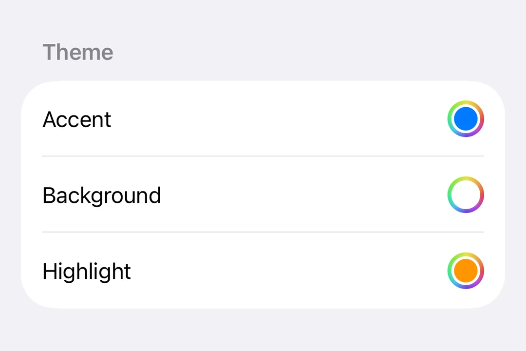
Expo UI ColorPicker 与官方的 SwiftUI ColorPicker API 相匹配,并允许应用用户从调色板中选择颜色。
🌐 Expo UI ColorPicker matches the official SwiftUI ColorPicker API and allows app users to select colors from a palette.
安装
🌐 Installation
Terminal
- npx expo install @expo/uiIf you are installing this in an existing React Native app, make sure to install expo in your project.
用法
🌐 Usage
基本颜色选择器
🌐 Basic color picker
ColorPickerExample.tsx
import { useState } from 'react';
import { Host, ColorPicker } from '@expo/ui/swift-ui';

export default function ColorPickerExample() {
  const [color, setColor] = useState('#FF6347');

  return (
    <Host matchContents>
      <ColorPicker label="Select a color" selection={color} onSelectionChange={setColor} />
    </Host>
  );
}
支持不透明度的取色器
🌐 Color picker with opacity support
使用 supportsOpacity 属性允许用户选择带有透明度的颜色。
🌐 Use the supportsOpacity prop to allow users to select colors with alpha transparency.
ColorPickerOpacityExample.tsx
import { useState } from 'react';
import { Host, ColorPicker } from '@expo/ui/swift-ui';

export default function ColorPickerOpacityExample() {
  const [color, setColor] = useState('#FF634780');

  return (
    <Host matchContents>
      <ColorPicker
        label="Select a color with opacity"
        selection={color}
        onSelectionChange={setColor}
        supportsOpacity
      />
    </Host>
  );
}
应用接口
🌐 API
import { ColorPicker } from '@expo/ui/swift-ui';
Component
Type: React.Element<ColorPickerProps>
Renders a ColorPicker component using SwiftUI.