This documentation is available as Markdown for AI agents and LLMs. See the full Markdown index or append .md to any documentation URL.
ConfirmationDialog
用于显示确认提示的 SwiftUI ConfirmationDialog 组件。
Expo UI ConfirmationDialog 与官方 SwiftUI confirmationDialog API 相匹配,并渲染带有标题、操作和可选消息的操作表样式对话框。
安装
🌐 Installation
- npx expo install @expo/uiIf you are installing this in an existing React Native app, make sure to install expo in your project.
用法
🌐 Usage
基本确认对话框
🌐 Basic confirmation dialog
使用 ConfirmationDialog.Trigger 来定义可见元素,使用 ConfirmationDialog.Actions 来提供对话框按钮。
🌐 Use ConfirmationDialog.Trigger to define the visible element and ConfirmationDialog.Actions to provide the dialog buttons.
import { useState } from 'react';
import { Host, ConfirmationDialog, Button, Text } from '@expo/ui/swift-ui';

export default function BasicConfirmationDialogExample() {
  const [isPresented, setIsPresented] = useState(false);

  return (
    <Host matchContents>
      <ConfirmationDialog
        title="你确定吗?"
        isPresented={isPresented}
        onIsPresentedChange={setIsPresented}
        titleVisibility="visible">
        <ConfirmationDialog.Trigger>
          <Button label="Show Dialog" onPress={() => setIsPresented(true)} />
        </ConfirmationDialog.Trigger>
        <ConfirmationDialog.Actions>
          <Button label="Confirm" onPress={() => setIsPresented(false)} />
          <Button label="Cancel" role="cancel" />
        </ConfirmationDialog.Actions>
      </ConfirmationDialog>
    </Host>
  );
}
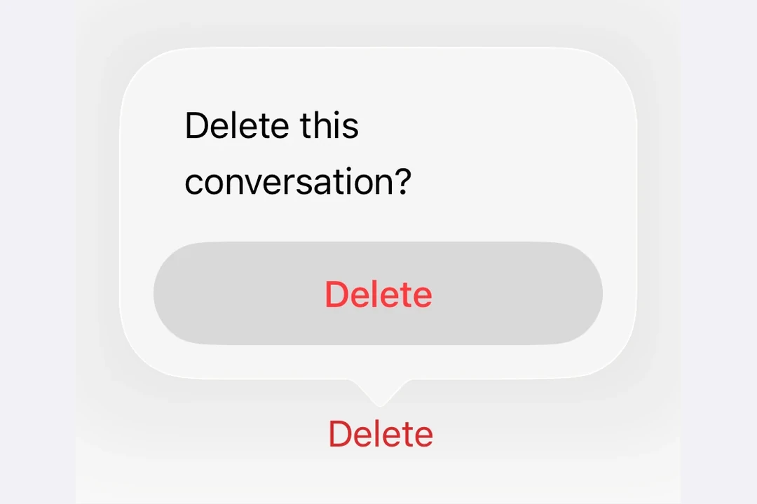
破坏性操作确认
🌐 Destructive action confirmation
在 ConfirmationDialog.Actions 内对 Button 使用 role="destructive" 来将其样式设为破坏性操作。
🌐 Use role="destructive" on a Button inside ConfirmationDialog.Actions to style it as a destructive action.
import { useState } from 'react';
import { Host, ConfirmationDialog, Button, Text } from '@expo/ui/swift-ui';

export default function DestructiveConfirmationDialogExample() {
  const [isPresented, setIsPresented] = useState(false);

  return (
    <Host matchContents>
      <ConfirmationDialog
        title="删除项目?"
        isPresented={isPresented}
        onIsPresentedChange={setIsPresented}
        titleVisibility="visible">
        <ConfirmationDialog.Trigger>
          <Button label="Delete" role="destructive" onPress={() => setIsPresented(true)} />
        </ConfirmationDialog.Trigger>
        <ConfirmationDialog.Actions>
          <Button
            label="Delete"
            role="destructive"
            onPress={() => {
              console.log('Deleted');
              setIsPresented(false);
            }}
          />
          <Button label="Cancel" role="cancel" />
        </ConfirmationDialog.Actions>
        <ConfirmationDialog.Message>
          <Text>This action cannot be undone.</Text>
        </ConfirmationDialog.Message>
      </ConfirmationDialog>
    </Host>
  );
}
带消息和多种操作
🌐 With message and multiple actions
使用 ConfirmationDialog.Message 在标题下显示描述性消息,并为不同的选择包含多个操作按钮。
🌐 Use ConfirmationDialog.Message to display a descriptive message below the title, and include multiple action buttons for different choices.
import { useState } from 'react';
import { Host, ConfirmationDialog, Button, Text } from '@expo/ui/swift-ui';

export default function MultiActionConfirmationDialogExample() {
  const [isPresented, setIsPresented] = useState(false);

  return (
    <Host matchContents>
      <ConfirmationDialog
        title="保存更改?"
        isPresented={isPresented}
        onIsPresentedChange={setIsPresented}
        titleVisibility="visible">
        <ConfirmationDialog.Trigger>
          <Button label="Close Document" onPress={() => setIsPresented(true)} />
        </ConfirmationDialog.Trigger>
        <ConfirmationDialog.Actions>
          <Button label="Save" onPress={() => console.log('Saved')} />
          <Button label="Discard" role="destructive" onPress={() => console.log('Discarded')} />
          <Button label="Cancel" role="cancel" />
        </ConfirmationDialog.Actions>
        <ConfirmationDialog.Message>
          <Text>You have unsaved changes. What would you like to do?</Text>
        </ConfirmationDialog.Message>
      </ConfirmationDialog>
    </Host>
  );
}
隐藏标题
🌐 Hidden title
将 titleVisibility="hidden" 设置为隐藏对话框标题,同时仍显示操作和消息。你仍然应该提供一个 title 以便无障碍访问。
🌐 Set titleVisibility="hidden" to hide the dialog title while still showing the actions and message. You should still provide a title for accessibility.
import { useState } from 'react';
import { Host, ConfirmationDialog, Button, Text } from '@expo/ui/swift-ui';

export default function HiddenTitleConfirmationDialogExample() {
  const [isPresented, setIsPresented] = useState(false);

  return (
    <Host matchContents>
      <ConfirmationDialog
        title="隐藏标题"
        isPresented={isPresented}
        onIsPresentedChange={setIsPresented}
        titleVisibility="hidden">
        <ConfirmationDialog.Trigger>
          <Button label="Show Dialog" onPress={() => setIsPresented(true)} />
        </ConfirmationDialog.Trigger>
        <ConfirmationDialog.Actions>
          <Button label="OK" onPress={() => setIsPresented(false)} />
          <Button label="Cancel" role="cancel" />
        </ConfirmationDialog.Actions>
        <ConfirmationDialog.Message>
          <Text>Only the message and actions are visible.</Text>
        </ConfirmationDialog.Message>
      </ConfirmationDialog>
    </Host>
  );
}
应用接口
🌐 API
import { ConfirmationDialog } from '@expo/ui/swift-ui';
Component
Type: React.Element<ConfirmationDialogProps>
ConfirmationDialog presents a confirmation dialog with a title, optional message, and action buttons.
ReactNodeThe contents of the confirmation dialog.
Should include ConfirmationDialog.Trigger, ConfirmationDialog.Actions, and optionally ConfirmationDialog.Message.
(isPresented: boolean) => voidA callback that is called when the isPresented state changes.
string • Default: 'automatic'The visibility of the dialog title.
Acceptable values are: 'automatic' | 'hidden' | 'visible'