This documentation is available as Markdown for AI agents and LLMs. See the full Markdown index or append .md to any documentation URL.
部分
SwiftUI 的 Section 组件,用于在列表和表单中分组内容。
Expo UI 段落(Section)与官方 SwiftUI Section API 相匹配,用于在 List、Form 或 Picker 组件中分组相关内容。
🌐 Expo UI Section matches the official SwiftUI Section API and is used to group related content within List, Form or Picker components.
安装
🌐 Installation
- npx expo install @expo/uiIf you are installing this in an existing React Native app, make sure to install expo in your project.
用法
🌐 Usage
带标题的基本部分
🌐 Basic section with title
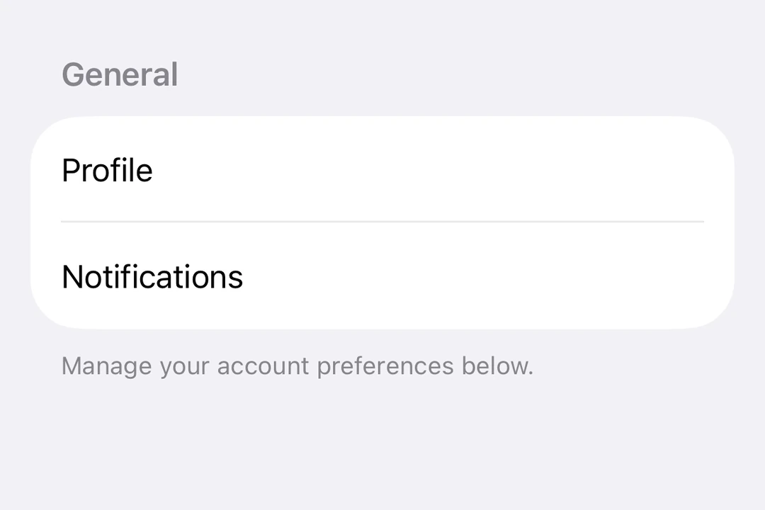
对于带有文本标题的简单部分,请使用 title 属性。
🌐 Use the title prop for simple sections with a text header.
import { Host, List, Section, Text } from '@expo/ui/swift-ui';

export default function BasicSectionExample() {
  return (
    <Host style={{ flex: 1 }}>
      <List>
        <Section title="设置">
          <Text>General</Text>
          <Text>Privacy</Text>
          <Text>Notifications</Text>
        </Section>
      </List>
    </Host>
  );
}
带自定义页眉和页脚的部分
🌐 Section with custom header and footer
使用 header 和 footer 属性来实现自定义视图。只有在未提供 title 时才会使用这些属性。
🌐 Use the header and footer props for custom views. These props are only used when title is not provided.
import { Host, List, Section, Toggle, Text, HStack, Image } from '@expo/ui/swift-ui';
import { useState } from 'react';

export default function CustomHeaderFooterExample() {
  const [locationEnabled, setLocationEnabled] = useState(false);

  return (
    <Host style={{ flex: 1 }}>
      <List>
        <Section
          header={
            <HStack>
              <Image systemName="location.fill" color="blue" size={16} />
              <Text>Location Services</Text>
            </HStack>
          }
          footer={
            <Text>
              Enabling location services allows the app to provide personalized recommendations.
            </Text>
          }>
          <Toggle
            label="Enable Location"
            isOn={locationEnabled}
            onIsOnChange={setLocationEnabled}
          />
        </Section>
      </List>
    </Host>
  );
}
可折叠部分
🌐 Collapsible section
使用 isExpanded 属性来控制该部分是展开还是折叠。提供该属性后,该部分将可折叠。使用 onIsExpandedChange 来处理状态变化。
🌐 Use the isExpanded prop to control whether the section is expanded or collapsed. When provided, the section becomes collapsible. Use onIsExpandedChange to handle state changes.
注意: 可折叠部分需要 iOS 17 及以上版本和 tvOS 17 及以上版本,并且列表必须使用
sidebar样式。可折叠部分不支持页脚。
import { useState } from 'react';
import { Host, List, Section, Text } from '@expo/ui/swift-ui';
import { listStyle } from '@expo/ui/swift-ui/modifiers';

export default function CollapsibleSectionExample() {
  const [favoritesExpanded, setFavoritesExpanded] = useState(false);
  const [recentsExpanded, setRecentsExpanded] = useState(false);

  return (
    <Host style={{ flex: 1 }}>
      <List modifiers={[listStyle('sidebar')]}>
        <Section
          title="收藏夹"
          isExpanded={favoritesExpanded}
          onIsExpandedChange={setFavoritesExpanded}>
          <Text>Home</Text>
          <Text>Work</Text>
          <Text>Gym</Text>
        </Section>
        <Section
          title="最近"
          isExpanded={recentsExpanded}
          onIsExpandedChange={setRecentsExpanded}>
          <Text>Coffee Shop</Text>
          <Text>Library</Text>
          <Text>Park</Text>
        </Section>
      </List>
    </Host>
  );
}
表单中的多个部分
🌐 Multiple sections in a form
Sections 在 Form 组件中用于将表单控件组织成逻辑组。
🌐 Sections work within Form components to organize form controls into logical groups.
import { useState } from 'react';
import { Host, Form, Section, Toggle, Picker, Text, Button } from '@expo/ui/swift-ui';
import { pickerStyle, tag } from '@expo/ui/swift-ui/modifiers';

export default function FormSectionsExample() {
  const [darkMode, setDarkMode] = useState(false);
  const [notifications, setNotifications] = useState(true);
  const [language, setLanguage] = useState(0);
  const languages = ['English', 'Spanish', 'French', 'German'];

  return (
    <Host style={{ flex: 1 }}>
      <Form>
        <Section title="外观">
          <Toggle label="Dark Mode" isOn={darkMode} onIsOnChange={setDarkMode} />
          <Picker
            label="Language"
            selection={language}
            onSelectionChange={setLanguage}
            modifiers={[pickerStyle('menu')]}>
            {languages.map((lang, index) => (
              <Text key={index} modifiers={[tag(index)]}>
                {lang}
              </Text>
            ))}
          </Picker>
        </Section>
        <Section title="通知">
          <Toggle label="Push Notifications" isOn={notifications} onIsOnChange={setNotifications} />
        </Section>
        <Section title="账户">
          <Button label="Sign Out" role="destructive" onPress={() => alert('Signed out')} />
        </Section>
      </Form>
    </Host>
  );
}
应用接口
🌐 API
import { Section } from '@expo/ui/swift-ui';
Component
Type: React.Element<SectionProps>
Section component uses the native Section component.
booleanControls whether the section is expanded or collapsed. When provided, the section becomes collapsible.
Note: Available only when the list style is set to
sidebar.
(isExpanded: boolean) => voidCallback triggered when the section's expanded state changes.