This documentation is available as Markdown for AI agents and LLMs. See the full Markdown index or append .md to any documentation URL.
卡片
一个 Jetpack Compose 卡片组件,用于在有样式的容器中显示内容。
Expo UI 卡片与官方 Jetpack Compose Card API 相匹配,并在带样式的表面容器中显示内容,可选择设置提升和轮廓。Card 组件渲染一个填充卡片,而 ElevatedCard 和 OutlinedCard 分别提供升起和有边框的变体。
🌐 Expo UI Card matches the official Jetpack Compose Card API and displays content inside a styled surface container with optional elevation and outline. The Card component renders a filled card, while ElevatedCard and OutlinedCard provide raised and bordered variants respectively.
安装
🌐 Installation
- npx expo install @expo/uiIf you are installing this in an existing React Native app, make sure to install expo in your project.
用法
🌐 Usage
基础卡
🌐 Basic card
import { Host, Card, Text } from '@expo/ui/jetpack-compose';
import { paddingAll } from '@expo/ui/jetpack-compose/modifiers';

export default function BasicCardExample() {
  return (
    <Host matchContents>
      <Card>
        <Text modifiers={[paddingAll(16)]}>This is a basic card with default styling.</Text>
      </Card>
    </Host>
  );
}
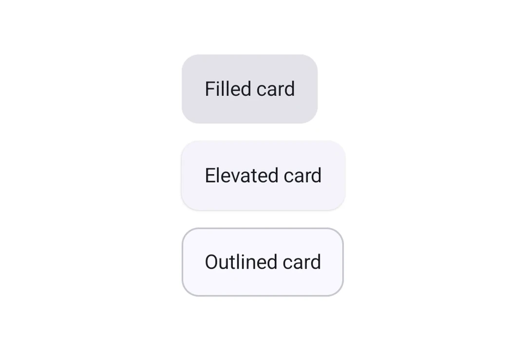
卡片类型
🌐 Card types
使用 Card(填充)、ElevatedCard 或 OutlinedCard 来表示不同的样式。
🌐 Use Card (filled), ElevatedCard, or OutlinedCard for different styles.
import { Host, Card, ElevatedCard, OutlinedCard, Text, Column } from '@expo/ui/jetpack-compose';
import { paddingAll } from '@expo/ui/jetpack-compose/modifiers';

export default function CardTypesExample() {
  return (
    <Host matchContents>
      <Column verticalArrangement={{ spacedBy: 12 }}>
        <Card>
          <Text modifiers={[paddingAll(16)]}>Filled card</Text>
        </Card>
        <ElevatedCard>
          <Text modifiers={[paddingAll(16)]}>Elevated card</Text>
        </ElevatedCard>
        <OutlinedCard>
          <Text modifiers={[paddingAll(16)]}>Outlined card</Text>
        </OutlinedCard>
      </Column>
    </Host>
  );
}
自定义高度
🌐 Custom elevation
使用 elevation 属性(以 dp 为单位)来控制阴影深度。在使用阴影高程的 ElevatedCard 上,高程最有意义。填充的 Card 默认使用色调高程,因此变化可能不明显。
🌐 Use the elevation prop (in dp) to control shadow depth. Elevation is most meaningful on ElevatedCard, which uses shadow elevation. Filled Card uses tonal elevation by default, so changes may be subtle.
import { Host, ElevatedCard, Text } from '@expo/ui/jetpack-compose';
import { paddingAll } from '@expo/ui/jetpack-compose/modifiers';

export default function ElevatedCardExample() {
  return (
    <Host matchContents>
      <ElevatedCard elevation={8}>
        <Text modifiers={[paddingAll(16)]}>Card with 8dp elevation</Text>
      </ElevatedCard>
    </Host>
  );
}
自定义边框
🌐 Custom border
Card 和 OutlinedCard 接受一个 border 属性来定制描边宽度和颜色。
import { Host, OutlinedCard, Text } from '@expo/ui/jetpack-compose';
import { paddingAll } from '@expo/ui/jetpack-compose/modifiers';

export default function OutlinedCardExample() {
  return (
    <Host matchContents>
      <OutlinedCard border={{ width: 2, color: '#6200EE' }}>
        <Text modifiers={[paddingAll(16)]}>Card with custom purple border</Text>
      </OutlinedCard>
    </Host>
  );
}
应用接口
🌐 API
import { Card, ElevatedCard, OutlinedCard } from '@expo/ui/jetpack-compose';
Components
Type: React.Element<ComponentType<CardProps>>
A card component that renders a filled card surface for content.
Type: React.Element<ComponentType<ElevatedCardProps>>
An elevated card component that provides a raised surface for content.
Type: React.Element<ComponentType<OutlinedCardProps>>
An outlined card component that provides a bordered surface for content.
Types
Border configuration for cards.
| Property | Type | Description |
|---|---|---|
| color(optional) | ColorValue | Border color. |
| width(optional) | number | Border width in dp. Default: 1 |
Colors for card's core elements.
| Property | Type | Description |
|---|---|---|
| containerColor(optional) | ColorValue | - |
| contentColor(optional) | ColorValue | - |