This documentation is available as Markdown for AI agents and LLMs. See the full Markdown index or append .md to any documentation URL.
进度指示器
用于显示操作状态的 Jetpack Compose 进度指示器组件。
Expo UI 进度指示器与官方 Jetpack Compose Progress Indicator API 匹配。
🌐 Expo UI Progress Indicators match the official Jetpack Compose Progress Indicator API.
安装
🌐 Installation
- npx expo install @expo/uiIf you are installing this in an existing React Native app, make sure to install expo in your project.
用法
🌐 Usage
线性进展
🌐 Linear progress
一个水平条,用于指示进度。为确定模式提供一个介于 0 和 1 之间的 progress 值。
🌐 A horizontal bar that fills to indicate progress. Provide a progress value between 0 and 1 for determinate mode.
import { Host, LinearProgressIndicator } from '@expo/ui/jetpack-compose';

export default function LinearExample() {
  return (
    <Host matchContents>
      <LinearProgressIndicator progress={0.5} />
    </Host>
  );
}
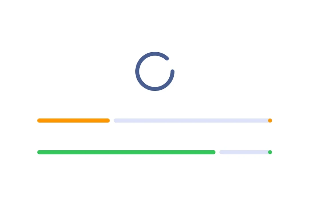
圆形进度
🌐 Circular progress
一个旋转的圆圈,其描边会增长以表示进度。
🌐 A spinning circle whose stroke grows to indicate progress.
import { Host, CircularProgressIndicator } from '@expo/ui/jetpack-compose';

export default function CircularExample() {
  return (
    <Host matchContents>
      <CircularProgressIndicator progress={0.75} />
    </Host>
  );
}
不确定
🌐 Indeterminate
省略 progress 属性以实现连续动画,而不指示特定的完成度。
🌐 Omit the progress prop to animate continuously without indicating a specific completion level.
import {
  CircularProgressIndicator,
  CircularWavyProgressIndicator,
  Column,
  Host,
  LinearProgressIndicator,
  LinearWavyProgressIndicator,
} from '@expo/ui/jetpack-compose';

export default function IndeterminateExample() {
  return (
    <Host matchContents>
      <Column verticalArrangement={{ spacedBy: 16 }}>
        <LinearProgressIndicator />
        <CircularProgressIndicator />
        <CircularWavyProgressIndicator />
        <LinearWavyProgressIndicator />
      </Column>
    </Host>
  );
}
自定义颜色
🌐 Custom colors
将 color 用于指示器,将 trackColor 用于背景轨道。
🌐 Use color for the indicator and trackColor for the background track.
import { Host, CircularProgressIndicator } from '@expo/ui/jetpack-compose';

export default function ColorsExample() {
  return (
    <Host matchContents>
      <CircularProgressIndicator progress={0.6} color="red" trackColor="#cccccc" />
    </Host>
  );
}
波浪形变体
🌐 Wavy variants
LinearWavyProgressIndicator 和 CircularWavyProgressIndicator 添加了来自 Material 3 Expressive 的表现性波浪动画。
import {
  Host,
  LinearWavyProgressIndicator,
  CircularWavyProgressIndicator,
  Column,
} from '@expo/ui/jetpack-compose';

export default function WavyExample() {
  return (
    <Host matchContents>
      <Column verticalArrangement={{ spacedBy: 16 }}>
        <LinearWavyProgressIndicator progress={0.6} />
        <CircularWavyProgressIndicator progress={0.6} />
      </Column>
    </Host>
  );
}
应用接口
🌐 API
import {
  LinearProgressIndicator,
  CircularProgressIndicator,
  LinearWavyProgressIndicator,
  CircularWavyProgressIndicator,
} from '@expo/ui/jetpack-compose';
Components
Type: React.Element<ComponentType<CircularProgressIndicatorProps>>
A circular progress indicator that displays progress in a circular format.
Matches the Jetpack Compose CircularProgressIndicator.
StrokeCap • Default: 'round'Stroke cap style for the indicator ends.
Type: React.Element<ComponentType<CircularWavyProgressIndicatorProps>>
A circular progress indicator with wavy animation style.
Matches the Jetpack Compose CircularWavyProgressIndicator.
Type: React.Element<ComponentType<LinearProgressIndicatorProps>>
A linear progress indicator that displays progress in a horizontal bar.
Matches the Jetpack Compose LinearProgressIndicator.
DrawStopIndicatorConfigConfiguration for the stop indicator dot at the end of the determinate progress track.
StrokeCap • Default: 'round'Stroke cap style for the indicator ends.
Type: React.Element<ComponentType<LinearWavyProgressIndicatorProps>>
A linear progress indicator with wavy animation style.
Matches the Jetpack Compose LinearWavyProgressIndicator.
Types
Configuration for the stop indicator dot at the end of the determinate linear progress track. When provided, draws a stop indicator with the given options. Omit to use the Compose default.
| Property | Type | Description |
|---|---|---|
| color(optional) | ColorValue | Color of the stop indicator. Defaults to the indicator's color. |
| stopSize(optional) | number | Size of the stop indicator in dp. Defaults to the Material 3 default. |
| strokeCap(optional) | StrokeCap | Stroke cap style for the stop indicator. Defaults to the indicator's strokeCap. |
Common props shared by all progress indicator variants.
| Property | Type | Description |
|---|---|---|
| color(optional) | ColorValue | Progress indicator color. |
| modifiers(optional) | ModifierConfig[] | Modifiers for the component. |
| progress(optional) | number | null | The current progress value between |
| trackColor(optional) | ColorValue | Track (background) color. |