This documentation is available as Markdown for AI agents and LLMs. See the full Markdown index or append .md to any documentation URL.
芯片
Jetpack Compose Chip 组件用于显示紧凑元素。
Expo UI 芯片与官方 Jetpack Compose Chip API 相匹配。每种芯片类型都是一个独立的组件:AssistChip、FilterChip、InputChip 和 SuggestionChip。
🌐 Expo UI Chips match the official Jetpack Compose Chip API. Each chip type is a separate component: AssistChip, FilterChip, InputChip, and SuggestionChip.
安装
🌐 Installation
- npx expo install @expo/uiIf you are installing this in an existing React Native app, make sure to install expo in your project.
用法
🌐 Usage
辅助芯片
🌐 Assist chip
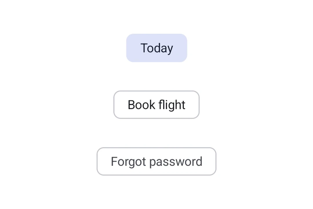
辅助芯片帮助用户采取行动或开始任务,例如预订航班或打开地图。它们通常作为对用户输入的临时界面元素出现。
🌐 Assist chips help users take actions or start tasks, such as booking a flight or opening a map. They often appear as temporary UI elements in response to user input.
import { Host, AssistChip, Icon, Text } from '@expo/ui/jetpack-compose';

export default function AssistChipExample() {
  return (
    <Host matchContents>
      <AssistChip onClick={() => console.log('Opening flight booking...')}>
        <AssistChip.Label>
          <Text>Book Flight</Text>
        </AssistChip.Label>
        <AssistChip.LeadingIcon>
          <Icon source={require('./assets/flight.xml')} size={18} />
        </AssistChip.LeadingIcon>
      </AssistChip>
    </Host>
  );
}
滤波芯片
🌐 Filter chip
筛选芯片允许用户从一组选项中细化内容。它们支持选中状态,并且通常用于搜索栏或内容过滤。
🌐 Filter chips allow users to refine content from a set of options. They support a selected state and are commonly used in search bars or content filtering.
import { useState } from 'react';
import { Host, FilterChip, Text } from '@expo/ui/jetpack-compose';

export default function FilterChipExample() {
  const [selected, setSelected] = useState(false);

  return (
    <Host matchContents>
      <FilterChip selected={selected} onClick={() => setSelected(!selected)}>
        <FilterChip.Label>
          <Text>Images</Text>
        </FilterChip.Label>
      </FilterChip>
    </Host>
  );
}
输入芯片
🌐 Input chip
输入芯片表示用户输入的离散信息片段,例如文本字段中的标签。它们支持头像、尾随图标,并且可以被关闭。
🌐 Input chips represent discrete pieces of information entered by a user, such as tags in a text field. They support avatars, trailing icons, and can be dismissed.
import { useState } from 'react';
import { Host, InputChip, Icon, Text, FlowRow } from '@expo/ui/jetpack-compose';

export default function InputChipExample() {
  const [chips, setChips] = useState(['Work', 'Travel', 'News']);

  return (
    <Host matchContents>
      <FlowRow horizontalArrangement={{ spacedBy: 8 }}>
        {chips.map(label => (
          <InputChip
            key={label}
            selected
            onClick={() => setChips(prev => prev.filter(c => c !== label))}>
            <InputChip.Label>
              <Text>{label}</Text>
            </InputChip.Label>
            <InputChip.TrailingIcon>
              <Icon source={require('./assets/close.xml')} size={18} />
            </InputChip.TrailingIcon>
          </InputChip>
        ))}
      </FlowRow>
    </Host>
  );
}
建议芯片
🌐 Suggestion chip
建议芯片通过提供动态生成的建议来帮助缩小用户的意图,例如聊天中的快速回复选项或搜索优化。
🌐 Suggestion chips help narrow a user's intent by presenting dynamically generated suggestions, such as quick-reply options in a chat or search refinements.
import { Host, SuggestionChip, Text } from '@expo/ui/jetpack-compose';

export default function SuggestionChipExample() {
  return (
    <Host matchContents>
      <SuggestionChip onClick={() => console.log('Searching nearby...')}>
        <SuggestionChip.Label>
          <Text>Nearby</Text>
        </SuggestionChip.Label>
      </SuggestionChip>
    </Host>
  );
}
应用接口
🌐 API
import { AssistChip, FilterChip, InputChip, SuggestionChip } from '@expo/ui/jetpack-compose';
Components
Type: React.Element<AssistChipProps>
An assist chip that helps users complete actions and primary tasks.
boolean • Default: trueWhether the chip is enabled and can be clicked.
Type: React.Element<FilterChipProps>
A filter chip component for refining content with selection/deselection.
FilterChipColorsColors for the chip's container, label, icon, and selected states.
Type: React.Element<InputChipProps>
An input chip that represents user input and can be dismissed.
InputChipColorsColors for the chip's container, label, icons, and selected states.
boolean • Default: trueWhether the chip is enabled and can be interacted with.
Type: React.Element<SuggestionChipProps>
A suggestion chip that offers contextual suggestions and recommendations.
boolean • Default: trueWhether the chip is enabled and can be clicked.
Types
Colors for AssistChip.
| Property | Type | Description |
|---|---|---|
| containerColor(optional) | ColorValue | - |
| labelColor(optional) | ColorValue | - |
| leadingIconContentColor(optional) | ColorValue | - |
| trailingIconContentColor(optional) | ColorValue | - |
Border configuration for chips.
| Property | Type | Description |
|---|---|---|
| color(optional) | ColorValue | Border color. |
| width(optional) | number | Border width in dp. Default: 1 |
Colors for FilterChip.
| Property | Type | Description |
|---|---|---|
| containerColor(optional) | ColorValue | - |
| iconColor(optional) | ColorValue | - |
| labelColor(optional) | ColorValue | - |
| selectedContainerColor(optional) | ColorValue | - |
| selectedLabelColor(optional) | ColorValue | - |
| selectedLeadingIconColor(optional) | ColorValue | - |
| selectedTrailingIconColor(optional) | ColorValue | - |
Colors for InputChip.
| Property | Type | Description |
|---|---|---|
| containerColor(optional) | ColorValue | - |
| labelColor(optional) | ColorValue | - |
| leadingIconColor(optional) | ColorValue | - |
| selectedContainerColor(optional) | ColorValue | - |
| selectedLabelColor(optional) | ColorValue | - |
| selectedLeadingIconColor(optional) | ColorValue | - |
| selectedTrailingIconColor(optional) | ColorValue | - |
| trailingIconColor(optional) | ColorValue | - |
Colors for SuggestionChip.
| Property | Type | Description |
|---|---|---|
| containerColor(optional) | ColorValue | - |
| iconContentColor(optional) | ColorValue | - |
| labelColor(optional) | ColorValue | - |