This documentation is available as Markdown for AI agents and LLMs. See the full Markdown index or append .md to any documentation URL.
构建一个屏幕
在本教程中,了解如何使用 React Native 的 Pressable 和 Expo Image 等组件来构建屏幕。
在本章中,我们将创建 StickerSmash 应用的第一个屏幕。
🌐 In this chapter, we'll create the first screen of the StickerSmash app.
上方的屏幕显示一个图片和两个按钮。应用用户可以使用其中一个按钮选择图片。第一个按钮允许用户从他们的设备中选择图片。第二个按钮允许用户使用应用提供的默认图片继续。
🌐 The screen above displays an image and two buttons. The app user can select an image using one of the two buttons. The first button allows the user to select an image from their device. The second button allows the user to continue with a default image provided by the app.
一旦用户选择了一张图片,他们就可以给它添加贴纸。那我们就开始创建这个界面吧。
🌐 Once the user selects an image, they can add a sticker to it. So, let's start creating this screen.
使用 Pressable、Expo Image 和其他核心组件构建 StickerSmash 应用的第一个屏幕,以创建一个图片选择器布局。
1
拆开屏幕
🌐 Break down the screen
在我们通过编写代码来构建这个界面之前,让我们先将其分解为一些基本元素。
🌐 Before we build this screen by writing code, let's break it down into some essential elements.
有两个基本要素:
🌐 There are two essential elements:
- 屏幕中央显示着一张大图片
- 屏幕下半部分有两个按钮
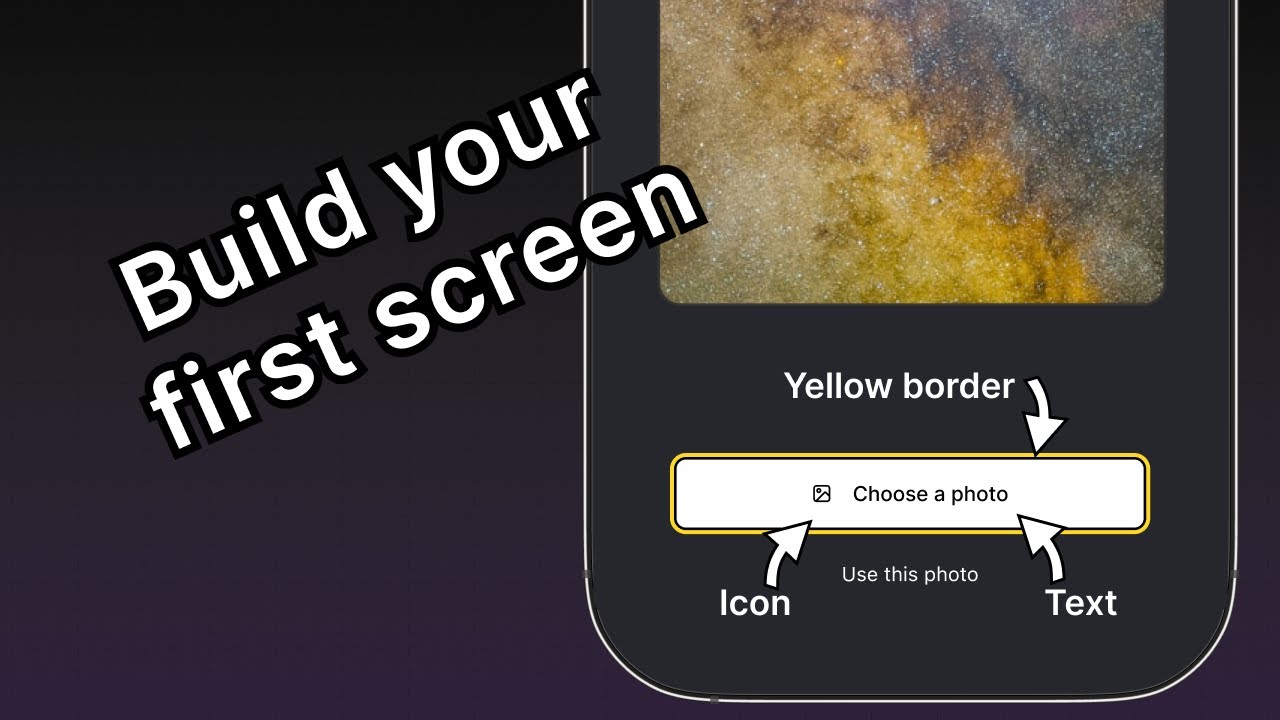
第一个按钮包含多个组件。父元素提供黄色边框,并在一行内包含图标和文本组件。
🌐 The first button contains multiple components. The parent element provides a yellow border, and contains an icon and text components inside a row.
现在我们已经将界面拆分成更小的部分,我们可以开始编码了。
🌐 Now that we've broken down the UI into smaller chunks, we're ready to start coding.
2
显示图片
🌐 Display the image
我们将使用 expo-image 库在应用中显示图片。它提供了一个跨平台的 <Image> 组件来加载和渲染图片。它已经包含在我们使用的默认项目模板中。
🌐 We'll use expo-image library to display the image in the app. It provides a cross-platform <Image> component to load and render an image. It is already included in the default project template we're using.
Image 组件将图片的来源作为其值。来源可以是静态资源或 URL。例如,来自 assets/images 目录的资源是静态的。它也可以来自 网络 作为 uri 属性。
🌐 The Image component takes the source of an image as its value. The source can be either a static asset or a URL. For example, the source required from assets/images directory is static. It can also come from Network as a uri property.
在 app/(tabs)/index.tsx 文件中使用 Image 组件:
🌐 To use the Image component in app/(tabs)/index.tsx file:
- 从
expo-image库中导入Image。 - 创建一个
PlaceholderImage变量,将 assets/images/background-image.png 文件作为Image组件的source属性使用。
import { View, StyleSheet } from 'react-native';
import { Image } from 'expo-image';

const PlaceholderImage = require('@/assets/images/background-image.png');

export default function Index() {
  return (
    <View style={styles.container}>
      <View style={styles.imageContainer}>
        <Image source={PlaceholderImage} style={styles.image} />
      </View>
    </View>
  );
}

const styles = StyleSheet.create({
  container: {
    flex: 1,
    backgroundColor: '#25292e',
    alignItems: 'center',
  },
  imageContainer: {
    flex: 1,
  },
  image: {
    width: 320,
    height: 440,
    borderRadius: 18,
  },
});
3
将组件划分到文件中
🌐 Divide components into files
随着我们向这个界面添加更多组件,让我们把代码分成多个文件。在整个教程中,我们将使用 components 目录来创建自定义组件。
🌐 Let's divide the code into multiple files as we add more components to this screen. Throughout this tutorial, we'll use the components directory to create custom components.
- 创建一个顶层的 components 目录,并在其中创建 ImageViewer.tsx 文件。
- 将显示图片的代码与
image样式一起移动到此文件中。
import { ImageSourcePropType, StyleSheet } from 'react-native';
import { Image } from 'expo-image';

type Props = {
  imgSource: ImageSourcePropType;
};

export default function ImageViewer({ imgSource }: Props) {
  return <Image source={imgSource} style={styles.image} />;
}

const styles = StyleSheet.create({
  image: {
    width: 320,
    height: 440,
    borderRadius: 18,
  },
});
信息 由于 ImageViewer 是一个自定义组件,我们将其放在单独的目录中,而不是 app 目录中。app 目录中的每个文件要么是布局文件,要么是路由文件。更多信息,请参见 非导航组件位于 app 目录之外。
导入 ImageViewer 并在 app/(tabs)/index.tsx 中使用它:
🌐 Import ImageViewer and use it in the app/(tabs)/index.tsx:
import { StyleSheet, View } from 'react-native';

import ImageViewer from '@/components/ImageViewer';

const PlaceholderImage = require('@/assets/images/background-image.png');

export default function Index() {
  return (
    <View style={styles.container}>
      <View style={styles.imageContainer}>
        <ImageViewer imgSource={PlaceholderImage} />
      </View>
    </View>
  );
}

const styles = StyleSheet.create({
  container: {
    flex: 1,
    backgroundColor: '#25292e',
    alignItems: 'center',
  },
  imageContainer: {
    flex: 1,
  },
});
导入语句中的 @ 是什么?
@ 符号是一个自定义的 路径别名,用于导入自定义组件和其他模块,而不是使用相对路径。Expo CLI 会自动在 tsconfig.json 中配置它。
🌐 The @ symbol is a custom path alias for importing custom components and other modules instead of relative paths. Expo CLI automatically configures it in tsconfig.json.
4
使用 Pressable 创建按钮
🌐 Create buttons using Pressable
React Native 包含几种用于处理触摸事件的不同组件,但 <Pressable> 因其灵活性而被推荐。它可以检测单次点击、长按,当按钮按下和释放时触发不同的事件,等等。
🌐 React Native includes a few different components for handling touch events, but <Pressable> is recommended for its flexibility. It can detect single taps, long presses, trigger separate events when the button is pushed in and released, and more.
在设计中,我们需要创建两个按钮。每个按钮都有不同的样式和标签。让我们先为这些按钮创建一个可复用的组件。在 components 目录下创建一个 Button.tsx 文件,并使用以下代码:
🌐 In the design, there are two buttons we need to create. Each has a different style and label. Let's start by creating a reusable component for these buttons. Create a Button.tsx file inside the components directory with the following code:
import { StyleSheet, View, Pressable, Text } from 'react-native';

type Props = {
  label: string;
};

export default function Button({ label }: Props) {
  return (
    <View style={styles.buttonContainer}>
      <Pressable style={styles.button} onPress={() => alert('You pressed a button.')}>
        <Text style={styles.buttonLabel}>{label}</Text>
      </Pressable>
    </View>
  );
}

const styles = StyleSheet.create({
  buttonContainer: {
    width: 320,
    height: 68,
    marginHorizontal: 20,
    alignItems: 'center',
    justifyContent: 'center',
    padding: 3,
  },
  button: {
    borderRadius: 10,
    width: '100%',
    height: '100%',
    alignItems: 'center',
    justifyContent: 'center',
    flexDirection: 'row',
  },
  buttonLabel: {
    color: '#fff',
    fontSize: 16,
  },
});
当用户点击屏幕上的任意按钮时,应用会显示一个提示。这是因为 <Pressable> 在其 onPress 属性上调用了 alert()。让我们将这个组件导入到 app/(tabs)/index.tsx 文件中,并为包含这些按钮的 <View> 添加样式:
🌐 The app displays an alert when the user taps any of the buttons on the screen. It happens because <Pressable> calls alert() on its onPress prop. Let's import this component into app/(tabs)/index.tsx file and add styles for the <View> that encapsulates these buttons:
import { View, StyleSheet } from 'react-native';

import Button from '@/components/Button';
import ImageViewer from '@/components/ImageViewer';

const PlaceholderImage = require("@/assets/images/background-image.png");

export default function Index() {
  return (
    <View style={styles.container}>
      <View style={styles.imageContainer}>
        <ImageViewer imgSource={PlaceholderImage} />
      </View>
      <View style={styles.footerContainer}>
        <Button label="Choose a photo" />
        <Button label="Use this photo" />
      </View>
    </View>
  );
}

const styles = StyleSheet.create({
  container: {
    flex: 1,
    backgroundColor: '#25292e',
    alignItems: 'center',
  },
  imageContainer: {
    flex: 1,
    paddingTop: 28,
  },
  footerContainer: {
    flex: 1 / 3,
    alignItems: 'center',
  },
});
让我们来看一下我们的应用在 Android、iOS 和网页上的表现:
🌐 Let's take a look at our app on Android, iOS and the web:
第二个标有“使用此照片”的按钮与设计中的实际按钮相似。然而,第一个按钮需要更多样式来符合设计。
🌐 The second button with the label "Use this photo" resembles the actual button from the design. However, the first button needs more styling to match the design.
5
增强可重用按钮组件
🌐 Enhance the reusable button component
“选择照片”按钮需要与“使用此照片”按钮不同的样式,因此我们将添加一个新的按钮主题属性,以便应用 primary 主题。这个按钮在标签前面还有一个图标。我们将使用来自 @expo/vector-icons 库的图标。
🌐 The "Choose a photo" button requires different styling than the "Use this photo" button, so we will add a new button theme prop that will allow us to apply a primary theme. This button also has an icon before the label. We will use an icon from the @expo/vector-icons library.
要在按钮上加载并显示图标,我们可以使用库中的 FontAwesome。修改 components/Button.tsx,添加以下代码片段:
🌐 To load and display the icon on the button, let's use FontAwesome from the library. Modify components/Button.tsx to add the following code snippet:
import { StyleSheet, View, Pressable, Text } from 'react-native';
import FontAwesome from '@expo/vector-icons/FontAwesome';

type Props = {
  label: string;
  theme?: 'primary';
};

export default function Button({ label, theme }: Props) {
  if (theme === 'primary') {
  return (
      <View
        style={[
          styles.buttonContainer,
          { borderWidth: 4, borderColor: '#ffd33d', borderRadius: 18 },
        ]}>
        <Pressable
          style={[styles.button, { backgroundColor: '#fff' }]}
          onPress={() => alert('You pressed a button.')}>
          <FontAwesome name="picture-o" size={18} color="#25292e" style={styles.buttonIcon} />
          <Text style={[styles.buttonLabel, { color: '#25292e' }]}>{label}</Text>
        </Pressable>
      </View>
    );
  }

  return (
    <View style={styles.buttonContainer}>
      <Pressable style={styles.button} onPress={() => alert('You pressed a button.')}>
        <Text style={styles.buttonLabel}>{label}</Text>
      </Pressable>
    </View>
  );
}

const styles = StyleSheet.create({
  buttonContainer: {
    width: 320,
    height: 68,
    marginHorizontal: 20,
    alignItems: 'center',
    justifyContent: 'center',
    padding: 3,
  },
  button: {
    borderRadius: 10,
    width: '100%',
    height: '100%',
    alignItems: 'center',
    justifyContent: 'center',
    flexDirection: 'row',
  },
  buttonIcon: {
    paddingRight: 8,
  },
  buttonLabel: {
    color: '#fff',
    fontSize: 16,
  },
});
让我们来学习上面的代码是做什么的:
🌐 Let's learn what the above code does:
- 主要主题按钮使用内联样式,它会用直接传递给
style属性的对象覆盖在StyleSheet.create()中定义的样式。 - 主主题中的
<Pressable>组件使用了一个backgroundColor属性,其值为#fff来将按钮的背景设置为白色。如果我们将这个属性添加到styles.button上,背景颜色的值将同时应用于主主题和未样式化主题。 - 内联样式使用 JavaScript,并覆盖特定值的默认样式。
现在,修改 app/(tabs)/index.tsx 文件,在第一个按钮上使用 theme="primary" 属性。
🌐 Now, modify the app/(tabs)/index.tsx file to use the theme="primary" prop on the first button.
import { View, StyleSheet } from 'react-native';

import Button from '@/components/Button';
import ImageViewer from '@/components/ImageViewer';

const PlaceholderImage = require('@/assets/images/background-image.png');

export default function Index() {
  return (
    <View style={styles.container}>
      <View style={styles.imageContainer}>
        <ImageViewer imgSource={PlaceholderImage} />
      </View>
      <View style={styles.footerContainer}>
        <Button theme="primary" label="Choose a photo" />
        <Button label="Use this photo" />
      </View>
    </View>
  );
}

const styles = StyleSheet.create({
  container: {
    flex: 1,
    backgroundColor: '#25292e',
    alignItems: 'center',
  },
  imageContainer: {
    flex: 1,
  },
  footerContainer: {
    flex: 1 / 3,
    alignItems: 'center',
  },
});
让我们来看一下我们的应用在 Android、iOS 和网页上的表现:
🌐 Let's take a look at our app on Android, iOS and the web:
概括
🌐 Summary
Chapter 3: Build a screen
我们已经成功实现了初始设计,开始构建我们应用的第一个界面。
在下一章,我们将添加从设备的媒体库中选择图片的功能。