This documentation is available as Markdown for AI agents and LLMs. See the full Markdown index or append .md to any documentation URL.
创建模态
在本教程中,了解如何创建 React Native 模式来选择图片。
React Native 提供了一个 <Modal> 组件,可以在应用的其他内容之上显示内容。通常,模态框用于吸引用户注意重要信息或引导他们采取行动。例如,在第三章中,按下按钮后,我们使用了 alert() 来显示一些占位文本。这就是模态组件显示覆盖层的方式。
🌐 React Native provides a <Modal> component that presents content above the rest of your app. In general, modals are used to draw a user's attention toward critical information or guide them to take action. For example, in the third chapter, after pressing the button, we used alert() to display some placeholder text. That's how a modal component displays an overlay.
在本章中,我们将创建一个显示表情符号选择器列表的模式。
🌐 In this chapter, we'll create a modal that shows an emoji picker list.
使用 React Native 的 Modal API 构建一个模态组件,以显示表情符号选择器并处理用户交互。
1
声明一个状态变量来显示按钮
🌐 Declare a state variable to show buttons
在实现模态窗口之前,我们将添加三个新按钮。这些按钮会在用户从媒体库选择图片或使用占位符图片后显示。其中一个按钮将触发表情选择器模态窗口。
🌐 Before implementing the modal, we are going to add three new buttons. These buttons are visible after the user picks an image from the media library or uses the placeholder image. One of these buttons will trigger the emoji picker modal.
在 app/(tabs)/index.tsx 中:
🌐 In app/(tabs)/index.tsx:
- 声明一个布尔类型的状态变量
showAppOptions,用于显示或隐藏打开模态框的按钮,以及其他一些选项。当应用屏幕加载时,我们将其设置为false,以便在选择图片之前不显示这些选项。当用户选择图片或使用占位图片时,我们将其设置为true。 - 更新
pickImageAsync()函数,在用户选择图片后将showAppOptions的值设置为true。 - 通过添加一个值为以下内容的
onPress属性来更新没有主题的按钮。
import { View, StyleSheet } from 'react-native';
import * as ImagePicker from 'expo-image-picker';
import { useState } from 'react';

import Button from '@/components/Button';
import ImageViewer from '@/components/ImageViewer';

const PlaceholderImage = require('@/assets/images/background-image.png');

export default function Index() {
  const [selectedImage, setSelectedImage] = useState<string | undefined>(undefined);
  const [showAppOptions, setShowAppOptions] = useState<boolean>(false);

  const pickImageAsync = async () => {
    let result = await ImagePicker.launchImageLibraryAsync({
      mediaTypes: ['images'],
      allowsEditing: true,
      quality: 1,
    });

    if (!result.canceled) {
      setSelectedImage(result.assets[0].uri);
      setShowAppOptions(true);
    } else {
      alert('You did not select any image.');
    }
  };

  return (
    <View style={styles.container}>
      <View style={styles.imageContainer}>
        <ImageViewer imgSource={PlaceholderImage} selectedImage={selectedImage} />
      </View>
      {showAppOptions ? (
        <View />
      ) : (
        <View style={styles.footerContainer}>
          <Button theme="primary" label="Choose a photo" onPress={pickImageAsync} />
          <Button label="Use this photo" onPress={() => setShowAppOptions(true)} />
        </View>
      )}
    </View>
  );
}

const styles = StyleSheet.create({
  container: {
    flex: 1,
    backgroundColor: '#25292e',
    alignItems: 'center',
  },
  imageContainer: {
    flex: 1,
  },
  footerContainer: {
    flex: 1 / 3,
    alignItems: 'center',
  },
});
在上面的代码片段中,我们根据 showAppOptions 的值渲染 Button 组件,并在三元运算符块中移动按钮。当 showAppOptions 的值为 true 时,渲染一个空的 <View> 组件。我们将在下一步处理这个状态。
🌐 In the above snippet, we're rendering the Button component based on the value of showAppOptions and moving the buttons in the ternary operator block. When the value of showAppOptions is true, render an empty <View> component. We'll address this state in the next step.
现在,我们可以移除 components/Button.tsx 中 Button 组件上的 alert,并在渲染第二个按钮时更新 onPress 属性:
🌐 Now, we can remove the alert on the Button component and update the onPress prop when rendering the second button in the components/Button.tsx:
<Pressable style={styles.button} onPress={onPress}>
2
添加按钮
🌐 Add buttons
让我们来分解一下本章中要实现的选项按钮布局。设计如下所示:
🌐 Let's break down the layout of the option buttons we'll implement in this chapter. The design looks like this:
它包含一个名为 <View> 的父元素,其中有三个按钮排成一行。中间带有加号图标(+)的按钮将打开模态框,并且其样式与另外两个按钮不同。
🌐 It contains a parent <View> with three buttons aligned in a row. The button in the middle with the plus icon (+) will open the modal and is styled differently than the other two buttons.
在 components 目录下,创建一个新的 CircleButton.tsx 文件,内容如下:
🌐 Inside the components directory, create a new CircleButton.tsx file with the following code:
import { View, Pressable, StyleSheet } from 'react-native';
import MaterialIcons from '@expo/vector-icons/MaterialIcons';

type Props = {
  onPress: () => void;
};

export default function CircleButton({ onPress }: Props) {
  return (
    <View style={styles.circleButtonContainer}>
      <Pressable style={styles.circleButton} onPress={onPress}>
        <MaterialIcons name="add" size={38} color="#25292e" />
      </Pressable>
    </View>
  );
}

const styles = StyleSheet.create({
  circleButtonContainer: {
    width: 84,
    height: 84,
    marginHorizontal: 60,
    borderWidth: 4,
    borderColor: '#ffd33d',
    borderRadius: 42,
    padding: 3,
  },
  circleButton: {
    flex: 1,
    justifyContent: 'center',
    alignItems: 'center',
    borderRadius: 42,
    backgroundColor: '#fff',
  },
});
为了显示加号图标,该按钮使用了 @expo/vector-icons 库中的 <MaterialIcons> 图标集。
🌐 To render the plus icon, this button uses the <MaterialIcons> icon set from the @expo/vector-icons library.
另外两个按钮也使用 <MaterialIcons> 来显示垂直排列的文本标签和图标。在 components 目录下创建一个名为 IconButton.tsx 的文件。该组件接受三个属性(props):
🌐 The other two buttons also use <MaterialIcons> to display vertically aligned text labels and icons. Create a file named IconButton.tsx inside the components directory. This component accepts three props:
icon:与MaterialIcons库图标对应的名称。label:按钮上显示的文本标签。onPress:当用户按下按钮时,会调用此函数。
import { Pressable, StyleSheet, Text } from 'react-native';
import MaterialIcons from '@expo/vector-icons/MaterialIcons';

type Props = {
  icon: keyof typeof MaterialIcons.glyphMap;
  label: string;
  onPress: () => void;
};

export default function IconButton({ icon, label, onPress }: Props) {
  return (
    <Pressable style={styles.iconButton} onPress={onPress}>
      <MaterialIcons name={icon} size={24} color="#fff" />
      <Text style={styles.iconButtonLabel}>{label}</Text>
    </Pressable>
  );
}

const styles = StyleSheet.create({
  iconButton: {
    justifyContent: 'center',
    alignItems: 'center',
  },
  iconButtonLabel: {
    color: '#fff',
    marginTop: 12,
  },
});
在 app/(tabs)/index.tsx 中:
🌐 Inside app/(tabs)/index.tsx:
- 导入
CircleButton和IconButton组件以显示它们。 - 为这些按钮添加三个占位函数。当用户按下重置按钮时,会调用
onReset()函数,使图片选择按钮再次出现。我们稍后会为其他两个函数添加功能。
import { View, StyleSheet } from 'react-native';
import * as ImagePicker from 'expo-image-picker';
import { useState } from 'react';

import Button from '@/components/Button';
import ImageViewer from '@/components/ImageViewer';
import IconButton from '@/components/IconButton';
import CircleButton from '@/components/CircleButton';

const PlaceholderImage = require('@/assets/images/background-image.png');

export default function Index() {
  const [selectedImage, setSelectedImage] = useState<string | undefined>(undefined);
  const [showAppOptions, setShowAppOptions] = useState<boolean>(false);

  const pickImageAsync = async () => {
    let result = await ImagePicker.launchImageLibraryAsync({
      mediaTypes: ['images'],
      allowsEditing: true,
      quality: 1,
    });

    if (!result.canceled) {
      setSelectedImage(result.assets[0].uri);
      setShowAppOptions(true);
    } else {
      alert('You did not select any image.');
    }
  };

  const onReset = () => {
    setShowAppOptions(false);
  };

  const onAddSticker = () => {
    // we will implement this later
  };

  const onSaveImageAsync = async () => {
    // we will implement this later
  };

  return (
    <View style={styles.container}>
      <View style={styles.imageContainer}>
        <ImageViewer imgSource={PlaceholderImage} selectedImage={selectedImage} />
      </View>
      {showAppOptions ? (
        <View style={styles.optionsContainer}>
          <View style={styles.optionsRow}>
            <IconButton icon="refresh" label="Reset" onPress={onReset} />
            <CircleButton onPress={onAddSticker} />
            <IconButton icon="save-alt" label="Save" onPress={onSaveImageAsync} />
          </View>
        </View>
      ) : (
        <View style={styles.footerContainer}>
          <Button theme="primary" label="Choose a photo" onPress={pickImageAsync} />
          <Button label="Use this photo" onPress={() => setShowAppOptions(true)} />
        </View>
      )}
    </View>
  );
}

const styles = StyleSheet.create({
  container: {
    flex: 1,
    backgroundColor: '#25292e',
    alignItems: 'center',
  },
  imageContainer: {
    flex: 1,
  },
  footerContainer: {
    flex: 1 / 3,
    alignItems: 'center',
  },
  optionsContainer: {
    position: 'absolute',
    bottom: 80,
  },
  optionsRow: {
    alignItems: 'center',
    flexDirection: 'row',
  },
});
让我们来看一下我们的应用在 Android、iOS 和网页上的表现:
🌐 Let's take a look at our app on Android, iOS and the web:
3
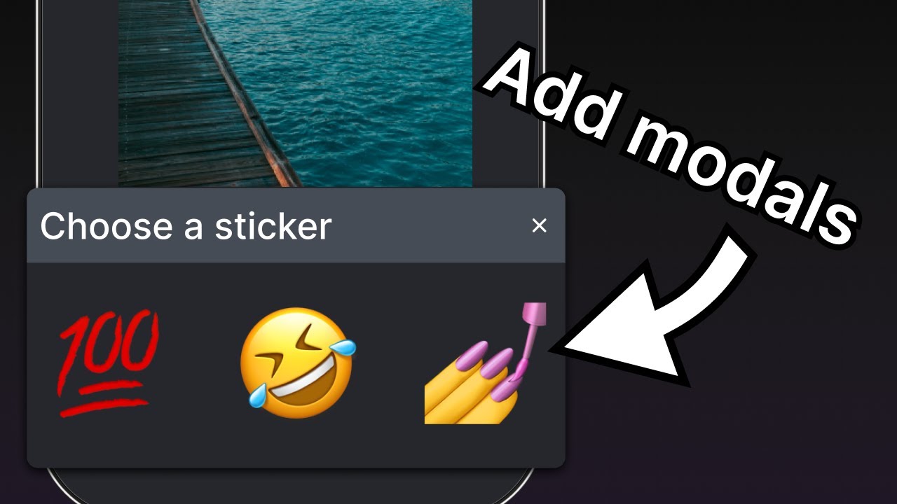
创建一个表情选择器模态窗口
🌐 Create an emoji picker modal
这个模态框允许用户从可用的表情符号列表中选择一个表情。在 components 目录下创建一个 EmojiPicker.tsx 文件。该组件接受三个属性:
🌐 The modal allows the user to choose an emoji from a list of available emoji. Create an EmojiPicker.tsx file inside the components directory. This component accepts three props:
isVisible:一个布尔值,用于确定模态窗口的可见状态。onClose:关闭模态框的函数。children:稍后用于显示表情符号列表。
import { Modal, View, Text, Pressable, StyleSheet } from 'react-native';
import { PropsWithChildren } from 'react';
import MaterialIcons from '@expo/vector-icons/MaterialIcons';

type Props = PropsWithChildren<{
  isVisible: boolean;
  onClose: () => void;
}>;

export default function EmojiPicker({ isVisible, children, onClose }: Props) {
  return (
    <View>
      <Modal animationType="slide" transparent={true} visible={isVisible}>
        <View style={styles.modalContent}>
          <View style={styles.titleContainer}>
            <Text style={styles.title}>Choose a sticker</Text>
            <Pressable onPress={onClose}>
              <MaterialIcons name="close" color="#fff" size={22} />
            </Pressable>
          </View>
          {children}
        </View>
      </Modal>
    </View>
  );
}

const styles = StyleSheet.create({
  modalContent: {
    height: '25%',
    width: '100%',
    backgroundColor: '#25292e',
    borderTopRightRadius: 18,
    borderTopLeftRadius: 18,
    position: 'absolute',
    bottom: 0,
  },
  titleContainer: {
    height: '16%',
    backgroundColor: '#464C55',
    borderTopRightRadius: 10,
    borderTopLeftRadius: 10,
    paddingHorizontal: 20,
    flexDirection: 'row',
    alignItems: 'center',
    justifyContent: 'space-between',
  },
  title: {
    color: '#fff',
    fontSize: 16,
  },
});
让我们来学习上面的代码是做什么的:
🌐 Let's learn what the above code does:
<Modal>组件显示标题和关闭按钮。- 它的
visible属性取isVisible的值,并控制模态框是打开还是关闭。 - 它的
transparent属性是一个布尔值,用于确定模态框是否填充整个视图。 - 它的
animationType属性决定了它如何进入和离开屏幕。在这种情况下,它是从屏幕底部滑入的。 - 最后,当用户按下关闭
<Pressable>时,<EmojiPicker>会调用onClose属性。
现在,让我们修改 app/(tabs)/index.tsx:
🌐 Now, let's modify the app/(tabs)/index.tsx:
- 导入
<EmojiPicker>组件。 - 使用
useState钩子创建一个isModalVisible状态变量。它的默认值是false,这会在用户按下按钮打开模态框之前隐藏它。 - 在
onAddSticker()函数中替换注释,当用户按下按钮时将isModalVisible变量更新为true。这将打开表情选择器。 - 创建
onModalClose()函数以更新isModalVisible状态变量。 - 将
<EmojiPicker>组件放置在Index组件的底部。
import { View, StyleSheet } from 'react-native';
import * as ImagePicker from 'expo-image-picker';
import { useState } from 'react';

import Button from '@/components/Button';
import ImageViewer from '@/components/ImageViewer';
import IconButton from '@/components/IconButton';
import CircleButton from '@/components/CircleButton';
import EmojiPicker from '@/components/EmojiPicker';

const PlaceholderImage = require('@/assets/images/background-image.png');

export default function Index() {
  const [selectedImage, setSelectedImage] = useState<string | undefined>(undefined);
  const [showAppOptions, setShowAppOptions] = useState<boolean>(false);
  const [isModalVisible, setIsModalVisible] = useState<boolean>(false);

  const pickImageAsync = async () => {
    let result = await ImagePicker.launchImageLibraryAsync({
      mediaTypes: ['images'],
      allowsEditing: true,
      quality: 1,
    });

    if (!result.canceled) {
      setSelectedImage(result.assets[0].uri);
      setShowAppOptions(true);
    } else {
      alert('You did not select any image.');
    }
  };

  const onReset = () => {
    setShowAppOptions(false);
  };

  const onAddSticker = () => {
    setIsModalVisible(true);
  };

  const onModalClose = () => {
    setIsModalVisible(false);
  };

  const onSaveImageAsync = async () => {
    // we will implement this later
  };

  return (
    <View style={styles.container}>
      <View style={styles.imageContainer}>
        <ImageViewer imgSource={PlaceholderImage} selectedImage={selectedImage} />
      </View>
      {showAppOptions ? (
        <View style={styles.optionsContainer}>
          <View style={styles.optionsRow}>
            <IconButton icon="refresh" label="Reset" onPress={onReset} />
            <CircleButton onPress={onAddSticker} />
            <IconButton icon="save-alt" label="Save" onPress={onSaveImageAsync} />
          </View>
        </View>
      ) : (
        <View style={styles.footerContainer}>
          <Button theme="primary" label="Choose a photo" onPress={pickImageAsync} />
          <Button label="Use this photo" onPress={() => setShowAppOptions(true)} />
        </View>
      )}
      <EmojiPicker isVisible={isModalVisible} onClose={onModalClose}>
        {/* Emoji list component will go here */}
      </EmojiPicker>
    </View>
  );
}

const styles = StyleSheet.create({
  container: {
    flex: 1,
    backgroundColor: '#25292e',
    alignItems: 'center',
  },
  imageContainer: {
    flex: 1,
  },
  footerContainer: {
    flex: 1 / 3,
    alignItems: 'center',
  },
  optionsContainer: {
    position: 'absolute',
    bottom: 80,
  },
  optionsRow: {
    alignItems: 'center',
    flexDirection: 'row',
  },
});
这是此步骤后的结果:
🌐 Here is the result after this step:
4
显示表情符号列表
🌐 Display a list of emoji
让我们在模态框的内容中添加一个水平的表情符号列表。我们将使用 React Native 的 <FlatList> 组件来实现。
🌐 Let's add a horizontal list of emoji in the modal's content. We'll use the <FlatList> component from React Native for it.
在 components 目录下创建一个 EmojiList.tsx 文件,并添加以下代码:
🌐 Create a EmojiList.tsx file inside the components directory and add the following code:
import { useState } from 'react';
import { ImageSourcePropType, StyleSheet, FlatList, Platform, Pressable } from 'react-native';
import { Image } from 'expo-image';

type Props = {
  onSelect: (image: ImageSourcePropType) => void;
  onCloseModal: () => void;
};

export default function EmojiList({ onSelect, onCloseModal }: Props) {
  const [emoji] = useState<ImageSourcePropType[]>([
    require("../assets/images/emoji1.png"),
    require("../assets/images/emoji2.png"),
    require("../assets/images/emoji3.png"),
    require("../assets/images/emoji4.png"),
    require("../assets/images/emoji5.png"),
    require("../assets/images/emoji6.png"),
  ]);

  return (
    <FlatList
      horizontal
      showsHorizontalScrollIndicator={Platform.OS === 'web'}
      data={emoji}
      contentContainerStyle={styles.listContainer}
      renderItem={({ item, index }) => (
        <Pressable
          onPress={() => {
            onSelect(item);
            onCloseModal();
          }}>
          <Image source={item} key={index} style={styles.image} />
        </Pressable>
      )}
    />
  );
}

const styles = StyleSheet.create({
  listContainer: {
    borderTopRightRadius: 10,
    borderTopLeftRadius: 10,
    paddingHorizontal: 20,
    flexDirection: 'row',
    alignItems: 'center',
    justifyContent: 'space-between',
  },
  image: {
    width: 100,
    height: 100,
    marginRight: 20,
  },
});
让我们来学习上面的代码是做什么的:
🌐 Let's learn what the above code does:
- 上面的
<FlatList>组件使用Image组件渲染所有的表情符号图片,并由<Pressable>封装。之后,我们会改进它,使用户可以点击屏幕上的表情符号,将其作为贴纸显示在图片上。 - 它还将由
emoji数组变量提供的项目数组作为data属性的值。renderItem属性从data中获取项目并返回列表中的项目。最后,我们添加了Image和<Pressable>组件来显示该项目。 horizontal属性将列表水平渲染,而不是垂直渲染。showsHorizontalScrollIndicator使用 React Native 的Platform模块来检查值,并在网页上显示水平滚动条。
现在,更新 app/(tabs)/index.tsx,导入 <EmojiList> 组件,并将 <EmojiPicker> 组件内的注释替换为以下代码片段:
🌐 Now, update the app/(tabs)/index.tsx to import the <EmojiList> component and replace the comments inside the <EmojiPicker> component with the following code snippet:
import { ImageSourcePropType, View, StyleSheet } from 'react-native';
import * as ImagePicker from 'expo-image-picker';
import { useState } from 'react';

import Button from '@/components/Button';
import ImageViewer from '@/components/ImageViewer';
import IconButton from '@/components/IconButton';
import CircleButton from '@/components/CircleButton';
import EmojiPicker from '@/components/EmojiPicker';
import EmojiList from '@/components/EmojiList';

const PlaceholderImage = require('@/assets/images/background-image.png');

export default function Index() {
  const [selectedImage, setSelectedImage] = useState<string | undefined>(undefined);
  const [showAppOptions, setShowAppOptions] = useState<boolean>(false);
  const [isModalVisible, setIsModalVisible] = useState<boolean>(false);
  const [pickedEmoji, setPickedEmoji] = useState<ImageSourcePropType | undefined>(undefined);

  const pickImageAsync = async () => {
    let result = await ImagePicker.launchImageLibraryAsync({
      mediaTypes: ['images'],
      allowsEditing: true,
      quality: 1,
    });

    if (!result.canceled) {
      setSelectedImage(result.assets[0].uri);
      setShowAppOptions(true);
    } else {
      alert('You did not select any image.');
    }
  };

  const onReset = () => {
    setShowAppOptions(false);
  };

  const onAddSticker = () => {
    setIsModalVisible(true);
  };

  const onModalClose = () => {
    setIsModalVisible(false);
  };

  const onSaveImageAsync = async () => {
    // we will implement this later
  };

  return (
    <View style={styles.container}>
      <View style={styles.imageContainer}>
        <ImageViewer imgSource={PlaceholderImage} selectedImage={selectedImage} />
      </View>
      {showAppOptions ? (
        <View style={styles.optionsContainer}>
          <View style={styles.optionsRow}>
            <IconButton icon="refresh" label="Reset" onPress={onReset} />
            <CircleButton onPress={onAddSticker} />
            <IconButton icon="save-alt" label="Save" onPress={onSaveImageAsync} />
          </View>
        </View>
      ) : (
        <View style={styles.footerContainer}>
          <Button theme="primary" label="Choose a photo" onPress={pickImageAsync} />
          <Button label="Use this photo" onPress={() => setShowAppOptions(true)} />
        </View>
      )}
      <EmojiPicker isVisible={isModalVisible} onClose={onModalClose}>
        <EmojiList onSelect={setPickedEmoji} onCloseModal={onModalClose} />
      </EmojiPicker>
    </View>
  );
}

const styles = StyleSheet.create({
  container: {
    flex: 1,
    backgroundColor: '#25292e',
    alignItems: 'center',
  },
  imageContainer: {
    flex: 1,
  },
  footerContainer: {
    flex: 1 / 3,
    alignItems: 'center',
  },
  optionsContainer: {
    position: 'absolute',
    bottom: 80,
  },
  optionsRow: {
    alignItems: 'center',
    flexDirection: 'row',
  },
});
在 EmojiList 组件中,onSelect 属性用于选择表情符号,选择后,onCloseModal 会关闭模态窗口。
🌐 In the EmojiList component, the onSelect prop selects the emoji and after selecting it, the onCloseModal closes the modal.
让我们来看一下我们的应用在 Android、iOS 和网页上的表现:
🌐 Let's take a look at our app on Android, iOS and the web:
5
显示所选表情
🌐 Display the selected emoji
现在,我们将在图片上添加表情贴纸。在 components 目录下创建一个新文件,并命名为 EmojiSticker.tsx。然后,添加以下代码:
🌐 Now, we'll put the emoji sticker on the image. Create a new file in the components directory and call it EmojiSticker.tsx. Then, add the following code:
import { ImageSourcePropType, View } from 'react-native';
import { Image } from 'expo-image';

type Props = {
  imageSize: number;
  stickerSource: ImageSourcePropType;
};

export default function EmojiSticker({ imageSize, stickerSource }: Props) {
  return (
    <View style={{ top: -350 }}>
      <Image source={stickerSource} style={{ width: imageSize, height: imageSize }} />
    </View>
  );
}
该组件接收两个属性:
🌐 This component receives two props:
imageSize:在Index组件内定义的一个值。我们将在下一章中使用这个值来在点击时调整图片的大小。stickerSource:所选表情符号图片的来源。
在 app/(tabs)/index.tsx 文件中导入此组件,并更新 Index 组件以在图片上显示表情贴纸。我们将检查 pickedEmoji 状态是否不是 undefined:
🌐 Import this component in the app/(tabs)/index.tsx file and update the Index component to display the emoji sticker on the image. We'll check if the pickedEmoji state is not undefined:
import { ImageSourcePropType, View, StyleSheet } from 'react-native';
import * as ImagePicker from 'expo-image-picker';
import { useState } from 'react';

import Button from '@/components/Button';
import ImageViewer from '@/components/ImageViewer';
import IconButton from '@/components/IconButton';
import CircleButton from '@/components/CircleButton';
import EmojiPicker from '@/components/EmojiPicker';
import EmojiList from '@/components/EmojiList';
import EmojiSticker from '@/components/EmojiSticker';

const PlaceholderImage = require('@/assets/images/background-image.png');

export default function Index() {
  const [selectedImage, setSelectedImage] = useState<string | undefined>(undefined);
  const [showAppOptions, setShowAppOptions] = useState<boolean>(false);
  const [isModalVisible, setIsModalVisible] = useState<boolean>(false);
  const [pickedEmoji, setPickedEmoji] = useState<ImageSourcePropType | undefined>(undefined);


  const pickImageAsync = async () => {
    let result = await ImagePicker.launchImageLibraryAsync({
      mediaTypes: ['images'],
      allowsEditing: true,
      quality: 1,
    });

    if (!result.canceled) {
      setSelectedImage(result.assets[0].uri);
      setShowAppOptions(true);
    } else {
      alert('You did not select any image.');
    }
  };

  const onReset = () => {
    setShowAppOptions(false);
  };

  const onAddSticker = () => {
    setIsModalVisible(true);
  };

  const onModalClose = () => {
    setIsModalVisible(false);
  };

  const onSaveImageAsync = async () => {
    // we will implement this later
  };

  return (
    <View style={styles.container}>
      <View style={styles.imageContainer}>
        <ImageViewer imgSource={PlaceholderImage} selectedImage={selectedImage} />
        {pickedEmoji && <EmojiSticker imageSize={40} stickerSource={pickedEmoji} />}
      </View>
      {showAppOptions ? (
        <View style={styles.optionsContainer}>
          <View style={styles.optionsRow}>
            <IconButton icon="refresh" label="Reset" onPress={onReset} />
            <CircleButton onPress={onAddSticker} />
            <IconButton icon="save-alt" label="Save" onPress={onSaveImageAsync} />
          </View>
        </View>
      ) : (
        <View style={styles.footerContainer}>
          <Button theme="primary" label="Choose a photo" onPress={pickImageAsync} />
          <Button label="Use this photo" onPress={() => setShowAppOptions(true)} />
        </View>
      )}
      <EmojiPicker isVisible={isModalVisible} onClose={onModalClose}>
        <EmojiList onSelect={setPickedEmoji} onCloseModal={onModalClose} />
      </EmojiPicker>
    </View>
  );
}

const styles = StyleSheet.create({
  container: {
    flex: 1,
    backgroundColor: '#25292e',
    alignItems: 'center',
  },
  imageContainer: {
    flex: 1,
  },
  footerContainer: {
    flex: 1 / 3,
    alignItems: 'center',
  },
  optionsContainer: {
    position: 'absolute',
    bottom: 80,
  },
  optionsRow: {
    alignItems: 'center',
    flexDirection: 'row',
  },
});
让我们来看一下我们的应用在 Android、iOS 和网页上的表现:
🌐 Let's take a look at our app on Android, iOS and the web:
概括
🌐 Summary
Chapter 5: Create a modal
我们已经成功创建了表情符号选择器模态框,并实现了选择表情符号并将其显示在图片上的逻辑。
在下一章中,我们来添加用户通过手势的交互操作,可以拖动表情符号并通过点击来缩放大小。