This documentation is available as Markdown for AI agents and LLMs. See the full Markdown index or append .md to any documentation URL.
添加手势
在本教程中,了解如何从 React Native Gesture Handler 和 Reanimated 库实现手势。
手势是在应用中提供直观用户体验的绝佳方式。React Native Gesture Handler 库提供了内置的原生组件来处理手势。它使用平台的原生触摸处理系统来识别平移、点击、旋转等手势。在本章中,我们将使用该库添加两种不同的手势:
🌐 Gestures are a great way to provide an intuitive user experience in an app. The React Native Gesture Handler library provides built-in native components that can handle gestures. It recognizes pan, tap, rotation, and other gestures using the platform's native touch handling system. In this chapter, we'll add two different gestures using this library:
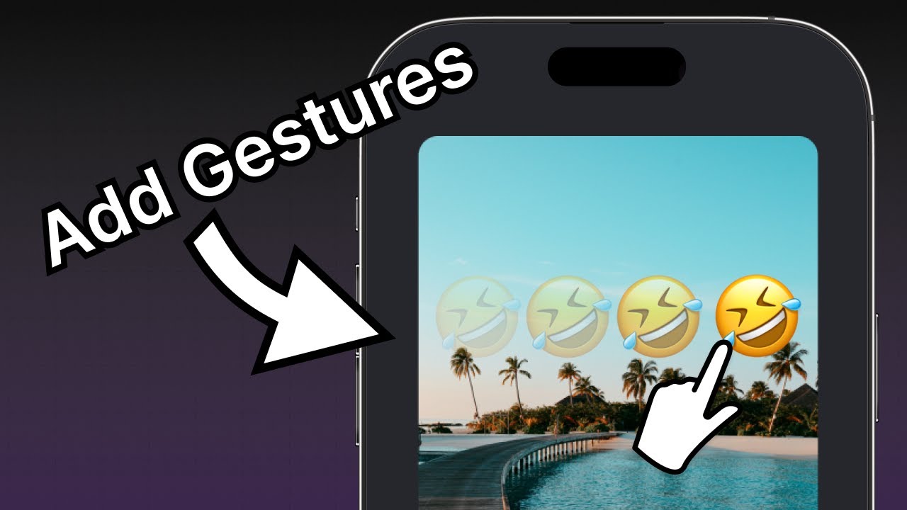
- 双击可缩放表情符号贴纸的大小,再次双击可缩小比例。
- 平移以在屏幕上移动表情符号贴纸,以便用户可以将贴纸放置在图片上的任何位置。
我们还将使用 Reanimated 库在手势状态之间进行动画处理。
🌐 We'll also use the Reanimated library to animate between gesture states.
使用 React Native Gesture Handler 和 Reanimated 为表情贴纸添加双击和拖动手势。
1
添加 GestureHandlerRootView
🌐 Add GestureHandlerRootView
为了在应用中实现手势交互,我们将在 Index 组件的顶部从 react-native-gesture-handler 渲染 <GestureHandlerRootView>。将 app/(tabs)/index.tsx 中根级别的 <View> 组件替换为 <GestureHandlerRootView>。
🌐 To get gesture interactions to work in the app, we'll render <GestureHandlerRootView> from react-native-gesture-handler at the top of Index component. Replace the root level <View> component in the app/(tabs)/index.tsx with <GestureHandlerRootView>.
// ... rest of the import statements remain same
import { GestureHandlerRootView } from 'react-native-gesture-handler';

export default function Index() {
  return (
    <GestureHandlerRootView style={styles.container}>
      {/* ...rest of the code remains */}
    </GestureHandlerRootView>
  )
}
2
使用动画组件
🌐 Use animated components
Animated 组件查看组件的 style 属性,并确定要动画的值并应用更新以创建动画。Reanimated 导出诸如 <Animated.View>、<Animated.Text> 或 <Animated.ScrollView> 等动画组件。我们将对 <Animated.Image> 组件应用动画以使双击手势生效。
🌐 An Animated component looks at the style prop of the component and determines which values to animate and apply updates to create an animation. Reanimated exports animated components such as <Animated.View>, <Animated.Text>, or <Animated.ScrollView>. We will apply animations to the <Animated.Image> component to make a double tap gesture work.
- 打开 components 目录下的 EmojiSticker.tsx 文件。在其中,从
react-native-reanimated库中导入Animated以使用动画组件。 - 将
Image组件替换为<Animated.Image>。
import { ImageSourcePropType, View } from 'react-native';
import Animated from 'react-native-reanimated';

type Props = {
  imageSize: number;
  stickerSource: ImageSourcePropType;
};

export default function EmojiSticker({ imageSize, stickerSource }: Props) {
  return (
    <View style={{ top: -350 }}>
      <Animated.Image
        source={stickerSource}
        resizeMode="contain"
        style={{ width: imageSize, height: imageSize }}
      />
    </View>
  );
}
有关动画组件 API 的完整参考,请参阅 React Native Reanimated 文档。
3
添加点击手势
🌐 Add a tap gesture
React Native 手势处理器允许我们在检测到触摸输入时添加行为,比如双击事件。
🌐 React Native Gesture Handler allows us to add behavior when it detects touch input, like a double tap event.
在 EmojiSticker.tsx 文件中:
🌐 In the EmojiSticker.tsx file:
- 从
react-native-gesture-handler导入Gesture和GestureDetector。 - 为了识别贴纸上的点击,请从
react-native-reanimated导入useAnimatedStyle、useSharedValue和withSpring来为<Animated.Image>的样式添加动画效果。 - 在
EmojiSticker组件内部,使用useSharedValue()钩子创建一个名为scaleImage的引用。它将以imageSize的值作为初始值。
// ...rest of the import statements remain same
import { Gesture, GestureDetector } from 'react-native-gesture-handler';
import Animated, { useAnimatedStyle, useSharedValue, withSpring } from 'react-native-reanimated';

export default function EmojiSticker({ imageSize, stickerSource }: Props) {
  const scaleImage = useSharedValue(imageSize);

  return (
    // ...rest of the code remains same
  )
}
使用 useSharedValue() 钩子创建共享值有许多优势。它有助于变更数据,并根据当前值运行动画。我们可以使用 .value 属性访问和修改共享值。我们将创建一个 doubleTap 对象来缩放初始值,并使用 Gesture.Tap() 来在缩放贴纸图片的同时动画过渡。为了确定所需的点击次数,我们将添加 numberOfTaps()。
🌐 Creating a shared value using the useSharedValue() hook has many advantages. It helps to mutate data and runs animations based on the current value. We can access and modify the shared value using the .value property. We'll create a doubleTap object to scale the initial value and use Gesture.Tap() to animate the transition while scaling the sticker image. To determine the number of taps required, we'll add numberOfTaps().
在 EmojiSticker 组件中创建以下对象:
🌐 Create the following object in the EmojiSticker component:
const doubleTap = Gesture.Tap()
  .numberOfTaps(2)
  .onStart(() => {
    if (scaleImage.value !== imageSize * 2) {
      scaleImage.value = scaleImage.value * 2;
    } else {
      scaleImage.value = Math.round(scaleImage.value / 2);
    }
  });
为了使过渡动画更加生动,我们可以使用基于弹簧的动画。这会让动画显得更有生命力,因为它基于现实世界中弹簧的物理原理。我们将使用 react-native-reanimated 提供的 withSpring() 函数。
🌐 To animate the transition, let's use a spring-based animation. This will make it feel alive because it's based on the real-world physics of a spring. We will use the withSpring() function provided by react-native-reanimated.
在贴纸图片上,我们将使用 useAnimatedStyle() 钩子来创建一个样式对象。这将帮助我们在动画发生时使用共享值更新样式。我们还将通过操作 width 和 height 属性来缩放图片的大小。这些属性的初始值设置为 imageSize。
🌐 On the sticker image, we'll use the useAnimatedStyle() hook to create a style object. This will help us to update styles using shared values when the animation happens. We'll also scale the size of the image by manipulating the width and height properties. The initial values of these properties are set to imageSize.
创建一个 imageStyle 变量并将其添加到 EmojiSticker 组件中:
🌐 Create an imageStyle variable and add it to the EmojiSticker component:
const imageStyle = useAnimatedStyle(() => {
  return {
    width: withSpring(scaleImage.value),
    height: withSpring(scaleImage.value),
  };
});
接着,将 <Animated.Image> 组件与 <GestureDetector> 封装,并修改 style 的属性以通过 imageStyle。
🌐 Next, wrap the <Animated.Image> component with the <GestureDetector> and modify the style prop on the <Animated.Image> to pass the imageStyle.
import { ImageSourcePropType, View } from 'react-native';
import { Gesture, GestureDetector } from 'react-native-gesture-handler';
import Animated, { useAnimatedStyle, useSharedValue, withSpring } from 'react-native-reanimated';

type Props = {
  imageSize: number;
  stickerSource: ImageSourcePropType;
};

export default function EmojiSticker({ imageSize, stickerSource }: Props) {
  const scaleImage = useSharedValue(imageSize);

  const doubleTap = Gesture.Tap()
    .numberOfTaps(2)
    .onStart(() => {
      if (scaleImage.value !== imageSize * 2) {
        scaleImage.value = scaleImage.value * 2;
      } else {
        scaleImage.value = Math.round(scaleImage.value / 2);
      }
    });

  const imageStyle = useAnimatedStyle(() => {
    return {
      width: withSpring(scaleImage.value),
      height: withSpring(scaleImage.value),
    };
  });

  return (
    <View style={{ top: -350 }}>
      <GestureDetector gesture={doubleTap}>
        <Animated.Image
          source={stickerSource}
          resizeMode="contain"
          style={[imageStyle, { width: imageSize, height: imageSize }]}
        />
      </GestureDetector>
    </View>
  );
}
在上面的代码片段中,gesture 属性采用 doubleTap 的值,在用户双击贴纸图片时触发手势。
🌐 In the above snippet, the gesture prop takes the value of the doubleTap to trigger a gesture when a user double-taps the sticker image.
让我们来看一下我们的应用在 Android、iOS 和网页上的表现:
🌐 Let's take a look at our app on Android, iOS and the web:
有关点按手势 API 的完整参考,请参见 React Native Gesture Handler 文档。
4
添加平移手势
🌐 Add a pan gesture
为了识别贴纸上的拖动手势并跟踪其移动,我们将使用平移手势。在 components/EmojiSticker.tsx 中:
🌐 To recognize a dragging gesture on the sticker and to track its movement, we'll use a pan gesture. In the components/EmojiSticker.tsx:
- 创建两个新的共享值:
translateX和translateY。 - 将
<View>替换为<Animated.View>组件。
export default function EmojiSticker({ imageSize, stickerSource }: Props) {
  const scaleImage = useSharedValue(imageSize);
  const translateX = useSharedValue(0);
  const translateY = useSharedValue(0);
  // ...rest of the code remains same

  return (
    <Animated.View style={{ top: -350 }}>
      <GestureDetector gesture={doubleTap}>
        {/* ...rest of the code remains same */}
      </GestureDetector>
    </Animated.View>
  );
}
让我们来学习上面的代码是做什么的:
🌐 Let's learn what the above code does:
- 定义的平移值将使贴纸在屏幕上移动。由于贴纸沿两个轴移动,我们需要跟踪 X 和 Y 值。
- 在
useSharedValue()钩子中,我们已将两个翻译变量的初始位置设置为0。这是贴纸的初始位置,也是起点。这个值设置了手势开始时贴纸的初始位置。
在上一步中,我们触发了与 Gesture.Tap() 方法链式连接的点击手势的 onStart() 回调。对于平移手势,指定一个 onChange() 回调,该回调在手势激活并移动时运行。
🌐 In the previous step, we triggered the onStart() callback for the tap gesture chained to the Gesture.Tap() method. For the pan gesture, specify an onChange() callback, which runs when the gesture is active and moving.
- 创建一个
drag对象来处理平移手势。onChange()回调接受event作为参数。changeX和changeY属性保存自上一个事件以来的位置变化,并更新存储在translateX和translateY中的数值。 - 使用
useAnimatedStyle()钩子定义containerStyle对象。它将返回一个变换数组。对于<Animated.View>组件,我们需要将transform属性设置为translateX和translateY值。这将在手势激活时改变贴纸的位置。
const drag = Gesture.Pan().onChange(event => {
  translateX.value += event.changeX;
  translateY.value += event.changeY;
});

const containerStyle = useAnimatedStyle(() => {
  return {
    transform: [
      {
        translateX: translateX.value,
      },
      {
        translateY: translateY.value,
      },
    ],
  };
});
接下来,在 JSX 代码中:
🌐 Next, inside the JSX code:
- 更新
<EmojiSticker>组件,使<GestureDetector>组件成为顶层组件。 - 在
<Animated.View>组件上添加containerStyle以应用转换样式。
import { Gesture, GestureDetector } from 'react-native-gesture-handler';
import Animated, { useAnimatedStyle, useSharedValue, withSpring } from 'react-native-reanimated';
import { ImageSourcePropType } from 'react-native';

type Props = {
  imageSize: number;
  stickerSource: ImageSourcePropType;
};

export default function EmojiSticker({ imageSize, stickerSource }: Props) {
  const scaleImage = useSharedValue(imageSize);
  const translateX = useSharedValue(0);
  const translateY = useSharedValue(0);

  const doubleTap = Gesture.Tap()
    .numberOfTaps(2)
    .onStart(() => {
      if (scaleImage.value !== imageSize * 2) {
        scaleImage.value = scaleImage.value * 2;
      } else {
        scaleImage.value = Math.round(scaleImage.value / 2);
      }
    });

  const imageStyle = useAnimatedStyle(() => {
    return {
      width: withSpring(scaleImage.value),
      height: withSpring(scaleImage.value),
    };
  });

  const drag = Gesture.Pan().onChange(event => {
    translateX.value += event.changeX;
    translateY.value += event.changeY;
  });

  const containerStyle = useAnimatedStyle(() => {
    return {
      transform: [
        {
          translateX: translateX.value,
        },
        {
          translateY: translateY.value,
        },
      ],
    };
  });

  return (
    <GestureDetector gesture={drag}>
      <Animated.View style={[containerStyle, { top: -350 }]}>
        <GestureDetector gesture={doubleTap}>
          <Animated.Image
            source={stickerSource}
            resizeMode="contain"
            style={[imageStyle, { width: imageSize, height: imageSize }]}
          />
        </GestureDetector>
      </Animated.View>
    </GestureDetector>
  );
}
让我们来看一下我们的应用在 Android、iOS 和网页上的表现:
🌐 Let's take a look at our app on Android, iOS and the web:
概括
🌐 Summary
Chapter 6: Add gestures
我们已经成功实现了平移和点击手势。
在下一章中,我们将学习如何截取图片和贴纸的屏幕,并将其保存到设备的图库中。