This documentation is available as Markdown for AI agents and LLMs. See the full Markdown index or append .md to any documentation URL.
配置状态栏、启动屏幕和应用图标
在本教程中,了解如何配置状态栏、应用图标和启动画面的基础知识。
在本章中,我们将在将我们的应用部署到应用商店之前解决一些应用细节,例如为状态栏设置主题、自定义应用图标和启动画面。
🌐 In this chapter, we'll address some app details before deploying our app to an app store, such as theming the status bar, customizing the app icon, and splash screen.
在部署到应用商店之前,配置状态栏、自定义应用图标并设置启动画面。
1
配置状态栏
🌐 Configure the status bar
expo-status-bar 库在使用 create-expo-app 创建的每个项目中都预安装了。该库提供了一个 StatusBar 组件,用于配置应用的状态栏样式。
在 app/_layout.tsx 中:
🌐 Inside app/_layout.tsx:
- 从
expo-status-bar导入StatusBar。 - 将
StatusBar和现有的Stack组件与 React 的 Fragment 组件 组合起来。
import { Stack } from 'expo-router';
import { StatusBar } from 'expo-status-bar';

export default function RootLayout() {
  return (
    <>
      <Stack>
        <Stack.Screen name="(tabs)" options={{ headerShown: false }} />
      </Stack>
      <StatusBar style="light" />
    </>
  );
}
现在让我们来看一下我们的应用在 Android 和 iOS 上的表现:
🌐 Let's take a look at our app now on Android, and iOS:
2
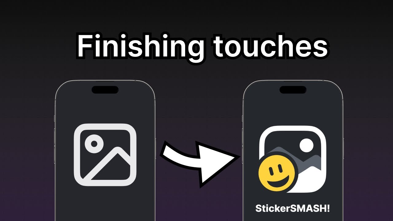
应用图标
🌐 App icon
在项目中,assets/images 目录下有一个 icon.png 文件。这是我们的应用图标。它是一个 1024px × 1024px 的图片,如下所示:
🌐 Inside the project, there's an icon.png file inside the assets/images directory. This is our app icon. It's a 1024px by 1024px image and looks as shown below:
像启动屏幕图片一样,app.json 文件中的 "icon" 属性用于配置应用图标的路径。默认情况下,新的 Expo 项目会定义正确的 "./assets/images/icon.png" 路径。我们不需要进行任何更改。
🌐 Like the splash screen image, the "icon" property in the app.json file configures the app icon's path. By default, a new Expo project defines the correct path to "./assets/images/icon.png". We don't have to change anything.
最终,当你为应用商店构建应用时,Expo 应用服务 (EAS) 会使用这张图片为每种设备创建优化后的图标。
你可以在 Expo Go 的各个地方看到该图标。这里是一个示例,显示了该应用图标在 Expo Go 开发者菜单中的样子:
🌐 You can see the icon in various places in Expo Go. Here is an example of the app icon displayed in the developer menu of Expo Go:
3
启动画面
🌐 Splash screen
在应用内容加载之前会显示启动屏幕。它使用较小的图片,例如应用的图标,并且居中显示。一旦应用的内容准备好显示时,它就会隐藏。
🌐 A splash screen is visible before the app's content is loaded. It uses a smaller image, such as an app's icon, which is centered. It hides once the app's content is ready to be displayed.
[expo-splash-screen](/versions/latest/sdk/splash-screen/) 插件已经预装在使用 create-expo-app 创建的每个项目中。这个库提供了一个配置插件,用于配置启动屏幕。
🌐 The expo-splash-screen plugin already comes pre-installed in every project created using create-expo-app. This library provides a config plugin to configure the splash screen.
在 app.json 中,expo-splash-screen 插件已配置为使用应用的图标作为启动屏幕图片(在可下载资源中提供),使用以下代码片段,因此我们不需要进行任何更改:
🌐 In app.json, the expo-splash-screen plugin is already configured to use the app's icon as the splash screen image (provided in the downloadable assets) with the following snippet so we don't have to change anything:
{
  "plugins": [
    %%placeholder-start%%... %%placeholder-end%%
    [
      "expo-splash-screen",
      {
        "image": "./assets/images/splash-icon.png"
        %%placeholder-start%%... %%placeholder-end%%
      }
    ]
  ]
}
但是,要测试启动屏幕,我们不能使用 Expo Go 或 开发版本。要进行测试,我们需要创建应用的预览版或生产版本。我们建议查看以下资源,以了解有关启动屏幕配置及如何测试的更多信息:
🌐 However, to test the splash screen, we cannot use Expo Go or a development build. To test it, we need to create a preview or a production build of our app. We recommend going through the following resources to learn more about the splash screen configuration and how to test it:
概括
🌐 Summary
Chapter 9: Configure status bar, splash screen and app icon
做得好!我们用同一份代码构建了一个可以在 Android、iOS 和网页上运行的应用。
教程的下一部分将引导你获取更多资源,以深入学习我们在这里讲解的概念以及其他我们曾简要提及的内容。