This documentation is available as Markdown for AI agents and LLMs. See the full Markdown index or append .md to any documentation URL.
AlertDialog
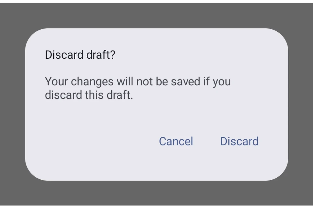
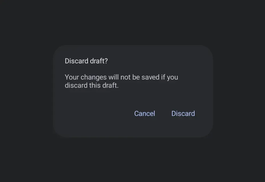
A Jetpack Compose AlertDialog component for displaying native alert dialogs.
Android
Included in Expo Go
Recommended version:
~56.0.26
Expo UI AlertDialog matches the official Jetpack Compose AlertDialog API. Content is provided via slot sub-components (AlertDialog.Title, AlertDialog.Text, AlertDialog.ConfirmButton, AlertDialog.DismissButton, AlertDialog.Icon) that map directly to Compose's slot parameters.
Installation
Terminal
If you are installing this in an existing React Native app, make sure to install expo in your project.
Usage
Basic alert dialog
BasicAlertDialogExample.tsx
Custom colors
CustomColorsExample.tsx
With icon
IconDialogExample.tsx
API
import { AlertDialog } from '@expo/ui/jetpack-compose';
No API data file found, sorry!