This documentation is available as Markdown for AI agents and LLMs. See the full Markdown index or append .md to any documentation URL.

ModalBottomSheet

A Jetpack Compose ModalBottomSheet component that presents content from the bottom of the screen.

Android
Included in Expo Go
Recommended version:
~56.0.26

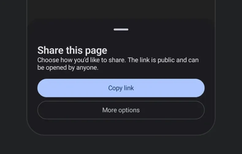
Expo UI ModalBottomSheet matches the official Jetpack Compose Bottom Sheet API and displays content in a modal sheet that slides up from the bottom.

Modal bottom sheet with title, description, and action buttonsModal bottom sheet with title, description, and action buttons

Installation

Terminal
- npx expo install @expo/ui
- yarn expo install @expo/ui
- pnpm expo install @expo/ui
- bun expo install @expo/ui

If you are installing this in an existing React Native app, make sure to install expo in your project.

Usage

Basic bottom sheet

Use ref.hide() to programmatically dismiss the sheet with an animation before unmounting it.

BasicBottomSheetExample.tsx
import { useRef, useState } from 'react'; import { Host, ModalBottomSheet, Button, Column, Text } from '@expo/ui/jetpack-compose'; import type { ModalBottomSheetRef } from '@expo/ui/jetpack-compose'; import { paddingAll } from '@expo/ui/jetpack-compose/modifiers'; export default function BasicBottomSheetExample() { const [visible, setVisible] = useState(false); const sheetRef = useRef<ModalBottomSheetRef>(null); const hideSheet = async () => { await sheetRef.current?.hide(); setVisible(false); }; return ( <Host matchContents> <Button onClick={() => setVisible(true)}> <Text>Open Sheet</Text> </Button> {visible && ( <ModalBottomSheet ref={sheetRef} onDismissRequest={() => setVisible(false)}> <Column verticalArrangement={{ spacedBy: 12 }} modifiers={[paddingAll(24)]}> <Text>Hello from bottom sheet!</Text> <Text>You can add more content here.</Text> <Button onClick={hideSheet}> <Text>Close</Text> </Button> </Column> </ModalBottomSheet> )} </Host> ); }

Skip partially expanded state

When skipPartiallyExpanded is set, the sheet opens directly in the fully expanded state instead of stopping at the half-height position first.

SkipPartiallyExpandedExample.tsx
import { useRef, useState } from 'react'; import { Host, ModalBottomSheet, Button, Column, Text } from '@expo/ui/jetpack-compose'; import type { ModalBottomSheetRef } from '@expo/ui/jetpack-compose'; import { paddingAll, height } from '@expo/ui/jetpack-compose/modifiers'; export default function SkipPartiallyExpandedExample() { const [visible, setVisible] = useState(false); const sheetRef = useRef<ModalBottomSheetRef>(null); const hideSheet = async () => { await sheetRef.current?.hide(); setVisible(false); }; return ( <Host matchContents> <Button onClick={() => setVisible(true)}> <Text>Open Sheet</Text> </Button> {visible && ( <ModalBottomSheet ref={sheetRef} onDismissRequest={() => setVisible(false)} skipPartiallyExpanded> <Column verticalArrangement={{ spacedBy: 12 }} modifiers={[paddingAll(24), height(600)]}> <Text>This sheet skips the partially expanded state.</Text> <Text>It opens directly in the fully expanded position.</Text> <Button onClick={hideSheet}> <Text>Close</Text> </Button> </Column> </ModalBottomSheet> )} </Host> ); }

Initial fully expanded state

When initialFullyExpanded is true, the sheet opens directly in the fully expanded state on first composition while leaving the partial state reachable. Unlike skipPartiallyExpanded, the user can still drag down to the partial state. The partialExpand() method also continues to work.

InitialFullyExpandedExample.tsx
import { useRef, useState } from 'react'; import { Host, ModalBottomSheet, Button, Column, Text } from '@expo/ui/jetpack-compose'; import type { ModalBottomSheetRef } from '@expo/ui/jetpack-compose'; import { paddingAll } from '@expo/ui/jetpack-compose/modifiers'; export default function InitialFullyExpandedExample() { const [visible, setVisible] = useState(false); const sheetRef = useRef<ModalBottomSheetRef>(null); const hideSheet = async () => { await sheetRef.current?.hide(); setVisible(false); }; return ( <Host matchContents> <Button onClick={() => setVisible(true)}> <Text>Open Sheet</Text> </Button> {visible && ( <ModalBottomSheet ref={sheetRef} onDismissRequest={() => setVisible(false)} initialFullyExpanded> <Column verticalArrangement={{ spacedBy: 12 }} modifiers={[paddingAll(24)]}> <Text>This sheet opened fully expanded.</Text> <Text>You can still drag it down to the partial state.</Text> <Button onClick={() => sheetRef.current?.partialExpand()}> <Text>Collapse to partial</Text> </Button> <Button onClick={hideSheet}> <Text>Close</Text> </Button> </Column> </ModalBottomSheet> )} </Host> ); }

Custom colors

Use containerColor, contentColor, and scrimColor to customize the sheet's appearance.

CustomColorsExample.tsx
import { useRef, useState } from 'react'; import { Host, ModalBottomSheet, Button, Column, Text } from '@expo/ui/jetpack-compose'; import type { ModalBottomSheetRef } from '@expo/ui/jetpack-compose'; import { paddingAll } from '@expo/ui/jetpack-compose/modifiers'; export default function CustomColorsExample() { const [visible, setVisible] = useState(false); const sheetRef = useRef<ModalBottomSheetRef>(null); const hideSheet = async () => { await sheetRef.current?.hide(); setVisible(false); }; return ( <Host matchContents> <Button onClick={() => setVisible(true)}> <Text>Open Colored Sheet</Text> </Button> {visible && ( <ModalBottomSheet ref={sheetRef} onDismissRequest={() => setVisible(false)} containerColor="#1a1a2e" contentColor="#e0e0e0" scrimColor="#806200EE"> <Column verticalArrangement={{ spacedBy: 12 }} modifiers={[paddingAll(24)]}> <Text>Custom styled bottom sheet.</Text> <Text>Dark container with a purple scrim overlay.</Text> <Button onClick={hideSheet}> <Text>Close</Text> </Button> </Column> </ModalBottomSheet> )} </Host> ); }

Custom drag handle

Use ModalBottomSheet.DragHandle slot to provide a custom drag handle, or set showDragHandle={false} to hide it entirely.

CustomDragHandleExample.tsx
import { useRef, useState } from 'react'; import { Host, ModalBottomSheet, Button, Column, Box, Text } from '@expo/ui/jetpack-compose'; import type { ModalBottomSheetRef } from '@expo/ui/jetpack-compose'; import { background, clip, fillMaxWidth, height, padding, Shapes, width, } from '@expo/ui/jetpack-compose/modifiers'; export default function CustomDragHandleExample() { const [visible, setVisible] = useState(false); const sheetRef = useRef<ModalBottomSheetRef>(null); const hideSheet = async () => { await sheetRef.current?.hide(); setVisible(false); }; return ( <Host matchContents> <Button onClick={() => setVisible(true)}> <Text>Open Custom Handle Sheet</Text> </Button> {visible && ( <ModalBottomSheet ref={sheetRef} onDismissRequest={() => setVisible(false)}> <ModalBottomSheet.DragHandle> <Column horizontalAlignment="center" modifiers={[fillMaxWidth(), padding(0, 12, 0, 8)]}> <Box modifiers={[width(60), height(6), clip(Shapes.Circle), background('#6200EE')]} /> </Column> </ModalBottomSheet.DragHandle> <Column verticalArrangement={{ spacedBy: 12 }} modifiers={[padding(16, 16, 16, 16)]}> <Button onClick={hideSheet}> <Text>Close</Text> </Button> </Column> </ModalBottomSheet> )} </Host> ); }

React Native content inside a bottom sheet

Use RNHostView to embed interactive React Native views inside a Compose bottom sheet. This lets you mix Compose layout with RN components like Pressable and Text.

RNContentBottomSheetExample.tsx
import { useRef, useState } from 'react'; import { Host, ModalBottomSheet, Button, Column, RNHostView, Text } from '@expo/ui/jetpack-compose'; import type { ModalBottomSheetRef } from '@expo/ui/jetpack-compose'; import { padding } from '@expo/ui/jetpack-compose/modifiers'; import { Pressable, Text as RNText, View } from 'react-native'; export default function RNContentBottomSheetExample() { const [visible, setVisible] = useState(false); const sheetRef = useRef<ModalBottomSheetRef>(null); const hideSheet = async () => { await sheetRef.current?.hide(); setVisible(false); }; return ( <Host matchContents> <Button onClick={() => setVisible(true)}> <Text>Open RN Content Sheet</Text> </Button> {visible && ( <ModalBottomSheet ref={sheetRef} onDismissRequest={() => setVisible(false)} skipPartiallyExpanded={false}> <Column verticalArrangement={{ spacedBy: 16 }} modifiers={[padding(16, 16, 16, 16)]}> <Text>Mixing Compose + RN in a Bottom Sheet</Text> <RNHostView> <View> <RNText style={{ fontSize: 18, fontWeight: 'bold', marginBottom: 8 }}> React Native Content </RNText> <Pressable style={{ backgroundColor: '#007AFF', padding: 12, borderRadius: 8, alignItems: 'center', }} onPress={hideSheet}> <RNText style={{ color: 'white', fontWeight: '600' }}>Close</RNText> </Pressable> </View> </RNHostView> </Column> </ModalBottomSheet> )} </Host> ); }

React Native content with flex

Use RNHostView without matchContents to let the RN view fill the remaining space inside the sheet. Combine with a fixed height modifier on the parent Column to control the sheet size.

FlexRNContentExample.tsx
import { useRef, useState } from 'react'; import { Host, ModalBottomSheet, Button, Column, RNHostView, Text } from '@expo/ui/jetpack-compose'; import type { ModalBottomSheetRef } from '@expo/ui/jetpack-compose'; import { height, padding } from '@expo/ui/jetpack-compose/modifiers'; import { Text as RNText, View } from 'react-native'; export default function FlexRNContentExample() { const [visible, setVisible] = useState(false); const sheetRef = useRef<ModalBottomSheetRef>(null); const hideSheet = async () => { await sheetRef.current?.hide(); setVisible(false); }; return ( <Host matchContents> <Button onClick={() => setVisible(true)}> <Text>Open Flex Content Sheet</Text> </Button> {visible && ( <ModalBottomSheet ref={sheetRef} onDismissRequest={() => setVisible(false)} skipPartiallyExpanded> <Column modifiers={[height(400), padding(16, 16, 16, 16)]}> <Text>RN View with flex: 1</Text> <RNHostView> <View style={{ flex: 1, backgroundColor: '#9B59B6', borderRadius: 10 }}> <RNText style={{ color: 'white', fontSize: 18, fontWeight: 'bold', padding: 16, }}> React Native Content (flex: 1) </RNText> </View> </RNHostView> </Column> </ModalBottomSheet> )} </Host> ); }

Scrollable React Native content

Nest a scrollable React Native list such as FlatList, ScrollView, or a high-performance list like FlashList or Legend List inside the sheet with RNHostView. Set nestedScrollEnabled on the scrollable so it scrolls its own content first. Once it reaches the top edge, the remaining drag moves the sheet. Without nestedScrollEnabled the list consumes the gesture and the sheet stays put.

ScrollableContentBottomSheetExample.tsx
import { useState } from 'react'; import { Host, ModalBottomSheet, Button, Column, RNHostView, Text } from '@expo/ui/jetpack-compose'; import { fillMaxHeight, padding } from '@expo/ui/jetpack-compose/modifiers'; import { FlatList, Text as RNText } from 'react-native'; const DATA = Array.from({ length: 50 }, (_, i) => `Item ${i + 1}`); export default function ScrollableContentBottomSheetExample() { const [visible, setVisible] = useState(false); return ( <Host matchContents> <Button onClick={() => setVisible(true)}> <Text>Open Scrollable Sheet</Text> </Button> {visible && ( <ModalBottomSheet onDismissRequest={() => setVisible(false)}> <Column modifiers={[fillMaxHeight(), padding(16, 16, 16, 16)]}> <RNHostView> <FlatList nestedScrollEnabled style={{ flex: 1 }} data={DATA} keyExtractor={item => item} renderItem={({ item }) => <RNText style={{ paddingVertical: 16 }}>{item}</RNText>} /> </RNHostView> </Column> </ModalBottomSheet> )} </Host> ); }

Non-dismissible sheet

Combine properties, sheetGesturesEnabled to create a sheet that can only be closed programmatically.

NonDismissibleExample.tsx
import { useRef, useState } from 'react'; import { Host, ModalBottomSheet, Button, Column, Text } from '@expo/ui/jetpack-compose'; import type { ModalBottomSheetRef } from '@expo/ui/jetpack-compose'; import { paddingAll } from '@expo/ui/jetpack-compose/modifiers'; export default function NonDismissibleExample() { const [visible, setVisible] = useState(false); const sheetRef = useRef<ModalBottomSheetRef>(null); const hideSheet = async () => { await sheetRef.current?.hide(); setVisible(false); }; return ( <Host matchContents> <Button onClick={() => setVisible(true)}> <Text>Open Non-Dismissible Sheet</Text> </Button> {visible && ( <ModalBottomSheet ref={sheetRef} onDismissRequest={() => setVisible(false)} sheetGesturesEnabled={false} properties={{ shouldDismissOnBackPress: false, shouldDismissOnClickOutside: false, }}> <Column verticalArrangement={{ spacedBy: 12 }} modifiers={[paddingAll(24)]}> <Text>This sheet cannot be dismissed by swiping, back press, or tapping outside.</Text> <Text>Only the button below will close it.</Text> <Button onClick={hideSheet}> <Text>Close</Text> </Button> </Column> </ModalBottomSheet> )} </Host> ); }

API

import { ModalBottomSheet } from '@expo/ui/jetpack-compose';

No API data file found, sorry!