This documentation is available as Markdown for AI agents and LLMs. See the full Markdown index or append .md to any documentation URL.
Tooltip
Jetpack Compose Tooltip components for displaying contextual information on long-press.
Android
Included in Expo Go
Recommended version:
~56.0.26
Expo UI Tooltip matches the official Jetpack Compose Tooltip API. TooltipBox wraps anchor content and displays a tooltip. The tooltip content is provided via the TooltipBox.PlainTooltip or TooltipBox.RichTooltip compound components, which match PlainTooltip and RichTooltip respectively. Tooltips can be triggered by long-press or shown programmatically via ref.
Long-press the anchor content to display the tooltip.
PlainTooltipExample.tsx
import{Host,TooltipBox,Button,Text}from'@expo/ui/jetpack-compose';exportdefaultfunctionPlainTooltipExample(){return(<HostmatchContents><TooltipBox><TooltipBox.PlainTooltip><Text>Add to favorites</Text></TooltipBox.PlainTooltip><ButtononClick={()=>{}}><Text>Favorite</Text></Button></TooltipBox></Host>);}
Rich tooltip with title and body
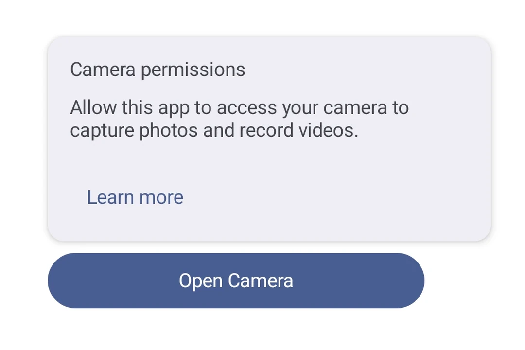
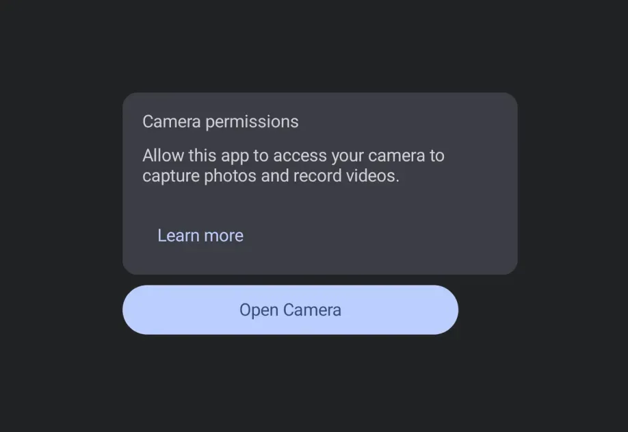
Use TooltipBox.RichTooltip with Title and Text compound component pattern for more detailed contextual information.
RichTooltipExample.tsx
import{Host,TooltipBox,Button,Text}from'@expo/ui/jetpack-compose';exportdefaultfunctionRichTooltipExample(){return(<HostmatchContents><TooltipBox><TooltipBox.RichTooltip><TooltipBox.RichTooltip.Title><Text>Camera</Text></TooltipBox.RichTooltip.Title><TooltipBox.RichTooltip.Text><Text>Take photos and record videos with your device camera.</Text></TooltipBox.RichTooltip.Text></TooltipBox.RichTooltip><ButtononClick={()=>{}}><Text>Open Camera</Text></Button></TooltipBox></Host>);}
Rich tooltip with action
Add an interactive action with TooltipBox.RichTooltip.Action. Use isPersistent so the tooltip stays visible for the user to tap it. hasAction is automatically derived when an action slot is present.
RichTooltipActionExample.tsx
import{Host,TooltipBox,Button,TextButton,Text}from'@expo/ui/jetpack-compose';exportdefaultfunctionRichTooltipActionExample(){return(<HostmatchContents><TooltipBoxisPersistent><TooltipBox.RichTooltip><TooltipBox.RichTooltip.Title><Text>Permissions Required</Text></TooltipBox.RichTooltip.Title><TooltipBox.RichTooltip.Text><Text>This feature requires camera and microphone access.</Text></TooltipBox.RichTooltip.Text><TooltipBox.RichTooltip.Action><TextButtononClick={()=>{}}><Text>Learn More</Text></TextButton></TooltipBox.RichTooltip.Action></TooltipBox.RichTooltip><ButtononClick={()=>{}}><Text>Record Video</Text></Button></TooltipBox></Host>);}
Programmatic show and dismiss
Use a ref to imperatively show() or dismiss() the tooltip without requiring a long-press.