This documentation is available as Markdown for AI agents and LLMs. See the full Markdown index or append .md to any documentation URL.

DateTimePicker

A Jetpack Compose DateTimePicker component for selecting dates and times.

Android
Included in Expo Go
Recommended version:
~56.0.26

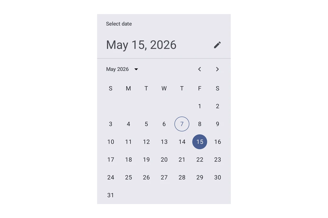
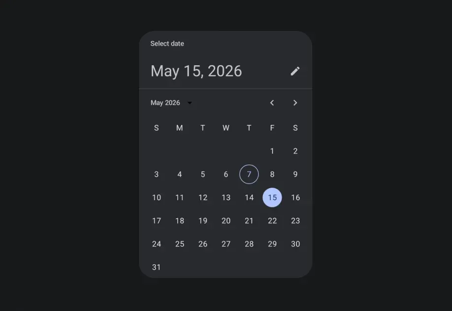
Expo UI DateTimePicker matches the official Jetpack Compose Date Picker and Time Picker APIs and supports date, time, and combined selection.

Material 3 date picker showing a selected date in a calendar gridMaterial 3 date picker showing a selected date in a calendar grid

Installation

Terminal
- npx expo install @expo/ui
- yarn expo install @expo/ui
- pnpm expo install @expo/ui
- bun expo install @expo/ui

If you are installing this in an existing React Native app, make sure to install expo in your project.

Usage

Date picker

DatePickerExample.tsx
import { useState } from 'react'; import { Host, DateTimePicker } from '@expo/ui/jetpack-compose'; export default function DatePickerExample() { const [selectedDate, setSelectedDate] = useState(new Date()); return ( <Host matchContents={{ vertical: true }} style={{ width: '100%' }}> <DateTimePicker onDateSelected={date => { setSelectedDate(date); }} displayedComponents="date" initialDate={selectedDate.toISOString()} variant="picker" /> </Host> ); }

Time picker

TimePickerExample.tsx
import { useState } from 'react'; import { Host, DateTimePicker } from '@expo/ui/jetpack-compose'; export default function TimePickerExample() { const [selectedDate, setSelectedDate] = useState(new Date()); return ( <Host matchContents={{ vertical: true }} style={{ width: '100%' }}> <DateTimePicker onDateSelected={date => { setSelectedDate(date); }} displayedComponents="hourAndMinute" initialDate={selectedDate.toISOString()} variant="picker" /> </Host> ); }

Input variant

Use variant="input" to display the picker as a text input field instead of the default picker UI.

InputVariantExample.tsx
import { useState } from 'react'; import { Host, DateTimePicker } from '@expo/ui/jetpack-compose'; export default function InputVariantExample() { const [selectedDate, setSelectedDate] = useState(new Date()); return ( <Host matchContents={{ vertical: true }} style={{ width: '100%' }}> <DateTimePicker onDateSelected={date => { setSelectedDate(date); }} displayedComponents="date" initialDate={selectedDate.toISOString()} variant="input" /> </Host> ); }

API

import { DateTimePicker } from '@expo/ui/jetpack-compose';

No API data file found, sorry!