This documentation is available as Markdown for AI agents and LLMs. See the full Markdown index or append .md to any documentation URL.
Text
A Jetpack Compose Text component for displaying styled text.
Android
Included in Expo Go
Recommended version:
~56.0.26
For cross-platform usage, see the universal Text — it renders the appropriate native component per platform.
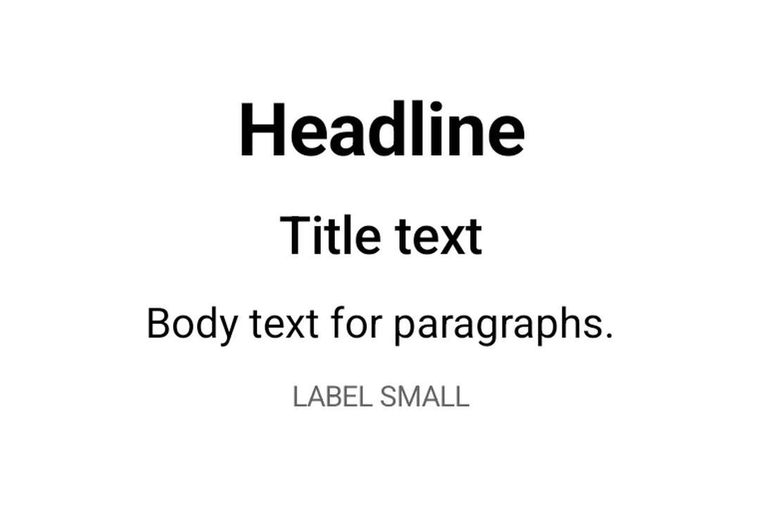
Expo UI Text matches the official Jetpack Compose Text styling API and displays text with Material 3 typography styles, custom fonts, and text formatting options.
Control text truncation with maxLines and overflow.
TextOverflowExample.tsx
import{Host,Text}from'@expo/ui/jetpack-compose';import{ width }from'@expo/ui/jetpack-compose/modifiers';exportdefaultfunctionTextOverflowExample(){return(<HostmatchContents><TextmaxLines={2}overflow="ellipsis"modifiers={[width(200)]}>
This is a long paragraph of text that will be truncated after two lines with an ellipsis at
the end to indicate there is more content.
</Text></Host>);}
Styled text
Apply custom text styles including font weight, style, size, and decoration.
StyledTextExample.tsx
import{Host,Text,Column}from'@expo/ui/jetpack-compose';import{ paddingAll }from'@expo/ui/jetpack-compose/modifiers';exportdefaultfunctionStyledTextExample(){return(<HostmatchContents><Columnmodifiers={[paddingAll(16)]}><Textstyle={{ fontWeight:'bold', fontSize:20}}>Bold text</Text><Textstyle={{ fontStyle:'italic'}}>Italic text</Text><Textstyle={{ textDecoration:'underline'}}>Underlined text</Text><Textstyle={{ letterSpacing:4}}>Spaced out text</Text><Textcolor="#E91E63"style={{ fontSize:18, textAlign:'center'}}>
Colored and centered
</Text></Column></Host>);}
Nested text
Nest <Text> components to apply inline styles to parts of a sentence. Child spans inherit styles from their parent. For example, a bold parent with an italic child renders the child as bold and italic.
NestedTextExample.tsx
import{Host,Text,Column}from'@expo/ui/jetpack-compose';import{ paddingAll }from'@expo/ui/jetpack-compose/modifiers';exportdefaultfunctionNestedTextExample(){return(<HostmatchContents><Columnmodifiers={[paddingAll(16)]}>{/* Bold parent, italic child inherits bold */}<Textstyle={{ fontWeight:'bold'}}>
Hello <Textstyle={{ fontStyle:'italic'}}>world</Text>!
</Text>{/* Mixed inline styles */}<Textstyle={{ fontSize:16}}>
Normal, <Textstyle={{ fontStyle:'italic'}}>italic</Text>,{' '}<Textstyle={{ fontWeight:'bold'}}>bold</Text>, and{' '}<Textstyle={{ textDecoration:'underline'}}>underlined</Text></Text>{/* Color and background overrides per span */}<Textstyle={{ fontSize:18}}>
Click{' '}<Textcolor="#007AFF"style={{ fontWeight:'bold'}}>
here
</Text>{' '}
or <Textstyle={{ background:'#FFEB3B'}}>highlighted</Text></Text>{/* Deep nesting — styles accumulate */}<Textstyle={{ fontWeight:'bold'}}>
Bold{' '}<Textstyle={{ fontStyle:'italic'}}>
bold+italic <Textstyle={{ textDecoration:'underline'}}>bold+italic+underline</Text></Text></Text></Column></Host>);}
Custom fonts
Use fonts loaded via expo-font by passing the font family name to style.fontFamily.