This documentation is available as Markdown for AI agents and LLMs. See the full Markdown index or append .md to any documentation URL.

Switch

A Jetpack Compose Switch component for toggle controls.

Android
Included in Expo Go
Recommended version:
~56.0.26

Expo UI Switch matches the official Jetpack Compose Switch API.
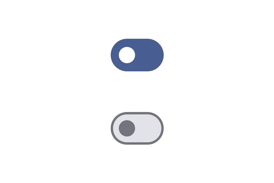
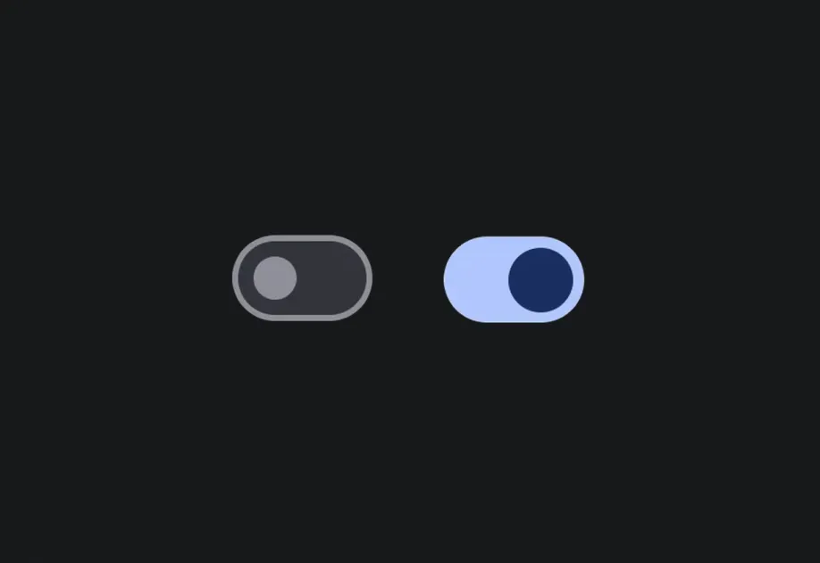
Two Material 3 switches showing on and off statesTwo Material 3 switches showing on and off states

Installation

Terminal
- npx expo install @expo/ui
- yarn expo install @expo/ui
- pnpm expo install @expo/ui
- bun expo install @expo/ui

If you are installing this in an existing React Native app, make sure to install expo in your project.

Usage

Toggle switch

ToggleSwitchExample.tsx
import { useState } from 'react'; import { Host, Switch } from '@expo/ui/jetpack-compose'; export default function ToggleSwitchExample() { const [checked, setChecked] = useState(false); return ( <Host matchContents> <Switch value={checked} onCheckedChange={setChecked} /> </Host> ); }

Custom colors

CustomColorsExample.tsx
import { useState } from 'react'; import { Host, Switch } from '@expo/ui/jetpack-compose'; export default function CustomColorsExample() { const [checked, setChecked] = useState(false); return ( <Host matchContents> <Switch value={checked} onCheckedChange={setChecked} colors={{ checkedThumbColor: '#6200EE', checkedTrackColor: '#EDE9FE', uncheckedThumbColor: '#9CA3AF', uncheckedTrackColor: '#F3F4F6', uncheckedBorderColor: '#D1D5DB', }} /> </Host> ); }

Custom thumb content

Use Switch.ThumbContent to render a custom element inside the thumb. Switch.DefaultIconSize gives you the M3 default icon size so your content fits perfectly.

ThumbContentExample.tsx
import { useState } from 'react'; import { Host, Switch, Box } from '@expo/ui/jetpack-compose'; import { size, clip, background, Shapes } from '@expo/ui/jetpack-compose/modifiers'; export default function ThumbContentExample() { const [checked, setChecked] = useState(false); return ( <Host matchContents> <Switch value={checked} onCheckedChange={setChecked} colors={{ checkedThumbColor: '#7C3AED', checkedTrackColor: '#EDE9FE', checkedIconColor: '#7C3AED', uncheckedThumbColor: '#9CA3AF', uncheckedTrackColor: '#F3F4F6', uncheckedBorderColor: '#D1D5DB', uncheckedIconColor: '#9CA3AF', }}> <Switch.ThumbContent> <Box modifiers={[ size(Switch.DefaultIconSize, Switch.DefaultIconSize), clip(Shapes.Circle), background(checked ? '#FFFFFF' : '#E5E7EB'), ]} /> </Switch.ThumbContent> </Switch> </Host> ); }

API

import { Switch } from '@expo/ui/jetpack-compose';

No API data file found, sorry!