This documentation is available as Markdown for AI agents and LLMs. See the full Markdown index or append .md to any documentation URL.

HorizontalFloatingToolbar

A Jetpack Compose HorizontalFloatingToolbar component for displaying a floating action bar.

Android
Included in Expo Go
Recommended version:
~56.0.26

Expo UI HorizontalFloatingToolbar wraps the official Jetpack Compose HorizontalFloatingToolbar and displays a horizontal toolbar that floats above content, containing action buttons.

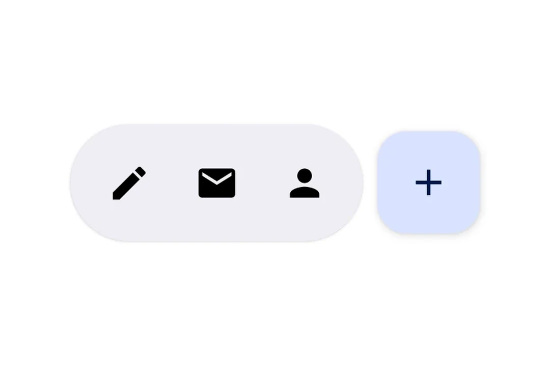
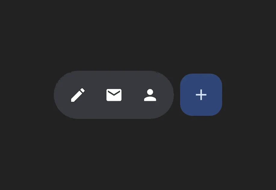
Pill-shaped floating toolbar with three icon buttons and a separate primary FABPill-shaped floating toolbar with three icon buttons and a separate primary FAB

Installation

Terminal
- npx expo install @expo/ui
- yarn expo install @expo/ui
- pnpm expo install @expo/ui
- bun expo install @expo/ui

If you are installing this in an existing React Native app, make sure to install expo in your project.

Usage

Floating toolbar over scrollable content

Place the toolbar inside a Box with floatingToolbarExitAlwaysScrollBehavior to get scroll-driven hide/show behavior. Use align('bottomCenter') to position the toolbar at the bottom of the screen. The entire layout stays within the Compose layer — no React Native absolute positioning needed.

FloatingToolbarExample.tsx
import { Box, HorizontalFloatingToolbar, Host, Icon, IconButton, LazyColumn, ListItem, } from '@expo/ui/jetpack-compose'; import { align, fillMaxSize, fillMaxWidth, offset } from '@expo/ui/jetpack-compose/modifiers'; export default function FloatingToolbarExample() { return ( <Host style={{ flex: 1 }}> <Box modifiers={[fillMaxSize()]} floatingToolbarExitAlwaysScrollBehavior="bottom"> <LazyColumn modifiers={[fillMaxSize()]}>{/* ...list items... */}</LazyColumn> <HorizontalFloatingToolbar variant="vibrant" modifiers={[align('bottomCenter'), offset(0, -16)]}> <IconButton onClick={() => console.log('Edit pressed')}> <Icon source={require('./assets/edit.xml')} /> </IconButton> <HorizontalFloatingToolbar.FloatingActionButton onPress={() => console.log('Add pressed')}> <Icon source={require('./assets/add.xml')} /> </HorizontalFloatingToolbar.FloatingActionButton> </HorizontalFloatingToolbar> </Box> </Host> ); }

Toolbar with FloatingActionButton

Use IconButton as direct children for toolbar items, and HorizontalFloatingToolbar.FloatingActionButton for the primary action.

ToolbarWithFABExample.tsx
import { Host, HorizontalFloatingToolbar, IconButton, Icon } from '@expo/ui/jetpack-compose'; export default function ToolbarWithFABExample() { return ( <Host matchContents> <HorizontalFloatingToolbar> <IconButton onClick={() => console.log('Edit pressed')}> <Icon source={require('./assets/edit.xml')} contentDescription="Edit" /> </IconButton> <IconButton onClick={() => console.log('Share pressed')}> <Icon source={require('./assets/share.xml')} contentDescription="Share" /> </IconButton> <HorizontalFloatingToolbar.FloatingActionButton onPress={() => console.log('Add pressed')}> <Icon source={require('./assets/add.xml')} contentDescription="Add" /> </HorizontalFloatingToolbar.FloatingActionButton> </HorizontalFloatingToolbar> </Host> ); }

API

import { HorizontalFloatingToolbar } from '@expo/ui/jetpack-compose';

No API data file found, sorry!