This documentation is available as Markdown for AI agents and LLMs. See the full Markdown index or append .md to any documentation URL.
TextField
Jetpack Compose TextField components for native Material3 text input.
Android
Included in Expo Go
Recommended version:
~56.0.26
For cross-platform usage, see the universal TextInput — it renders the appropriate native component per platform.
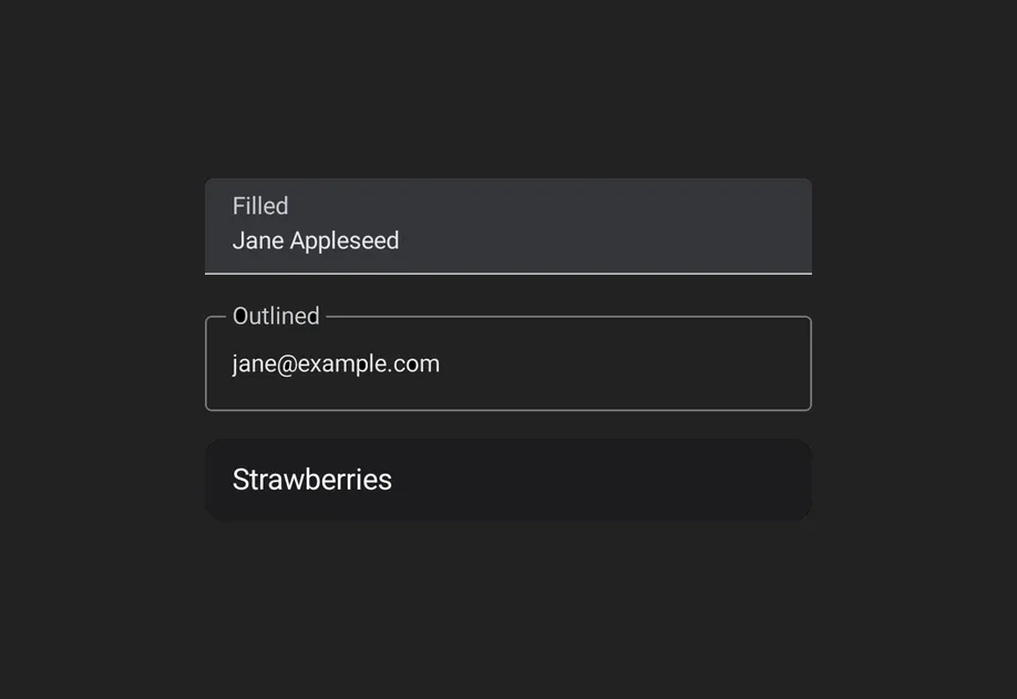
Expo UI provides three text field components that match the official Jetpack Compose TextField API: TextField (filled), OutlinedTextField (outlined border), and BasicTextField (unstyled). The Material variants TextField and OutlinedTextField share the same props and support composable slot children for label, placeholder, icons, prefix, suffix, and supporting text. BasicTextField has no Material chrome, so you supply your own decoration.
Type
Appearance
Purpose
Filled
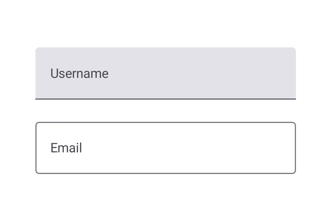
Solid background with a bottom indicator line.
Default text input style following Material3 design. Use for most forms and input fields.
Outlined
Transparent background with a border outline.
Alternative style that provides a distinct visual boundary. Use when filled fields blend into the background.
Basic
No container, indicator, or padding. Just the editable text.
Fully custom-styled inputs. Style it yourself and add decoration through DecorationBox.
Bind a useNativeState observable to value. The field tracks the user's input on its own, and you read the current value from text.value. The filled style shown here is the default Material3 text input.
UncontrolledTextFieldExample.tsx
import{Host,TextField,Text, useNativeState }from'@expo/ui/jetpack-compose';exportdefaultfunctionUncontrolledTextFieldExample(){const text =useNativeState('');return(<HostmatchContents><TextFieldvalue={text}><TextField.Label><Text>Username</Text></TextField.Label></TextField></Host>);}
Controlled text field
Pass a useNativeState observable as value and an onValueChange worklet to transform or validate input before writing it back. The example below uppercases the text as it is typed.
Use OutlinedTextField for a text field with a border outline instead of a filled background.
OutlinedTextFieldExample.tsx
import{Host,OutlinedTextField,Text, useNativeState }from'@expo/ui/jetpack-compose';exportdefaultfunctionOutlinedTextFieldExample(){const text =useNativeState('');return(<HostmatchContents><OutlinedTextFieldvalue={text}><OutlinedTextField.Label><Text>Email</Text></OutlinedTextField.Label><OutlinedTextField.Placeholder><Text>you@example.com</Text></OutlinedTextField.Placeholder></OutlinedTextField></Host>);}
Basic text field
BasicTextField is the unstyled Compose primitive, with no container, indicator, or padding. Style it yourself with modifiers and supply decoration through DecorationBox, placing InnerTextField where the editable text should render. Wrap placeholder content in Placeholder to have it shown only while the field is empty, toggled natively from the field's text.
BasicTextFieldExample.tsx
import{Host,BasicTextField,Box,Text, useNativeState }from'@expo/ui/jetpack-compose';import{
background,
clip,
fillMaxWidth,
padding,Shapes,}from'@expo/ui/jetpack-compose/modifiers';exportdefaultfunctionBasicTextFieldExample(){const value =useNativeState('');return(<HostmatchContents><BasicTextFieldcursorColor="#7c3aed"value={value}modifiers={[fillMaxWidth(),clip(Shapes.RoundedCorner(12)),background('#f3f4f6'),padding(12,10,12,10),]}><BasicTextField.DecorationBox><Box><BasicTextField.Placeholder><Textcolor="#9ca3af">Search…</Text></BasicTextField.Placeholder><BasicTextField.InnerTextField/></Box></BasicTextField.DecorationBox></BasicTextField></Host>);}
Slots
Both TextField and OutlinedTextField support 7 composable slots that match the Compose API: Label, Placeholder, LeadingIcon, TrailingIcon, Prefix, Suffix, and SupportingText.
TextFieldSlotsExample.tsx
import{Host,TextField,Text, useNativeState }from'@expo/ui/jetpack-compose';exportdefaultfunctionTextFieldSlotsExample(){const text =useNativeState('');return(<HostmatchContents><TextFieldvalue={text}><TextField.Label><Text>Price</Text></TextField.Label><TextField.Placeholder><Text>0.00</Text></TextField.Placeholder><TextField.LeadingIcon><Text>💰</Text></TextField.LeadingIcon><TextField.Prefix><Text>$</Text></TextField.Prefix><TextField.Suffix><Text>USD</Text></TextField.Suffix><TextField.SupportingText><Text>Enter the amount</Text></TextField.SupportingText></TextField></Host>);}
Keyboard options
Use the keyboardOptions prop to configure the keyboard type, capitalization, auto-correct, and IME action.
KeyboardOptionsExample.tsx
import{Host,TextField,Text, useNativeState }from'@expo/ui/jetpack-compose';exportdefaultfunctionKeyboardOptionsExample(){const text =useNativeState('');return(<HostmatchContents><TextFieldvalue={text}singleLinekeyboardOptions={{
keyboardType:'email',
capitalization:'none',
autoCorrectEnabled:false,
imeAction:'done',}}><TextField.Label><Text>Email</Text></TextField.Label></TextField></Host>);}
Keyboard actions
Use the keyboardActions prop to handle IME action button presses. The triggered callback depends on the imeAction set in keyboardOptions. Each callback receives the current text value.
KeyboardActionsExample.tsx
import{Host,TextField,Text, useNativeState }from'@expo/ui/jetpack-compose';exportdefaultfunctionKeyboardActionsExample(){const text =useNativeState('');return(<HostmatchContents><TextFieldvalue={text}singleLinekeyboardOptions={{ imeAction:'search'}}keyboardActions={{onSearch: value =>console.log('Searched:', value),}}><TextField.Label><Text>Search</Text></TextField.Label></TextField></Host>);}
Imperative ref
Use a ref to imperatively set text, clear the field, change the selection, or move focus.
When onValueChange is marked with the 'worklet' directive, it runs synchronously on the UI thread, so writes to useNativeState observables inside the callback take effect before the next frame. There is no flicker between the typed text and the masked text. The example below masks a phone number as the user types and writes both value and selection from the worklet to keep the cursor at the end of the formatted value.