This documentation is available as Markdown for AI agents and LLMs. See the full Markdown index or append .md to any documentation URL.

Chip

Jetpack Compose Chip components for displaying compact elements.

Android
Included in Expo Go
Recommended version:
~56.0.26

Expo UI Chips match the official Jetpack Compose Chip API. Each chip type is a separate component: AssistChip, FilterChip, InputChip, and SuggestionChip.

Filter, assist, and suggestion Material 3 chipsFilter, assist, and suggestion Material 3 chips

Installation

Terminal
- npx expo install @expo/ui
- yarn expo install @expo/ui
- pnpm expo install @expo/ui
- bun expo install @expo/ui

If you are installing this in an existing React Native app, make sure to install expo in your project.

Usage

Assist chip

Assist chips help users take actions or start tasks, such as booking a flight or opening a map. They often appear as temporary UI elements in response to user input.

AssistChipExample.tsx
import { Host, AssistChip, Icon, Text } from '@expo/ui/jetpack-compose'; export default function AssistChipExample() { return ( <Host matchContents> <AssistChip onClick={() => console.log('Opening flight booking...')}> <AssistChip.Label> <Text>Book Flight</Text> </AssistChip.Label> <AssistChip.LeadingIcon> <Icon source={require('./assets/flight.xml')} size={18} /> </AssistChip.LeadingIcon> </AssistChip> </Host> ); }

Filter chip

Filter chips allow users to refine content from a set of options. They support a selected state and are commonly used in search bars or content filtering.

FilterChipExample.tsx
import { useState } from 'react'; import { Host, FilterChip, Text } from '@expo/ui/jetpack-compose'; export default function FilterChipExample() { const [selected, setSelected] = useState(false); return ( <Host matchContents> <FilterChip selected={selected} onClick={() => setSelected(!selected)}> <FilterChip.Label> <Text>Images</Text> </FilterChip.Label> </FilterChip> </Host> ); }

Input chip

Input chips represent discrete pieces of information entered by a user, such as tags in a text field. They support avatars, trailing icons, and can be dismissed.

InputChipExample.tsx
import { useState } from 'react'; import { Host, InputChip, Icon, Text, FlowRow } from '@expo/ui/jetpack-compose'; export default function InputChipExample() { const [chips, setChips] = useState(['Work', 'Travel', 'News']); return ( <Host matchContents> <FlowRow horizontalArrangement={{ spacedBy: 8 }}> {chips.map(label => ( <InputChip key={label} selected onClick={() => setChips(prev => prev.filter(c => c !== label))}> <InputChip.Label> <Text>{label}</Text> </InputChip.Label> <InputChip.TrailingIcon> <Icon source={require('./assets/close.xml')} size={18} /> </InputChip.TrailingIcon> </InputChip> ))} </FlowRow> </Host> ); }

Suggestion chip

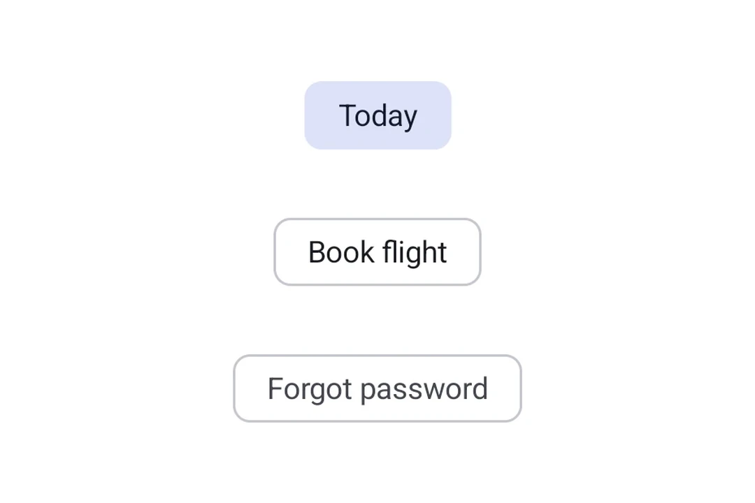
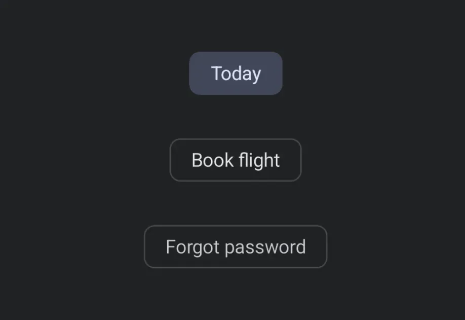
Suggestion chips help narrow a user's intent by presenting dynamically generated suggestions, such as quick-reply options in a chat or search refinements.
SuggestionChipExample.tsx
import { Host, SuggestionChip, Text } from '@expo/ui/jetpack-compose'; export default function SuggestionChipExample() { return ( <Host matchContents> <SuggestionChip onClick={() => console.log('Searching nearby...')}> <SuggestionChip.Label> <Text>Nearby</Text> </SuggestionChip.Label> </SuggestionChip> </Host> ); }

API

import { AssistChip, FilterChip, InputChip, SuggestionChip } from '@expo/ui/jetpack-compose';

No API data file found, sorry!