This documentation is available as Markdown for AI agents and LLMs. See the full Markdown index or append .md to any documentation URL.
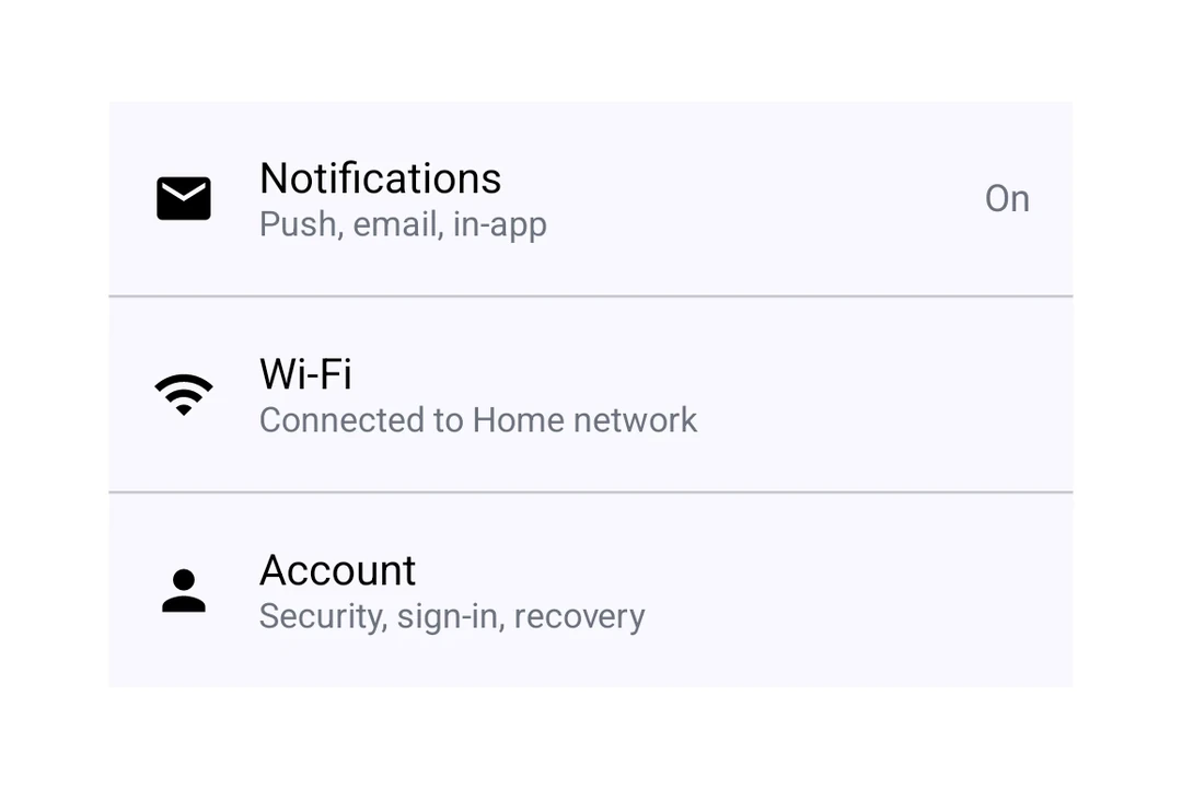
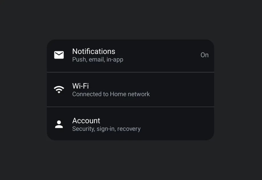
ListItem A Jetpack Compose ListItem component for displaying structured list entries.
Recommended version:
~56.0.26
Expo UI ListItem matches the official Jetpack Compose ListItem
Installation
- npx expo install @expo/ui
- yarn expo install @expo/ui
- pnpm expo install @expo/ui
- bun expo install @expo/ui
If you are installing this in an existing React Native app , make sure to install expo in your project.
Usage
Basic list item
import { Host , ListItem , Text } from '@expo/ui/jetpack-compose' ;
export default function BasicListItem ( ) {
return (
< Host matchContents >
< ListItem >
< ListItem.HeadlineContent >
< Text > Settings </ Text >
</ ListItem.HeadlineContent >
</ ListItem >
</ Host > ) ;
}
With compound components
Use compound components for rich content in each position.
ListItemWithCompoundComponent.tsx import { Host , ListItem , Icon , Text } from '@expo/ui/jetpack-compose' ;
export default function ListItemWithSlots ( ) {
return (
< Host matchContents >
< ListItem >
< ListItem.HeadlineContent >
< Text > Notifications </ Text >
</ ListItem.HeadlineContent >
< ListItem.OverlineContent >
< Text > ACCOUNT </ Text >
</ ListItem.OverlineContent >
< ListItem.SupportingContent >
< Text > Manage notification preferences </ Text >
</ ListItem.SupportingContent >
< ListItem.LeadingContent >
< Icon source = { require ( './assets/notifications.xml' ) } />
</ ListItem.LeadingContent >
< ListItem.TrailingContent >
< Icon source = { require ( './assets/chevron.xml' ) } />
</ ListItem.TrailingContent >
</ ListItem >
</ Host > ) ;
}
Clickable list item
Use the clickable modifier to handle tap interactions.
import { Host , ListItem , Text } from '@expo/ui/jetpack-compose' ;
import { clickable } from '@expo/ui/jetpack-compose/modifiers' ;
export default function ClickableListItem ( ) {
return (
< Host matchContents >
< ListItem modifiers = { [ clickable ( ( ) => console . log ( 'Tapped!' ) ) ] } >
< ListItem.HeadlineContent >
< Text > Tap me </ Text >
</ ListItem.HeadlineContent >
</ ListItem >
</ Host > ) ;
}
Custom headline content
Use ListItem.HeadlineContent for composable headline content like rows with icons.
ListItemCustomHeadline.tsx import { Host , ListItem , Text , Row , Icon } from '@expo/ui/jetpack-compose' ;
export default function ListItemCustomHeadline ( ) {
return (
< Host matchContents >
< ListItem >
< ListItem.HeadlineContent >
< Row horizontalArrangement = { { spacedBy: 8 } } verticalAlignment = " center" >
< Text > Premium Feature </ Text >
< Icon source = { require ( './assets/star.xml' ) } size = { 16 } />
</ Row >
</ ListItem.HeadlineContent >
</ ListItem >
</ Host > ) ;
}
API
import { ListItem } from '@expo/ui/jetpack-compose' ;
No API data file found, sorry!