This documentation is available as Markdown for AI agents and LLMs. See the full Markdown index or append .md to any documentation URL.
Shape A Jetpack Compose Shape component for drawing geometric shapes.
Recommended version:
~56.0.26
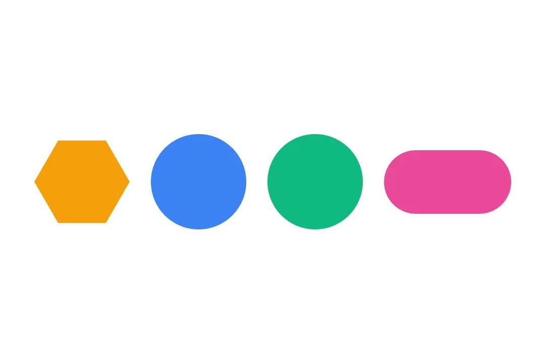
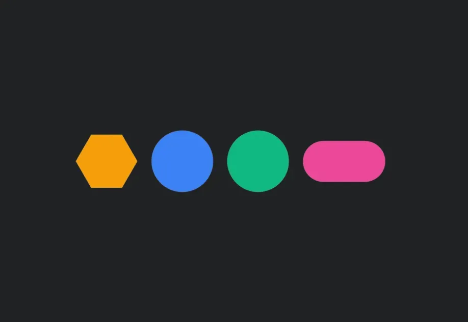
Expo UI Shape matches the official Jetpack Compose Shapes API and provides a set of sub-components for drawing geometric shapes such as stars, circles, rectangles, pills, and polygons.
Installation
- npx expo install @expo/ui
- yarn expo install @expo/ui
- pnpm expo install @expo/ui
- bun expo install @expo/ui
If you are installing this in an existing React Native app , make sure to install expo in your project.
Usage
Basic shapes
Render common shapes using the Shape sub-components.
import { Host , Shape , Row } from '@expo/ui/jetpack-compose' ;
import { size } from '@expo/ui/jetpack-compose/modifiers' ;
export default function BasicShapesExample ( ) {
return (
< Host matchContents >
< Row horizontalArrangement = { { spacedBy: 16 } } verticalAlignment = " center" >
< Shape.Star color = " #FFD700" modifiers = { [ size ( 80 , 80 ) ] } />
< Shape.Circle radius = { 40 } color = " #4285F4" modifiers = { [ size ( 80 , 80 ) ] } />
< Shape.Rectangle color = " #34A853" modifiers = { [ size ( 80 , 80 ) ] } />
< Shape.Pill color = " #EA4335" modifiers = { [ size ( 100 , 50 ) ] } />
</ Row >
</ Host > ) ;
}
Shapes with rounded corners
Use cornerRounding and smoothing to customize the appearance of shapes.
import { Host , Shape , Row } from '@expo/ui/jetpack-compose' ;
import { size } from '@expo/ui/jetpack-compose/modifiers' ;
export default function RoundedShapesExample ( ) {
return (
< Host matchContents >
< Row horizontalArrangement = { { spacedBy: 16 } } verticalAlignment = " center" >
< Shape.Rectangle cornerRounding = { 16 } smoothing = { 0.5 } color = " #9C27B0" modifiers = { [ size ( 100 , 80 ) ] } />
< Shape.RoundedCorner cornerRadii = { { topStart: 20 , topEnd: 20 , bottomStart: 0 , bottomEnd: 0 } } color = " #FF5722" modifiers = { [ size ( 100 , 80 ) ] } />
</ Row >
</ Host > ) ;
}
Polygon and star variants
Use verticesCount and innerRadius to control the shape geometry.
import { Host , Shape , Row } from '@expo/ui/jetpack-compose' ;
import { size } from '@expo/ui/jetpack-compose/modifiers' ;
export default function PolygonShapesExample ( ) {
return (
< Host matchContents >
< Row horizontalArrangement = { { spacedBy: 16 } } verticalAlignment = " center" >
< Shape.Polygon verticesCount = { 6 } cornerRounding = { 4 } color = " #00BCD4" modifiers = { [ size ( 80 , 80 ) ] } />
< Shape.Star verticesCount = { 8 } innerRadius = { 0.4 } cornerRounding = { 2 } color = " #FF9800" modifiers = { [ size ( 80 , 80 ) ] } />
< Shape.PillStar verticesCount = { 6 } innerRadius = { 0.5 } color = " #E91E63" modifiers = { [ size ( 80 , 80 ) ] } />
</ Row >
</ Host > ) ;
}
API
import { Shape } from '@expo/ui/jetpack-compose' ;
No API data file found, sorry!