This documentation is available as Markdown for AI agents and LLMs. See the full Markdown index or append .md to any documentation URL.

DropdownMenu

A Jetpack Compose DropdownMenu component for displaying dropdown menus.

Android
Included in Expo Go
Recommended version:
~56.0.26

Expo UI DropdownMenu matches the official Jetpack Compose Menu API and displays a dropdown menu when a trigger element is pressed.
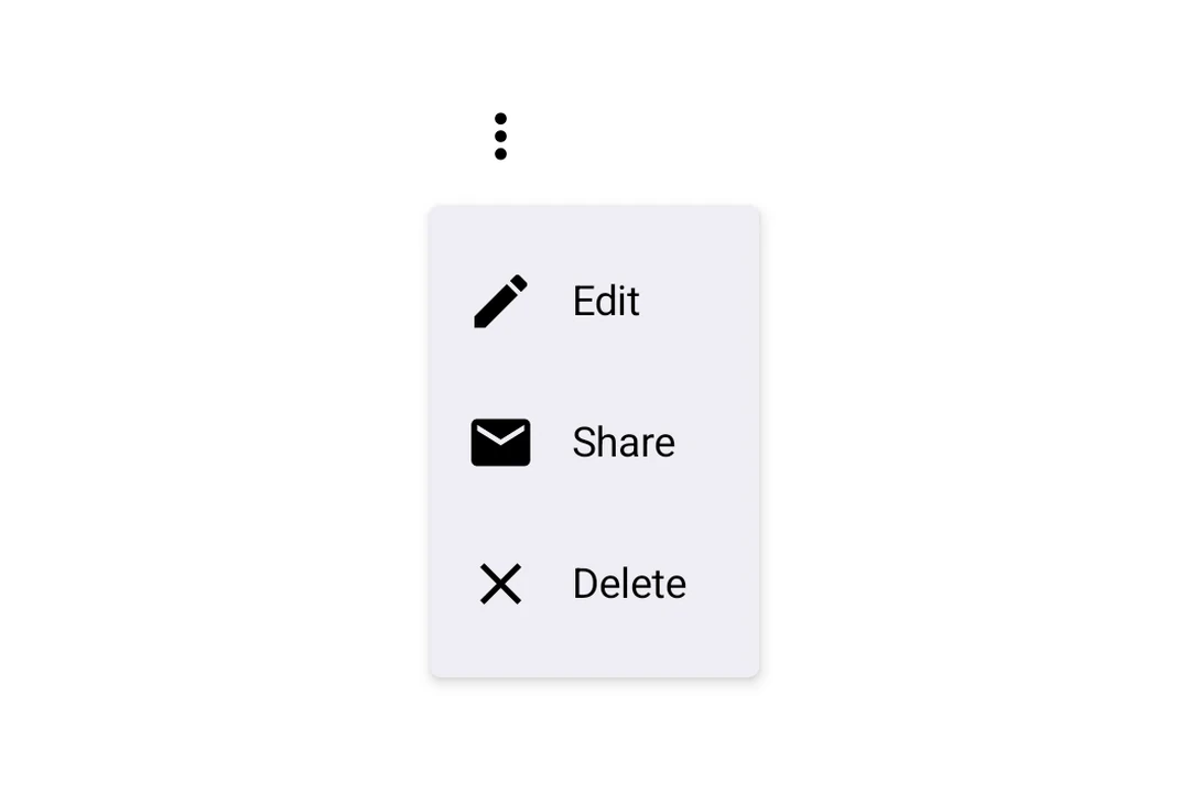
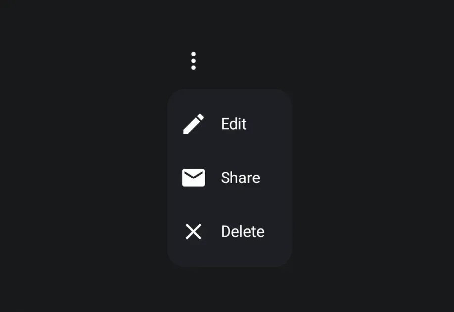
Three-dot more menu opened to show Edit, Share, and Delete options with leading iconsThree-dot more menu opened to show Edit, Share, and Delete options with leading icons

Installation

Terminal
- npx expo install @expo/ui
- yarn expo install @expo/ui
- pnpm expo install @expo/ui
- bun expo install @expo/ui

If you are installing this in an existing React Native app, make sure to install expo in your project.

Usage

Basic dropdown menu

BasicDropdownMenuExample.tsx
import { Host, DropdownMenu, DropdownMenuItem, OutlinedButton, Text, Icon, } from '@expo/ui/jetpack-compose'; import { useState } from 'react'; const homeIcon = require('./assets/home.xml'); export default function BasicDropdownMenuExample() { const [isExpanded, setIsExpanded] = useState(false); return ( <Host matchContents> <DropdownMenu expanded={isExpanded} onDismissRequest={() => setIsExpanded(false)}> <DropdownMenu.Trigger> <OutlinedButton onClick={() => setIsExpanded(true)}>Show Menu</OutlinedButton> </DropdownMenu.Trigger> <DropdownMenu.Items> <DropdownMenuItem onClick={() => { setIsExpanded(false); console.log('Home pressed'); }}> <DropdownMenuItem.Text> <Text>Home</Text> </DropdownMenuItem.Text> <DropdownMenuItem.LeadingIcon> <Icon source={homeIcon} size={24} /> </DropdownMenuItem.LeadingIcon> </DropdownMenuItem> </DropdownMenu.Items> </DropdownMenu> </Host> ); }

React Native components as trigger

You can use a React Native view (such as Pressable) as the dropdown's trigger by wrapping it in RNHostView.

RNTriggerDropdownMenuExample.tsx
import { Host, DropdownMenu, DropdownMenuItem, Text as ComposeText, RNHostView, } from '@expo/ui/jetpack-compose'; import { useState } from 'react'; import { Pressable, Text } from 'react-native'; export default function RNTriggerDropdownMenuExample() { const [isExpanded, setIsExpanded] = useState(false); return ( <Host matchContents> <DropdownMenu expanded={isExpanded} onDismissRequest={() => setIsExpanded(false)}> <DropdownMenu.Trigger> <RNHostView matchContents> <Pressable onPress={() => setIsExpanded(true)} style={{ alignSelf: 'flex-start', paddingHorizontal: 16, paddingVertical: 10, borderRadius: 8, backgroundColor: '#9B59B6', }}> <Text style={{ color: 'white', fontWeight: '600' }}>RN Pressable Trigger</Text> </Pressable> </RNHostView> </DropdownMenu.Trigger> <DropdownMenu.Items> <DropdownMenuItem onClick={() => setIsExpanded(false)}> <DropdownMenuItem.Text> <ComposeText>Item 1</ComposeText> </DropdownMenuItem.Text> </DropdownMenuItem> <DropdownMenuItem onClick={() => setIsExpanded(false)}> <DropdownMenuItem.Text> <ComposeText>Item 2</ComposeText> </DropdownMenuItem.Text> </DropdownMenuItem> </DropdownMenu.Items> </DropdownMenu> </Host> ); }

API

import { DropdownMenu } from '@expo/ui/jetpack-compose';

No API data file found, sorry!