This documentation is available as Markdown for AI agents and LLMs. See the full Markdown index or append .md to any documentation URL.
徽章
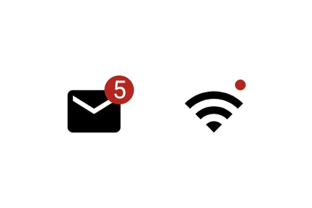
用于显示状态指示器和计数的 Jetpack Compose 徽章组件。
Expo UI 徽章与官方 Jetpack Compose Badge API 匹配。它表现为一个小的彩色指示点,或者带有内容,例如计数数字。
🌐 Expo UI Badge matches the official Jetpack Compose Badge API. It renders as a small colored indicator dot, or with content such as a count number.
安装
🌐 Installation
- npx expo install @expo/uiIf you are installing this in an existing React Native app, make sure to install expo in your project.
用法
🌐 Usage
指示点
🌐 Indicator dot
没有子项的徽章显示为一个小点指示器。
🌐 A badge with no children renders as a small dot indicator.
import { Host, Badge } from '@expo/ui/jetpack-compose';

export default function BadgeDot() {
  return (
    <Host matchContents>
      <Badge />
    </Host>
  );
}
带计数的徽章
🌐 Badge with count
传递一个 Text 子元素以显示数字或标签。
🌐 Pass a Text child to display a number or label.
import { Host, Badge, Text } from '@expo/ui/jetpack-compose';

export default function BadgeCount() {
  return (
    <Host matchContents>
      <Badge containerColor="#EF5350" contentColor="#FFFFFF">
        <Text>3</Text>
      </Badge>
    </Host>
  );
}
应用接口
🌐 API
import { Badge } from '@expo/ui/jetpack-compose';
Component
Type: React.Element<BadgeProps>
A badge component matching Compose's Badge.
Renders as a small colored indicator dot, or with content (for example, a count).
ReactNodeOptional content inside the badge (for example, a Text with a count).
When omitted, renders as a small indicator dot.
ColorValue • Default: BadgeDefaults.containerColorBackground color of the badge.
ColorValue • Default: BadgeDefaults.contentColorContent color inside the badge (text/icon tint).